Unlock a world of possibilities! Login now and discover the exclusive benefits awaiting you.
- Qlik Community
- :
- Forums
- :
- Analytics
- :
- App Development
- :
- Avg and Month Dimension on chart
- Subscribe to RSS Feed
- Mark Topic as New
- Mark Topic as Read
- Float this Topic for Current User
- Bookmark
- Subscribe
- Mute
- Printer Friendly Page
- Mark as New
- Bookmark
- Subscribe
- Mute
- Subscribe to RSS Feed
- Permalink
- Report Inappropriate Content
Avg and Month Dimension on chart
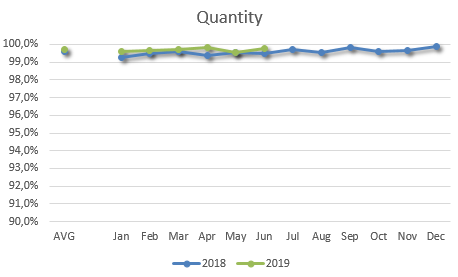
How can I add the both AVG and Month dimension in the chart as below, in Qlik Sense or QlikView?
- Tags:
- chart
- qlik sense
Accepted Solutions
- Mark as New
- Bookmark
- Subscribe
- Mute
- Subscribe to RSS Feed
- Permalink
- Report Inappropriate Content
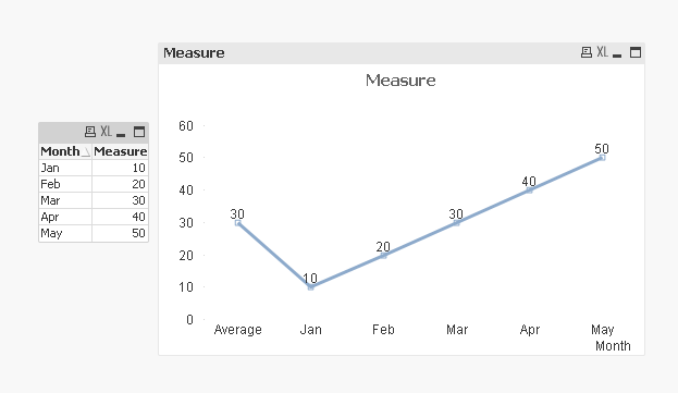
We have work around. PFA
- Mark as New
- Bookmark
- Subscribe
- Mute
- Subscribe to RSS Feed
- Permalink
- Report Inappropriate Content
We have work around. PFA
- Mark as New
- Bookmark
- Subscribe
- Mute
- Subscribe to RSS Feed
- Permalink
- Report Inappropriate Content
Thanks! It works properly.
But..I need something complex, so I want to show the trend CY vs PY.
I already did this but there is an issue on Average, the result in QlikView/Qlik Sense don't Match with the result in Excel.
As measure I have a percentage ([Received Calls]/[Calls]) for example.
- Mark as New
- Bookmark
- Subscribe
- Mute
- Subscribe to RSS Feed
- Permalink
- Report Inappropriate Content
You want to include Average in the Average calculation? Also the Average is 0? Shouldn't it be an average based on MonthNum 1, 2, 3 here? It might help if we can see a better sample where you share raw data and the output you expect to see from it


