Unlock a world of possibilities! Login now and discover the exclusive benefits awaiting you.
- Qlik Community
- :
- Forums
- :
- Analytics
- :
- App Development
- :
- Bar chart scale in sensible fractions of an hour
- Subscribe to RSS Feed
- Mark Topic as New
- Mark Topic as Read
- Float this Topic for Current User
- Bookmark
- Subscribe
- Mute
- Printer Friendly Page
- Mark as New
- Bookmark
- Subscribe
- Mute
- Subscribe to RSS Feed
- Permalink
- Report Inappropriate Content
Bar chart scale in sensible fractions of an hour
Dear all,
if I have a stacked bar chart with a duration as the measure, and a range of the values from 0 to 1 hour, I would expect the labels on the axis to be something like 00:15:00, 00:30:00, 00:45:00, 01:00:00.
However, it shows
00:14:23, 00:28:47, 00:43:11.
which correspond to numerical values of 0.0100, 0.0200, 0.0300, so this is why QlikSense does this strange tick marks, but for human reading, a axis label of 00:14:23 just hurts the eyes, and reduces the readability.
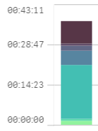
Is there any way to fix the scaling for this stacked bar chart to 00:15:00 00:30:00 etc...?
(I can convert that to minutes, obviously, but then I have decimal points in the formatting of displayed values, like 15.36, which is also not human eyes friendly...)