Unlock a world of possibilities! Login now and discover the exclusive benefits awaiting you.
- Qlik Community
- :
- Forums
- :
- Analytics
- :
- App Development
- :
- Re: Box Plot Road Map
- Subscribe to RSS Feed
- Mark Topic as New
- Mark Topic as Read
- Float this Topic for Current User
- Bookmark
- Subscribe
- Mute
- Printer Friendly Page
- Mark as New
- Bookmark
- Subscribe
- Mute
- Subscribe to RSS Feed
- Permalink
- Report Inappropriate Content
Box Plot Road Map
Hi Guys,
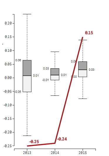
First of all thank you very much for actually bringing BoxPlot function into Qlik Sense directly! I tested it and I like it very much how it works when it comes to its basic functionalities. However, in order for this chart to really become useful for me or our business case is that we need to have an option to have a "reference line" that would compare for example in our case a "client" data vs the aggregated data on the boxplots.
Currently, we have adjusted an existing extension and created that option there. It looks like following. As you can see this functionality is not available directly in your built in chart. My question is, is it possible that we will see that in a future? I believe that it could bring tremendeous amount of usefulness for many business cases and not just our own and would make boxplot chart way more competitive in terms of usefulness.
What do you think? 
- Mark as New
- Bookmark
- Subscribe
- Mute
- Subscribe to RSS Feed
- Permalink
- Report Inappropriate Content
Bringing my post up.
Please, feel free to support this idea guys with any other recommendations or feedback on how this could be implemented and how it could benefit you, so we increase chance of ever seeing this directly in Qlik Sense
- Mark as New
- Bookmark
- Subscribe
- Mute
- Subscribe to RSS Feed
- Permalink
- Report Inappropriate Content
I was hoping for at least some interest for this feature, is there really absolutely noone, neither from a Qlik side neither from developer/user side that would simply have anything to say about this? 
Wishing you a great day my fellow Qlik users.
- Mark as New
- Bookmark
- Subscribe
- Mute
- Subscribe to RSS Feed
- Permalink
- Report Inappropriate Content
Hi,
I came across your post because I have the same requirement for a customer. In my case they need to show the last value of the series as a symbol on top of the box plot. They already plot this chart using Excel, so they expect to have the same in Qlik Sense.
I'm looking into the picasso.js components to build a custom combo box plot + symbol.