Unlock a world of possibilities! Login now and discover the exclusive benefits awaiting you.
- Qlik Community
- :
- Forums
- :
- Analytics
- :
- App Development
- :
- Re: Break multiple line chart by dimension in in P...
Options
- Subscribe to RSS Feed
- Mark Topic as New
- Mark Topic as Read
- Float this Topic for Current User
- Bookmark
- Subscribe
- Mute
- Printer Friendly Page
Turn on suggestions
Auto-suggest helps you quickly narrow down your search results by suggesting possible matches as you type.
Showing results for
Contributor II
2019-01-08
08:13 AM
- Mark as New
- Bookmark
- Subscribe
- Mute
- Subscribe to RSS Feed
- Permalink
- Report Inappropriate Content
Break multiple line chart by dimension in in Picasso Designer
Hello,
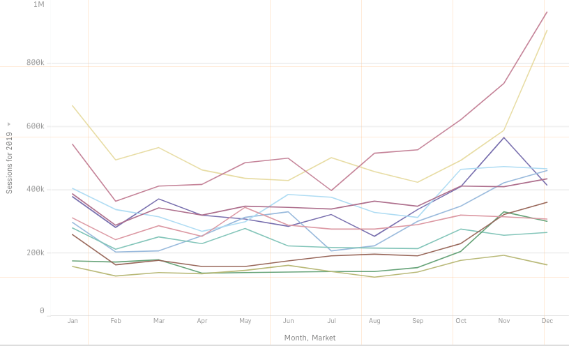
I have this multiple line chart made in native Qlik Sense chart objects, which I would like to recreate with Picasso Designer to get the styling we want. In the end, I want to display Sessions on the Y-axis, Month on the X-axis, and have multiple Session-lines broken down by Brand-Country combinations.
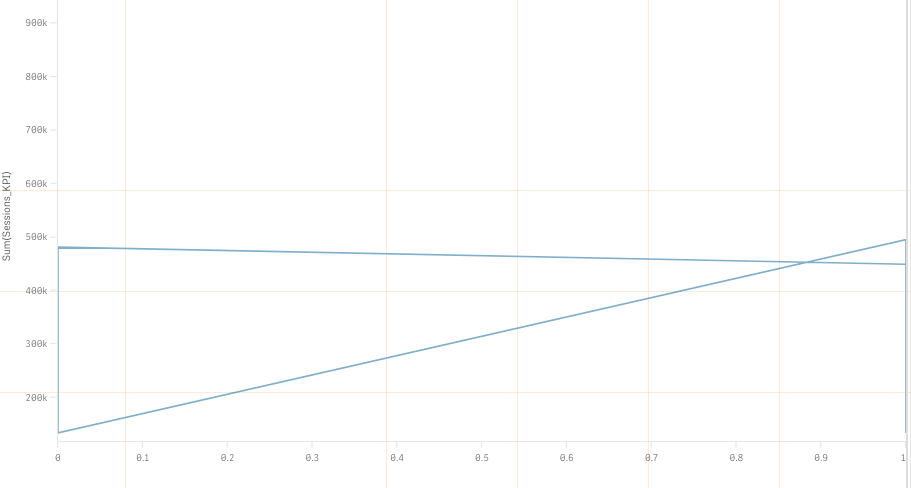
Here's what I get in Picasso. Have tried different variations of scales settings:
Here's my current Picasso scales setup:
706 Views
3 Replies
Creator II
2019-01-24
12:20 AM
- Mark as New
- Bookmark
- Subscribe
- Mute
- Subscribe to RSS Feed
- Permalink
- Report Inappropriate Content
Hi @Jonas,
Have you found the solution?
If yes could you please share the scale settings.
Thanks in advance.
Have you found the solution?
If yes could you please share the scale settings.
Thanks in advance.
665 Views
Contributor III
2019-08-01
02:30 AM
- Mark as New
- Bookmark
- Subscribe
- Mute
- Subscribe to RSS Feed
- Permalink
- Report Inappropriate Content
Any solution?
575 Views
Employee
2019-08-16
03:52 AM
- Mark as New
- Bookmark
- Subscribe
- Mute
- Subscribe to RSS Feed
- Permalink
- Report Inappropriate Content
is there any updates?
548 Views
Community Browser


