Unlock a world of possibilities! Login now and discover the exclusive benefits awaiting you.
- Qlik Community
- :
- Forums
- :
- Analytics
- :
- App Development
- :
- Chart with two access and multiple data series
- Subscribe to RSS Feed
- Mark Topic as New
- Mark Topic as Read
- Float this Topic for Current User
- Bookmark
- Subscribe
- Mute
- Printer Friendly Page
- Mark as New
- Bookmark
- Subscribe
- Mute
- Subscribe to RSS Feed
- Permalink
- Report Inappropriate Content
Chart with two access and multiple data series
Hi all,
I'm trying to develop a chart like in the following image, which has two axes, one with temperatures and another one with durations. For the temperature axis we know we'll only have the orange and the blue points; on the other side, for the duration axis, the number of series may vary with the selection.
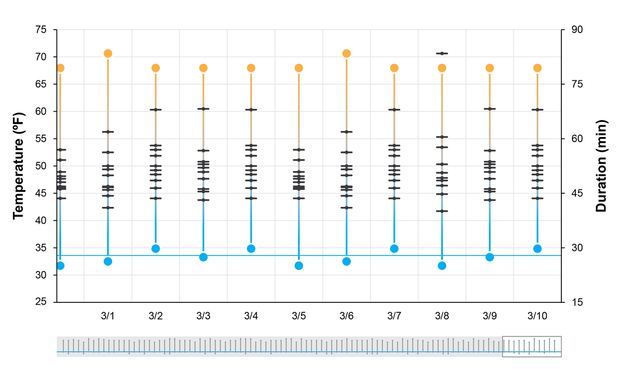
I've been trying several native charts and extensions, and always seems to be a limitation, either for the number of dimensions or for the variable points series, or even for the fact that there must be a visual differentiation between the information that's being summarized in the chart (temperatures vs durations).
Has anyone faced a task like this before? If so, please help with some directions; if not, help any way 
I'm developing on Qlik Sense Server 3.1 by the way.
Thanks in advance!
Agu.-