Unlock a world of possibilities! Login now and discover the exclusive benefits awaiting you.
- Qlik Community
- :
- Forums
- :
- Analytics
- :
- App Development
- :
- Create a Chart from the table created in visualiza...
- Subscribe to RSS Feed
- Mark Topic as New
- Mark Topic as Read
- Float this Topic for Current User
- Bookmark
- Subscribe
- Mute
- Printer Friendly Page
- Mark as New
- Bookmark
- Subscribe
- Mute
- Subscribe to RSS Feed
- Permalink
- Report Inappropriate Content
Create a Chart from the table created in visualization
Kindly help me to solve the below logic:
I have created a table in Qlik Sense visualization which has 3 Dimensions (Market, Account Name & Category). Moreover I have put a limitation of Top 5 on Account Name.
Question is I want to create a chart which picks the data from the above table i.e. if the table data changes it changes the chart too.
Thanks in advance
Thanks
Deepanshu
- Tags:
- deepanshu
- Mark as New
- Bookmark
- Subscribe
- Mute
- Subscribe to RSS Feed
- Permalink
- Report Inappropriate Content
please post in the Qlik Sense forum.
thanks
regards
Marco
- Mark as New
- Bookmark
- Subscribe
- Mute
- Subscribe to RSS Feed
- Permalink
- Report Inappropriate Content
Hi Deepanshu,
Yes it is possible, follow thesee steps:
- Copy and paste your table (ctrl+c, ctrl+v is suitable)
- Select the desired chart type at the left pane, and put over the copied table
- Local menu will appear, with two item Replace and Convert
- Choose convert
I hope that is what you want.
G.
- Mark as New
- Bookmark
- Subscribe
- Mute
- Subscribe to RSS Feed
- Permalink
- Report Inappropriate Content
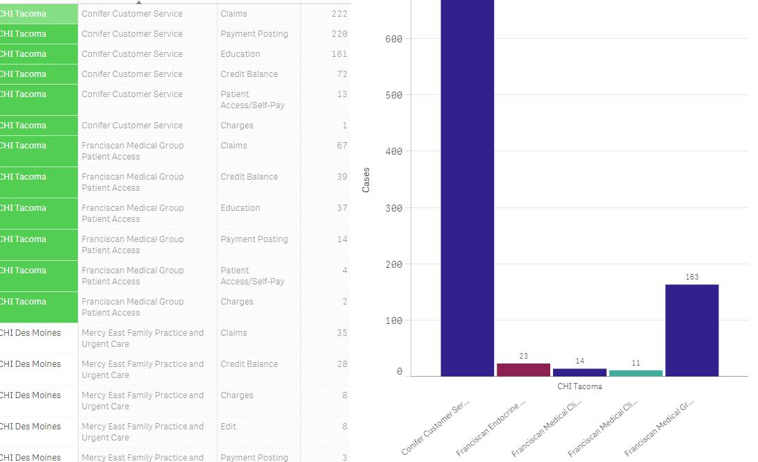
Thanks Sir!!
I did that but it was not working. It pull the whole data.
For E.g.
In table for Tacoma, we have just two names i.e. Confier and Franciscan. But the chart which is created from the table pull all data
I have attached the screenshot for your reference.
Please suggest
Thanks
Deepanshu
- Mark as New
- Bookmark
- Subscribe
- Mute
- Subscribe to RSS Feed
- Permalink
- Report Inappropriate Content
Hi Deepanshu,
It would be easy to solve your issue if you can attach a sample QVF.
Thanks and Regards,
Sangram Reddy.