Unlock a world of possibilities! Login now and discover the exclusive benefits awaiting you.
- Qlik Community
- :
- Forums
- :
- Analytics
- :
- App Development
- :
- Create a custom chart MAP
- Subscribe to RSS Feed
- Mark Topic as New
- Mark Topic as Read
- Float this Topic for Current User
- Bookmark
- Subscribe
- Mute
- Printer Friendly Page
- Mark as New
- Bookmark
- Subscribe
- Mute
- Subscribe to RSS Feed
- Permalink
- Report Inappropriate Content
Create a custom chart MAP
Hello,
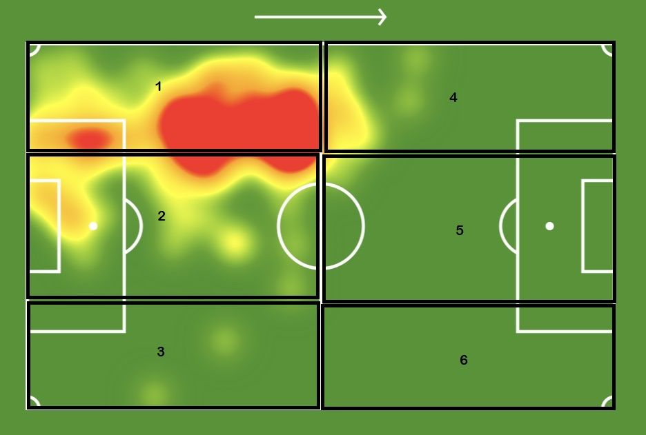
I have an exercise to perform which consists in creating a personalized map in order to add heat points according to the zones impacted by an indicator. To facilitate the work, I cut the map into 6 zones.
Do you know if it is possible to do this with Qliksense please? If so, how please?
thank you
- Mark as New
- Bookmark
- Subscribe
- Mute
- Subscribe to RSS Feed
- Permalink
- Report Inappropriate Content
There is a great post here:
https://community.qlik.com/t5/Qlik-GeoAnalytics-Documents/Image-to-Map/ta-p/1552580
- Mark as New
- Bookmark
- Subscribe
- Mute
- Subscribe to RSS Feed
- Permalink
- Report Inappropriate Content
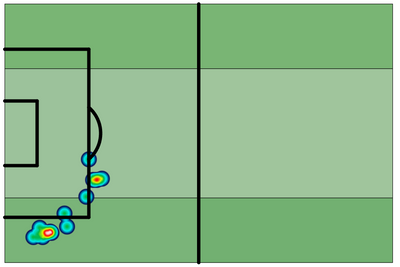
I was able to create something similar to what you are looking for using the Map chart. I have not put any practical data in it and not sure that it would be good to use if you need to make selections etc. but if you just need to visualize the heat map and quadrants this could be a solution. Note: This is extremely labor intensive to set up!

