Unlock a world of possibilities! Login now and discover the exclusive benefits awaiting you.
- Qlik Community
- :
- Forums
- :
- Analytics
- :
- App Development
- :
- Custom color for the line graph
- Subscribe to RSS Feed
- Mark Topic as New
- Mark Topic as Read
- Float this Topic for Current User
- Bookmark
- Subscribe
- Mute
- Printer Friendly Page
- Mark as New
- Bookmark
- Subscribe
- Mute
- Subscribe to RSS Feed
- Permalink
- Report Inappropriate Content
Custom color for the line graph
I have developed a line graph where I plot the Running Sales & Target for the month for each day. So as u progress the month; the chart shows an increasing sales vs target lines.
The formula for sales is as below:
RangeSum(Above(Sum(Sales)),0, RowNo(TOTAL)))
The graph was perfect.
The user comes with a requirement that he need to show sales with green color and the target with blue color. So I tried to develop the graph using value list. Value list dont bring the right graph. I observe that the RangeSum function in not working properly in the value list.
Any suggestions? Or there is any other way to color the line graph with two variables.
Accepted Solutions
- Mark as New
- Bookmark
- Subscribe
- Mute
- Subscribe to RSS Feed
- Permalink
- Report Inappropriate Content
You can achieve this either with a calculated dimension as you tried to or with making a change to your data model and actually have a real dimension - which I think is a better data model anyway. I have enclosed your QVF updated with my changes and you can have a look at both solutions:
The first alternative based on your data model with two columns for the amounts:
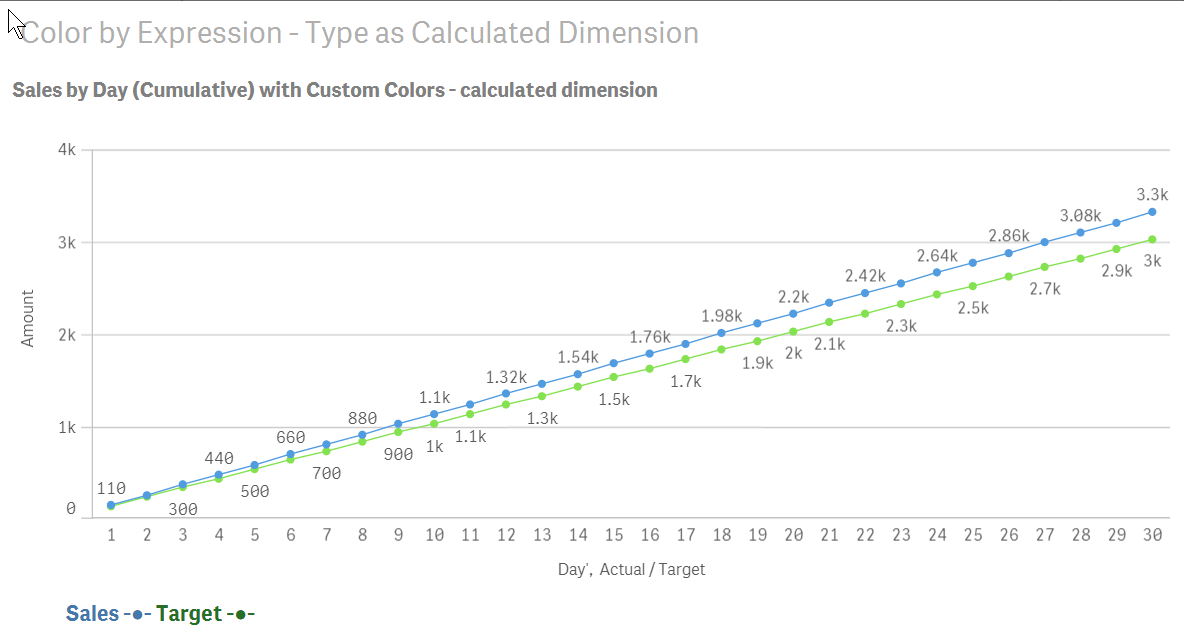
Measures Expression:
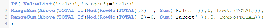
Notice that you have to use the full ValueList('Sales','Target') which is the pseudo-name for the calculated dimension.
Furthermore since this ValueList() doubles the number of rows you have to make sure that you only pick every other row and that mandates a Mod()-function to check that we only pick half of the rows. It doesn't really matter is it is 1 or 0 we compare with...
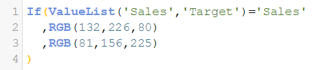
Colors Custom Expression:
The second alternative where there is a table that has been unpivoted in the load script by using the CrossTable prefix
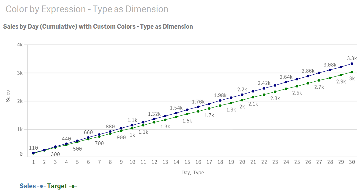
Measures Expression:
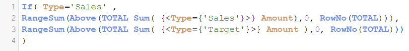
Colors Custom Expression:
![]()
- Mark as New
- Bookmark
- Subscribe
- Mute
- Subscribe to RSS Feed
- Permalink
- Report Inappropriate Content
You can achieve this either with a calculated dimension as you tried to or with making a change to your data model and actually have a real dimension - which I think is a better data model anyway. I have enclosed your QVF updated with my changes and you can have a look at both solutions:
The first alternative based on your data model with two columns for the amounts:
Measures Expression:
Notice that you have to use the full ValueList('Sales','Target') which is the pseudo-name for the calculated dimension.
Furthermore since this ValueList() doubles the number of rows you have to make sure that you only pick every other row and that mandates a Mod()-function to check that we only pick half of the rows. It doesn't really matter is it is 1 or 0 we compare with...
Colors Custom Expression:
The second alternative where there is a table that has been unpivoted in the load script by using the CrossTable prefix
Measures Expression:
Colors Custom Expression:
![]()
- Mark as New
- Bookmark
- Subscribe
- Mute
- Subscribe to RSS Feed
- Permalink
- Report Inappropriate Content
Infact I have four columns to work on :
Sales, Target, Sales Last Year Same Month, Sales vs Target
In this case how can I handle the Mod function?
- Mark as New
- Bookmark
- Subscribe
- Mute
- Subscribe to RSS Feed
- Permalink
- Report Inappropriate Content
I don't understand what you mean by "Mod function" are you referring to Moduolo-function in expressions?
- Mark as New
- Bookmark
- Subscribe
- Mute
- Subscribe to RSS Feed
- Permalink
- Report Inappropriate Content
yes...
but thanks for your help. I have reached my target.
- Mark as New
- Bookmark
- Subscribe
- Mute
- Subscribe to RSS Feed
- Permalink
- Report Inappropriate Content
You're welcome. Could you also please mark the question as answered too?