Unlock a world of possibilities! Login now and discover the exclusive benefits awaiting you.
- Qlik Community
- :
- Forums
- :
- Analytics
- :
- App Development
- :
- Re: Data Load Formatting
- Subscribe to RSS Feed
- Mark Topic as New
- Mark Topic as Read
- Float this Topic for Current User
- Bookmark
- Subscribe
- Mute
- Printer Friendly Page
- Mark as New
- Bookmark
- Subscribe
- Mute
- Subscribe to RSS Feed
- Permalink
- Report Inappropriate Content
Data Load Formatting
Hey there,
I'm attempting to create a Qlik application from an Excel spreadsheet and am having trouble with my data load. The spreadsheet formatting is:
| Client | Project | Project Start | Project End | Consultant | Bill Rate | FLC | Project Status | Jan-15 Hours | Feb-15 Hours | Mar-15 Hours | Apr-15 Hours | May-15 Hours |
|---|---|---|---|---|---|---|---|---|---|---|---|---|
| This continues into 2016 and ends with Dec-16 Hours. |
Because each month is a column I'm given a bunch of separate measures. What I'd like is to be able to make a graph over time with this data but when I do I get:
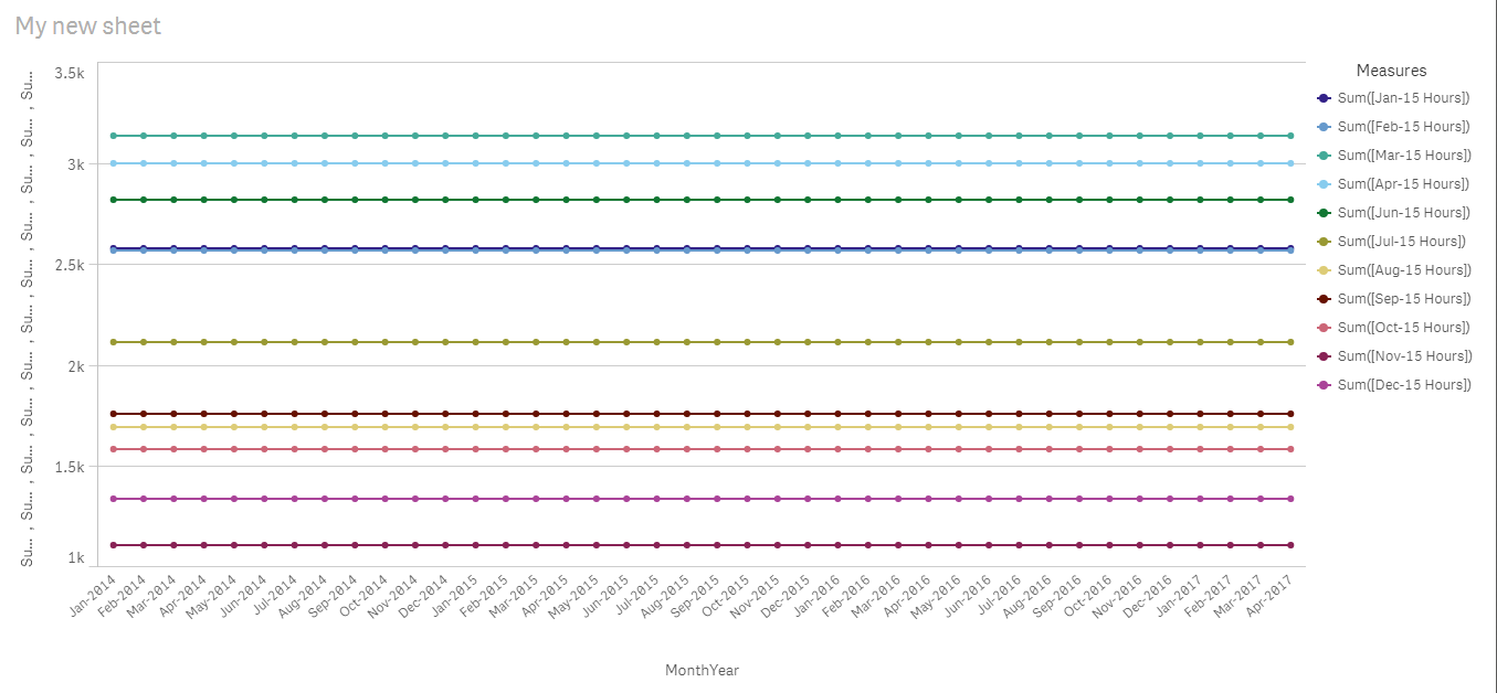
So in addition to having to put each measure on the graph it aggregates over the whole every month and year rather than for the specific month. I have used the data load editor for a cross table load with all of the '***-Hours' on a separate sheet in Excel, but the client came back and said they need to have the tables as is in the same format.
I hope I explained what the problem is succinctly enough but I'm sure I missed something. If anyone can give any advice as to how to get the data loaded better I'd really appreciate it. Or maybe there is some way to do a Cross Table load while keeping all the data on the same excel sheet?
Thanks for any help.
- Mark as New
- Bookmark
- Subscribe
- Mute
- Subscribe to RSS Feed
- Permalink
- Report Inappropriate Content
Hi,
look up CROSSTABLE load in the help section - that's exactly what you need to load your data from a single Excel Spreadsheet. You will need to parse your Month names and generate dates out of them, but that's not that hard...
cheers,
Oleg Troyansky
Learn advanced Qlik techniques in my book QlikView your Business
- Mark as New
- Bookmark
- Subscribe
- Mute
- Subscribe to RSS Feed
- Permalink
- Report Inappropriate Content
Thank you. I didn't realize you could do a cross table load from a single Excel spreadsheet.
Any hints as to what to search up for parsing month names and generating dates out of them?
- Mark as New
- Bookmark
- Subscribe
- Mute
- Subscribe to RSS Feed
- Permalink
- Report Inappropriate Content
I'd use a combination of LEFT(), DATE and DATE# - something like this (hard-coding the Year as 2016:
Date(
#Date( '2016-' & LEFT(Attribute, 6), 'YYYY-MMM-DD')
, 'MM/DD/YYYY')
Don't do it in the same CROSSTABLE load though, reload it in a subsequent Resident load and transform it there.
cheers,
Oleg Troyansky
Learn advanced Qlik techniques in my book QlikView your Business
- Mark as New
- Bookmark
- Subscribe
- Mute
- Subscribe to RSS Feed
- Permalink
- Report Inappropriate Content
Hi Oleg,
I'm sorry if this is a basic question, I'm fairly new to Qlik.
I have loaded the Crosstable with something like:
CrossTable(MonthsHours2015, [Total Hours 2015])
LOAD [Jan-15 Hours],
[Feb-15 Hours],
[Mar-15 Hours],
[Apr-15 Hours],
[May-15 Hours],
[Jun-15 Hours],
[Jul-15 Hours],
[Aug-15 Hours],
[Sep-15 Hours],
[Oct-15 Hours],
[Nov-15 Hours],
[Dec-15 Hours]
FROM [lib://Downloads/2016]
(ooxml, embedded labels, table is [Report 2016]);
I have done this separately for 2015 hours and 2016 hours. In a later load I then input the script you provided for parsing the dates.
My end goal is to have a single line graph with MONTHS on the X Axis, HOURS on the Y Axis, and two separate lines on the graph. One notating 2015 HOURS and one notating 2016 HOURS.
When I use the measures created by the Crosstable in a line graph with dimension created by the Crosstable, everything works. But the X Axis is 'Jan-15', etc for the MONTHS, so I can not lay the 2015 hours and the 2016 hours on the same graph. When I use the measures created by the Crosstable with a MONTHS dimension created by a MASTER CALENDAR, the data does not work properly and is a straight line across the whole graph.
I'm guessing my problem still has to do with Qlik not parsing the 'Jan-15 Hours' as a date. Maybe I'm not using the script you provided correctly? Would renaming the columns to anything other than 'Jan-15 Hours' be easier?
- Mark as New
- Bookmark
- Subscribe
- Mute
- Subscribe to RSS Feed
- Permalink
- Report Inappropriate Content
Hi Ryan,
it would be easier for me to troubleshoot and give you ideas if you could post your document...
With that, I have a question... Don't you want to load your hours together with the other associated Dimensions that you had before? You really should, and you simply need to specify the number of "Qualifying dimensions" in your CROSSTABLE prefix.
After the crosstable load, you should transform your month labels to the proper date format, using the formula that I suggested, and then you can generate the calendar based on these dates.
Based on your description, it looks like your data is not associated with your MASTER CALENDAR - hence the straight line across the chart. Make sure that the date field in your data is named, formatted, and built the same way as the date field in your calendar table.
- Mark as New
- Bookmark
- Subscribe
- Mute
- Subscribe to RSS Feed
- Permalink
- Report Inappropriate Content
Thank you for your response Oleg. As I mentioned before, I'm very new to Qlik and visualizations in general and I really sincerely appreciate the help you're providing. I would post my document but it has sensitive data in it. As I'm new to the Qlik community, maybe there is some standard way for uploading these types of documents that I'm unsure about.
Yes I want to load the hours together with the associated dimensions that I had before....I think. Like I said, my end goal is to have that line graph with MONTHS on X axis and HOURS on Y axis with 2 separate lines for the years. Right now my Crosstables are loading the data in a way that I can't (or I don't know how to) layer the lines on top of each other. What exactly do you mean by specifying the number of qualifying dimensions in the Crosstable prefix?
Also, could you break down a little bit more about the script your provided? I know that date#() is telling Qlik how to read the date format and date() is telling Qlik how to reformat it, but I'm unsure on exactly how the whole thing is turning 'Jan-15 Hours' into a usable date.
Thank you again for your help.