Unlock a world of possibilities! Login now and discover the exclusive benefits awaiting you.
- Qlik Community
- :
- Forums
- :
- Analytics
- :
- App Development
- :
- Different colors in Qlik Sense line chart
- Subscribe to RSS Feed
- Mark Topic as New
- Mark Topic as Read
- Float this Topic for Current User
- Bookmark
- Subscribe
- Mute
- Printer Friendly Page
- Mark as New
- Bookmark
- Subscribe
- Mute
- Subscribe to RSS Feed
- Permalink
- Report Inappropriate Content
Different colors in Qlik Sense line chart
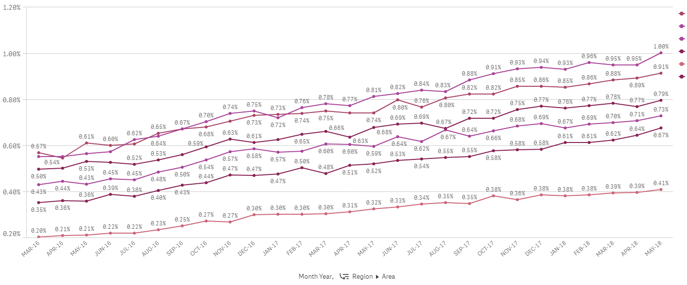
I have a line chart in Qlik Sense. The issue is that the colors that Qlik Sense has chosen are very similar. The line chart has two dimensions. The first dimension is a date. The second dimension is a drill-down with three levels: Region, Area, and Territory.
The following is what I've tried:
1. Turning off Library colors and changing to 100 colors. This helps only in some cases.
2. Setting Value Colors in the Master Dimension doesn't work on a drill-down dimension.
3. "Colors by expression" works but the legend disappears.
4. Changing to a "Combo Chart" doesn't work.
5. I'm unable to turn off the "Persistent Colors" option because it is disabled.
Ideas?
- Mark as New
- Bookmark
- Subscribe
- Mute
- Subscribe to RSS Feed
- Permalink
- Report Inappropriate Content
Set By dimension and select 12 colur pallet from the colurs tab and see
- Mark as New
- Bookmark
- Subscribe
- Mute
- Subscribe to RSS Feed
- Permalink
- Report Inappropriate Content
The above it was set to 12 colors. The issue is with the drill down. The first level with 6 regions looks fine. The colors chosen are fine. Each region has 5-6 areas. Each area has 5-6 territories. The view I show is at the second level which is the area level.
- Mark as New
- Bookmark
- Subscribe
- Mute
- Subscribe to RSS Feed
- Permalink
- Report Inappropriate Content
Hi,
Just tagging on to this topic, how do we change line colors manually? Because the same issue this topic starter has, how do we manually change a colour of a line?
In my case, the colours are very similar as well, making it hard to distinguish.
Many thanks