Unlock a world of possibilities! Login now and discover the exclusive benefits awaiting you.
- Qlik Community
- :
- Forums
- :
- Analytics
- :
- App Development
- :
- Re: Distribution plot does not show the real world
- Subscribe to RSS Feed
- Mark Topic as New
- Mark Topic as Read
- Float this Topic for Current User
- Bookmark
- Subscribe
- Mute
- Printer Friendly Page
- Mark as New
- Bookmark
- Subscribe
- Mute
- Subscribe to RSS Feed
- Permalink
- Report Inappropriate Content
Distribution plot does not show the real world
Hi all,
I am currently using Qlik Sense more often, but still trying to find out how to make the best use of it.
I need to show the distribution of values, hence I was enthusiastic to read about the distribution plot chart in QS
The distribution plot is suitable for comparing range and distribution for groups of numerical data.
| Advantages | Disadvantages |
|---|---|
| The distribution plot visualizes the distribution of data. | The distribution plot is not relevant for detailed analysis of the data as it deals with a summary of the data distribution. |
Sounds great and the first chart looks also good:
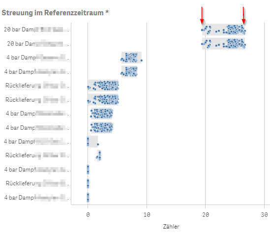
Specifically, I was looking at the top dimensional line, 20 bar something, with an interesting distribution between 19 and 27 approx which we didn't expect.
Select the dimension:
Wait!
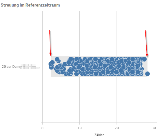
It now looks completey different, and the range is between 2  and 28 approx.
I was getting headaches trying to understand the behaviour, checking all dimensions and expressions and validating data in other charts etc. until ...
I finally noticed the foot note below the chart telling me something like 'Currently there is only a limited set of data shown'.
Well, I vaguely remember that Qlik Sense is built mobile first and this may cause Qlik to only sent a limited amount of data points to the client.
But getting serious: This is a distribution plot 'suitable for comparing range and distribution for groups of numerical data'
So to limit the amount of data sent, we need to get rid of the head and tail of the distribution curve?
I don't think so!!
At least the grey background should always show the range of possible values. And there are definitely a couple of better algorithms to shrink the amount of data points displayed, but still give an idea of the real distribution (AFAIR, the scatter chart does it much better).
As far as I see, this makes the distribution plot chart more or less useless, because it displays incorrect information (like for the range of values), if you have a lot of data points.
Any comments on how you are using this chart in a useful way? Am I missing something obvious?
Regards
Stefan
mto
Accepted Solutions
- Mark as New
- Bookmark
- Subscribe
- Mute
- Subscribe to RSS Feed
- Permalink
- Report Inappropriate Content
Hi Stefan,
We had the same issue and came across this thread. It looks like Qlik has adjusted the chart at least to accommodate your suggestion, the grey background seems to display the full range of possible values now. Working with the February 2019 release.

- Mark as New
- Bookmark
- Subscribe
- Mute
- Subscribe to RSS Feed
- Permalink
- Report Inappropriate Content
I was very excited about the Distrubution Plot, but when part of my points are not displayed, the meaning of the chart changes completely.
I've been looking for a way to override the 1,000 points limitation. I don't care that much if it takes some time for the chart to load if it means that it will be showing the real distribution. Unfortunately, I haven't found a way yet.
Did you do any progress on this?
- Mark as New
- Bookmark
- Subscribe
- Mute
- Subscribe to RSS Feed
- Permalink
- Report Inappropriate Content
Hi Morenoju,
thanks for keeping this thread alive, it seems there is not much interest in the distribution plot.
No, I haven't made any progress with this type of plot, I've used a different type of chart instead.
I haven't checked the latest release, though, in case Qlik made any changes.
I assume you were testing the latest Apr 2019 release?
Regards
Stefan
- Mark as New
- Bookmark
- Subscribe
- Mute
- Subscribe to RSS Feed
- Permalink
- Report Inappropriate Content
Thanks
- Mark as New
- Bookmark
- Subscribe
- Mute
- Subscribe to RSS Feed
- Permalink
- Report Inappropriate Content
I received the following response form Qlik Support:
"I was able to reproduce the reported issue. In my test app, the limitation for warning message "Currently showing a limited dataset" to appear is 1999.
Currently there is no documentation explaining this limitation as far as I am aware of. I have created bug QLIK-95333 for R&D to explain the behavior, and to confirm if there is any supported way to lift this limitation."
I'll let you guys know if something comes out of this.
- Mark as New
- Bookmark
- Subscribe
- Mute
- Subscribe to RSS Feed
- Permalink
- Report Inappropriate Content
Guys, bad news:
According to the latest feedback from R&D, in Distribution Plot and Box Plot, we do have a limitation of max number of data points/outliers. The limit is set to 3000 for performance reasons and unfortunately is not configurable.
I wish Qlik would let us, the users, configure the limitations on the charts. In my case, I would use 4000 points accepting some delay when loading the chart. To me, my main concern is being faithful to reality, better than load very quickly a chart with incomplete data.
But at this point, looks like the limitation is there and there are no plans to get rid of it. 😞
- Mark as New
- Bookmark
- Subscribe
- Mute
- Subscribe to RSS Feed
- Permalink
- Report Inappropriate Content
Hello,
I'm totally agree with you.
I work in the industry on big data and Qlik Sense does not display enough points in the graphs. The limitation in the scatter plot is also very low.
@Anonymous, there is no update on Qlik Sense native graph (except for the maps) since very long time. We need to display more and more data in Qlik Sense and it's currently impossible.
Please help us 🙂
Paul
- Mark as New
- Bookmark
- Subscribe
- Mute
- Subscribe to RSS Feed
- Permalink
- Report Inappropriate Content
Hi Stefan,
We had the same issue and came across this thread. It looks like Qlik has adjusted the chart at least to accommodate your suggestion, the grey background seems to display the full range of possible values now. Working with the February 2019 release.
- Mark as New
- Bookmark
- Subscribe
- Mute
- Subscribe to RSS Feed
- Permalink
- Report Inappropriate Content
Hi Vercammenqlik,
yes, it seems that Qlik has changed the distribution plot, at least to show the grey background correctly.
With the reduced data set, the dots still seem to not represent the range of distribution, but I guess that may be a bit harder to correct.
Thanks for the update, I'll mark your answer as correct (even if I better would give credit to Qlik in this cases).
Best
Stefan