Unlock a world of possibilities! Login now and discover the exclusive benefits awaiting you.
- Qlik Community
- :
- Forums
- :
- Analytics
- :
- App Development
- :
- Re: Drill Down option
- Subscribe to RSS Feed
- Mark Topic as New
- Mark Topic as Read
- Float this Topic for Current User
- Bookmark
- Subscribe
- Mute
- Printer Friendly Page
- Mark as New
- Bookmark
- Subscribe
- Mute
- Subscribe to RSS Feed
- Permalink
- Report Inappropriate Content
Drill Down option
Hi All,
I want to display all the records of a particular selection of any chart in a new sheet in a customized format (i.e. the columns chosen by me).
Drill down option is not suitable as it shows the cumulative data and does not show me the records.
For eg, i have a pie chart and if i click on a particular segment in that chart it should display all the records under that selection in a new sheet.
Would appreciate any help on this issue.
Thanks
- Mark as New
- Bookmark
- Subscribe
- Mute
- Subscribe to RSS Feed
- Permalink
- Report Inappropriate Content
Hi Manisha,
I believe out of the box new sheet is not possible in qlik sense. you may consider exploring an extension for this.
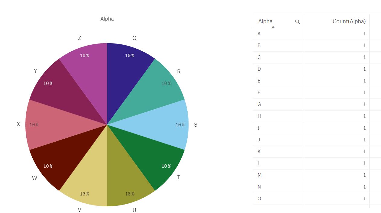
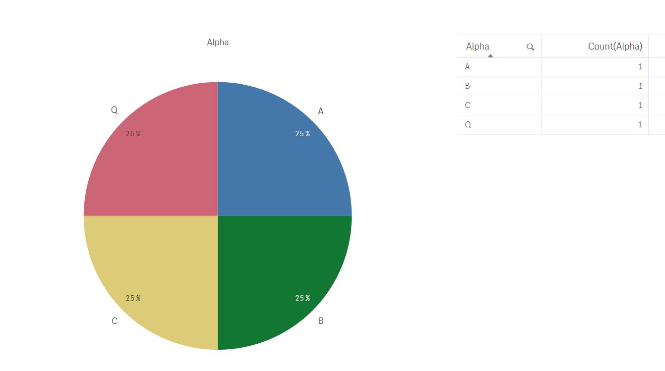
selecting one sector in a pie-chart and getting additional details is a typical standard feature. have a pie chart, a details table chart and as long as you have dimensions that are common / impacted or related - it will change based on the selections in the pie chart or vice versa.
without any selection
after making some random selections
is this something you are looking to get?
Thanks,
Ajit
- Mark as New
- Bookmark
- Subscribe
- Mute
- Subscribe to RSS Feed
- Permalink
- Report Inappropriate Content
Hi Ajit,
Thanks for your reply! your answer gives a partial solution to my needs. I have many charts in my dashboard app, and each chart corresponding to different selection criteria. So if i click on a selection in chart 1, i need the table to be of a given format, while selecting in chart 2 should give me a table in with other fields. Is there any way to do this!!
- Mark as New
- Bookmark
- Subscribe
- Mute
- Subscribe to RSS Feed
- Permalink
- Report Inappropriate Content
Hi Manisha,
I think what you are looking for is a classic case of set analysis. If I understand it right, here is what you are looking for.
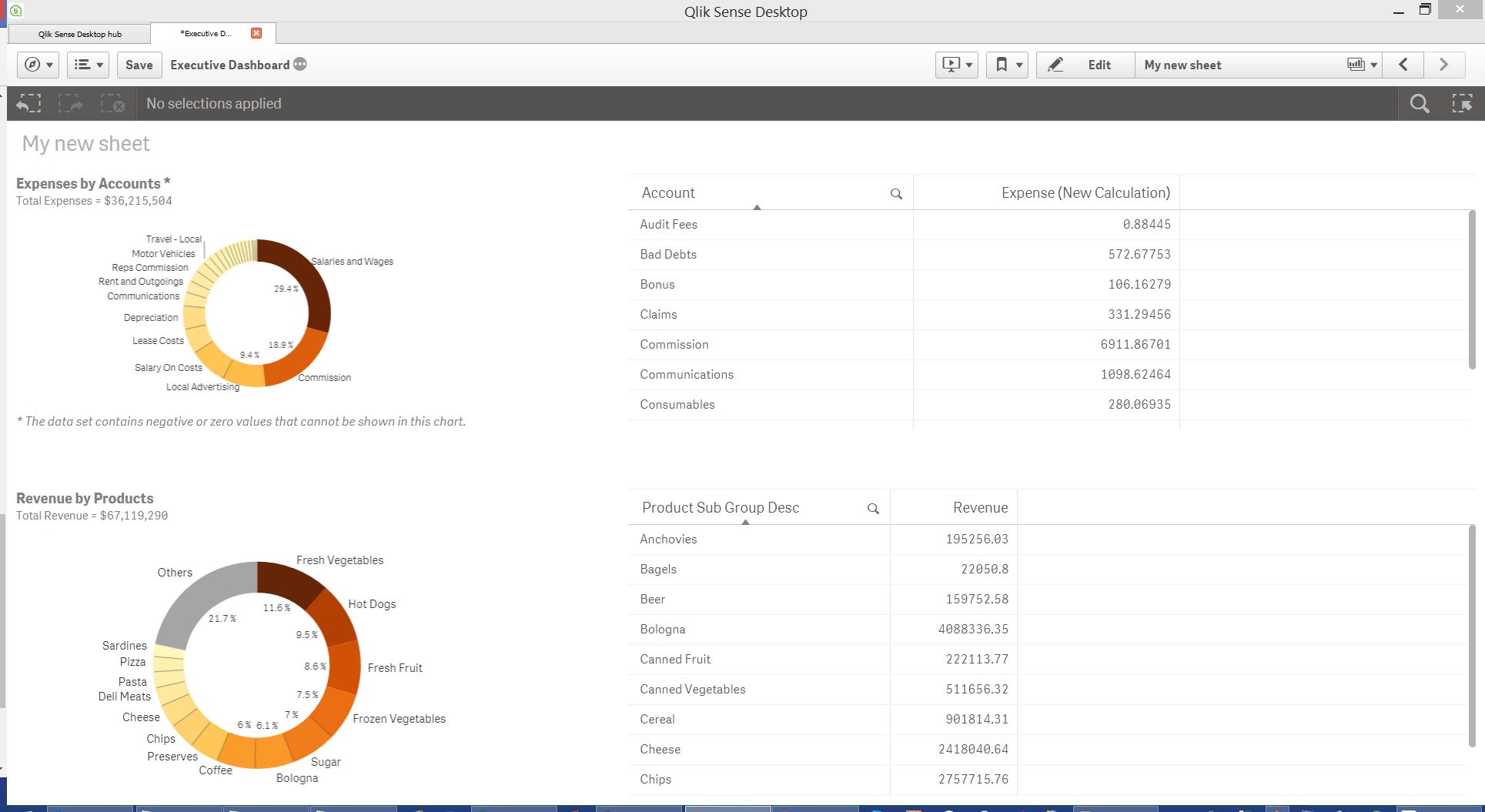 This is without any changes - two charts, two details tables with different fields showing.
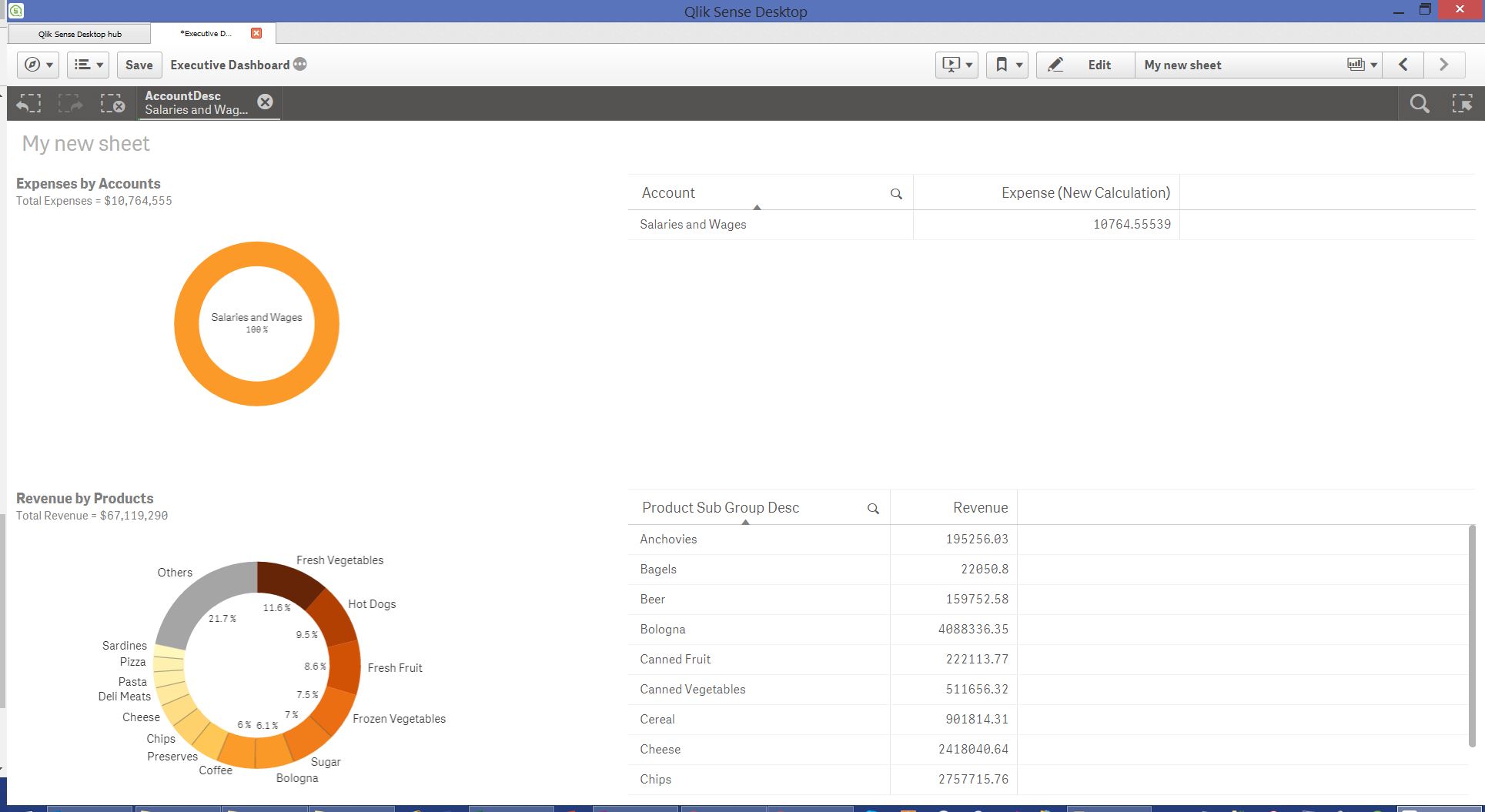 and this is when you make a selection in either of the charts.
I am using the Executive Dashboard that comes with your QS version. In most cases, you want to see an impact of your selection in one chart across other but you can stop it by using set analysis and forcing the details table to change only based on selections of certain dimensions.
If you have an example app that you can share, I can provide more specifics of how to make it work. Alternatively, mto has a great demo/discussion at this link - https://community.qlik.com/docs/DOC-8174
let me know how it goes,
thanks,
Ajit