Unlock a world of possibilities! Login now and discover the exclusive benefits awaiting you.
- Qlik Community
- :
- Forums
- :
- Analytics
- :
- App Development
- :
- Filtering data with expression editor in combo plo...
- Subscribe to RSS Feed
- Mark Topic as New
- Mark Topic as Read
- Float this Topic for Current User
- Bookmark
- Subscribe
- Mute
- Printer Friendly Page
- Mark as New
- Bookmark
- Subscribe
- Mute
- Subscribe to RSS Feed
- Permalink
- Report Inappropriate Content
Filtering data with expression editor in combo plot
Hi everyone,
quite new to Qlik Sense and I'm having troubles regarding expression editor in combo plots.
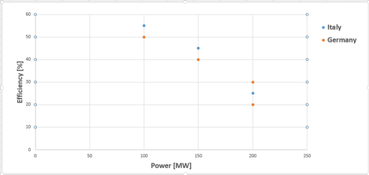
Let's say I have two different engines (for example two gas turbines, one named “Italy” and the other “Germany”) and I measured at different levels of power the efficiency of each turbine (a value regarding how much the turbine was performing well, on a scale from 0% to 100%). Now, with combo plots, I’d like to plot on the same chart (power on the X and efficiency on the Y) a comparison between the two turbines, as shown below (I used Excel to better explain the problem).
As you can see the same turbine at the same power could have different efficiencies due to errors of measure, weather etc, as it happens for "Germany" at a power of 200MW.
In Qlik Sense I thought to create this chart importing the data as shown below and then using a combo chart.
In this combo chart:
- I set dimension (X axis) equal to “Turbine Power”
- To plot Italy's efficiency values, I set as measure (Y axis) the data in the column “Efficiency” when the column “Turbine Name” is equal to “Italy”
- To plot Germany's efficiency values, I set a second measure, this time with the data in column “Efficiency” when the column “Turbine Name” is equal to “Germany”
I’m having troubles writing in the editor the functions to define these two measures, I was trying something like:
- = if(<Turbine Name>=’Italy’,<Turbine Power>,0)
And then I activated the flag to not plot null values, but this if-statement didn’t work. With the statement:
- =Avg({<Turbine Name>={‘Italy’}>}<Turbine Power>)
It did work, but since the same turbine at the same power could have different efficiency for the value of 200MW I don’t plot the right efficiency of “Germany”.
Maybe the solution it’s quite trivial but I can't find it.. can anyone help me? Thanks in advance!
NB: I have to use combo chart since the next step is to plot a third element, a continuous line pointing which is the best efficiency a turbine can achieve for each value of power from 100 to 200 MW.
- Tags:
- combo chart
- Subscribe by Topic:
-
editor
-
filtering
-
function
-
if
-
If statment
-
Logic Calculation
-
Set Analysis
Accepted Solutions
- Mark as New
- Bookmark
- Subscribe
- Mute
- Subscribe to RSS Feed
- Permalink
- Report Inappropriate Content
I've realized there is no solution to a problem like this, the architecture of Qlik itself is based to prevent that the value of a dimension (X) could have more than one value for a measure (Y).
Every time a conflict like this arises (two or more values of a measure for a value of a dimension, like Power=200 for Germany and Efficiency = (20, 30)) it's necessary to specify an aggregation function ( Avg(Efficiency)=25, Max(Efficiency)=30 etc, so from two or more values it's possible to calculate a single value for the measure).

