Unlock a world of possibilities! Login now and discover the exclusive benefits awaiting you.
- Qlik Community
- :
- Forums
- :
- Analytics
- :
- App Development
- :
- How to Color by?
- Subscribe to RSS Feed
- Mark Topic as New
- Mark Topic as Read
- Float this Topic for Current User
- Bookmark
- Subscribe
- Mute
- Printer Friendly Page
- Mark as New
- Bookmark
- Subscribe
- Mute
- Subscribe to RSS Feed
- Permalink
- Report Inappropriate Content
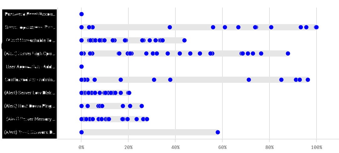
How to Color by?
Hello folks,
I have a distribution chart as follows:
- Y Axis - Activity
- X axis - Resolve %
- Points - Cusomter
I wanted to color each of the data point in 2 colors using color by expression
For each activity (Y axis point), the mean has to be found and anything greater than mean is blue and anything less than mean is red.
How can I achieve this?
My color by expression is not auto resolve. It is as follows:
SUM({<$(vDateFilter),GreaterThanToday={0}>}IncidentCount)
So the color by expression should be something like:
IF(AVG(AGGR(SUM({<$(vDateFilter),GreaterThanToday={0}>}IncidentCount),Customer))
>
SUM({<$(vDateFilter),GreaterThanToday={0}>}IncidentCount)
,RED(),BLUE())
- Tags:
- color
- Mark as New
- Bookmark
- Subscribe
- Mute
- Subscribe to RSS Feed
- Permalink
- Report Inappropriate Content
Can you attach an app to work with ?