Unlock a world of possibilities! Login now and discover the exclusive benefits awaiting you.
- Qlik Community
- :
- Forums
- :
- Analytics
- :
- App Development
- :
- Re: How to group/ #Pareto chart/ #dimension
- Subscribe to RSS Feed
- Mark Topic as New
- Mark Topic as Read
- Float this Topic for Current User
- Bookmark
- Subscribe
- Mute
- Printer Friendly Page
- Mark as New
- Bookmark
- Subscribe
- Mute
- Subscribe to RSS Feed
- Permalink
- Report Inappropriate Content
How to group/ #Pareto chart/ #dimension
Hello everybody!
First at all, thank you to everyone that help me!.
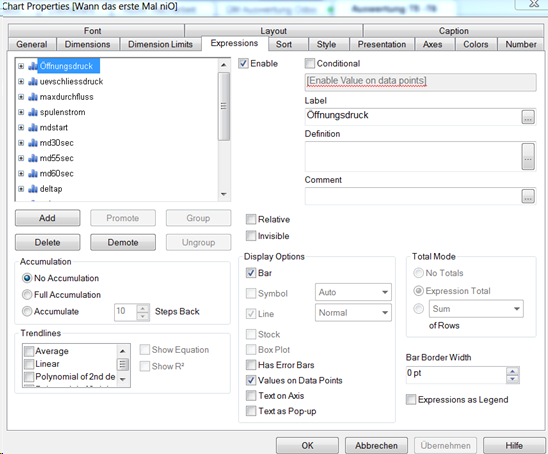
I need to make a Pareto chart, but the values that I have are millions and I don't know to manage them. I made it but in "Expressions" because I do not know to group all the tests in one "Tests_ED" by example, or whatever. That case is, when I made it by Expressions It's not avalible to create a Pareto.
The tablesource is something like that:
#/ Serienummer/ Time/ Status /Article/ Line/ Öffnungdruck/ uevschliesdruck/...
Status: Values are "IO" or "NIO"
IMPORTANT: Status shows when IO or NIO is, but I need to calculate just when NIO is.
Öffnungdruck and all tests : Values are Numbers like "16,93"
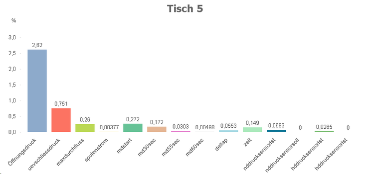
Bar chart that I get working with expressions. It is good but 'till not represent what i need
S. Each test depends on the previous.
Anyone can help me! Thanks a lot for any idea.
- Mark as New
- Bookmark
- Subscribe
- Mute
- Subscribe to RSS Feed
- Permalink
- Report Inappropriate Content
Can you post a small Qlikview document with some example data that explains what you're trying to do?
talk is cheap, supply exceeds demand
- Mark as New
- Bookmark
- Subscribe
- Mute
- Subscribe to RSS Feed
- Permalink
- Report Inappropriate Content
Sure. here its
Thanks

