Unlock a world of possibilities! Login now and discover the exclusive benefits awaiting you.
- Qlik Community
- :
- Forums
- :
- Analytics
- :
- App Development
- :
- Re: Incomplete visualization in bar chart
- Subscribe to RSS Feed
- Mark Topic as New
- Mark Topic as Read
- Float this Topic for Current User
- Bookmark
- Subscribe
- Mute
- Printer Friendly Page
- Mark as New
- Bookmark
- Subscribe
- Mute
- Subscribe to RSS Feed
- Permalink
- Report Inappropriate Content
Incomplete visualization in bar chart
Hi There Qlik Community,
I'm struggeling with an bar chart visualization in Qlik Sense.
I have a list of tasks with a start and end time. And I want to display the duration of each task in a bar chart. So I display a bar for each minute a single task is 'opened'.
Dimension: MasterTime
Meassure: =Sum(if(StartTime <= MasterTime and MasterTime <= EndTime,1,0))
This works fine. But i have an issue with the visualization:
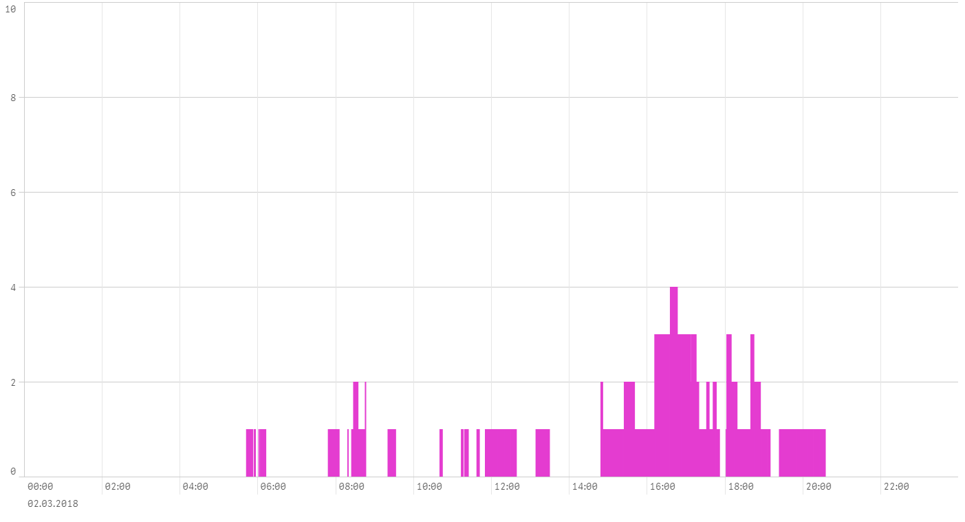
When I try to show the tasks of a whole day (whole_day.png) data is missing.
When I just display the data of one hour (one_hour.png) all tasks are shown. Especially when you have a look on the peak (for the whole day there are 5 parallel tasks and for the hour view there are 8.
And when I view the data for one unique task (one_task.png) all the data is shown too.
I suspect that there are some issues with the amount of data. But all in all for one day there are 2652 bars that should be displayed. That seems not to be too high, am I right?
Does anybody had similar problems and do you know how to solve this issue.
- Mark as New
- Bookmark
- Subscribe
- Mute
- Subscribe to RSS Feed
- Permalink
- Report Inappropriate Content
I'd try to round the MasterTime field to one minute level or even more, in order to reduce the number of bars in the chart.
Cheers,
Oleg Troyansky