Unlock a world of possibilities! Login now and discover the exclusive benefits awaiting you.
- Qlik Community
- :
- Forums
- :
- Analytics
- :
- App Development
- :
- Limit automatic filtering of data across your App
- Subscribe to RSS Feed
- Mark Topic as New
- Mark Topic as Read
- Float this Topic for Current User
- Bookmark
- Subscribe
- Mute
- Printer Friendly Page
- Mark as New
- Bookmark
- Subscribe
- Mute
- Subscribe to RSS Feed
- Permalink
- Report Inappropriate Content
Limit automatic filtering of data across your App
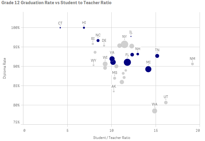
When selecting a data point in a visual in your App, all the other visualizations in your App are automatically filtered down to that data point. E.g. select 1 sales person in a table and the scatter plot that sits next to the table on your sheet and that shows all sales people also filters down to that 1 sales person = 1 point on the scatter plot.
As a result, you loose the ability to see where the selected sales person's point is on the scatter plot; aka how he/she is doing compared to the other sales people in the company.
Is there a way in Qlik Sense to not get rid of all the other sales people's points/dots on the scatter plot, but instead, highlight the selected sales person?
Accepted Solutions
- Mark as New
- Bookmark
- Subscribe
- Mute
- Subscribe to RSS Feed
- Permalink
- Report Inappropriate Content
The feature that lets you ignore or modify selections in a given visualization (actually in the measure) is "Set Analysis". You can read more about it in the Help, books, here on the forums or Qlik Continuous Classroom
You can see some examples of the type of "focus filtering" you mentioned here Focus not Filter | Qlikview Cookbook
There is a QlikView example Search Recipes | Qlikview Cookbook to accompany the article, I'm working up a Qlik Sense version.
Basically, in your scatterplot measures you would add a Set Expression that ignores any SalesRep selection. e.g.
sum({<SalesRep=>}Sales)
-Rob
- Mark as New
- Bookmark
- Subscribe
- Mute
- Subscribe to RSS Feed
- Permalink
- Report Inappropriate Content
Thanks Rob. That works, however, it would be nice if Qlik would highlight the selection. With a good amount of sales people (dots) in the scatter chart, applying set analysis keeps all the dots there but it's impossible to know which dot is the sales person you selected in the other viz..
- Mark as New
- Bookmark
- Subscribe
- Mute
- Subscribe to RSS Feed
- Permalink
- Report Inappropriate Content
You can highlight selected using the color expression. See the "Graying data" sheet in the attached example qvf.
-Rob