Unlock a world of possibilities! Login now and discover the exclusive benefits awaiting you.
- Qlik Community
- :
- Forums
- :
- Analytics
- :
- App Development
- :
- Line chart, stacked area. Empty spaces
- Subscribe to RSS Feed
- Mark Topic as New
- Mark Topic as Read
- Float this Topic for Current User
- Bookmark
- Subscribe
- Mute
- Printer Friendly Page
- Mark as New
- Bookmark
- Subscribe
- Mute
- Subscribe to RSS Feed
- Permalink
- Report Inappropriate Content
Line chart, stacked area. Empty spaces
Hi, experts!
I have an issue with a line chart. But before I'll put some sample data.
Data:
LOAD
Month(makedate(year(today()),Month)) as Month
,Type
,Value
INLINE [
Month, Type, Value
1 , Type A , 1345
1 , Type C , 32
2 , Type A , 1285
3 , Type A , 1380
4 , Type A , 1208
5 , Type A , 1790
5 , Type B , 160
5 , Type C , 160
6 , Type A , 2130
6 , Type B , 32
7 , Type A , 1786
7 , Type B , 224
7 , Type C , 102
8 , Type A , 1988
8 , Type B , 736
8 , Type C , 44
9 , Type A , 2404
9 , Type B , 64
9 , Type C , 96
9 , Type D , 128
10 , Type A , 994
10 , Type B , 192
11 , Type A , 1286
11 , Type B , 32
12 , Type A , 816
12 , Type B , 384
];
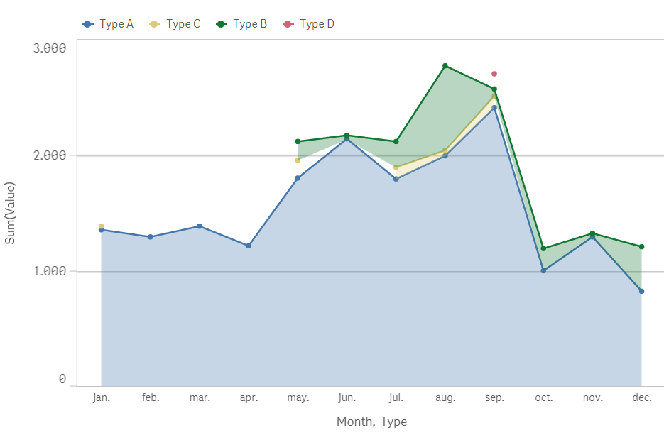
With 2 dimension (Type and Month) and a measure (sum(Value)), I get this chart (stacked area) :
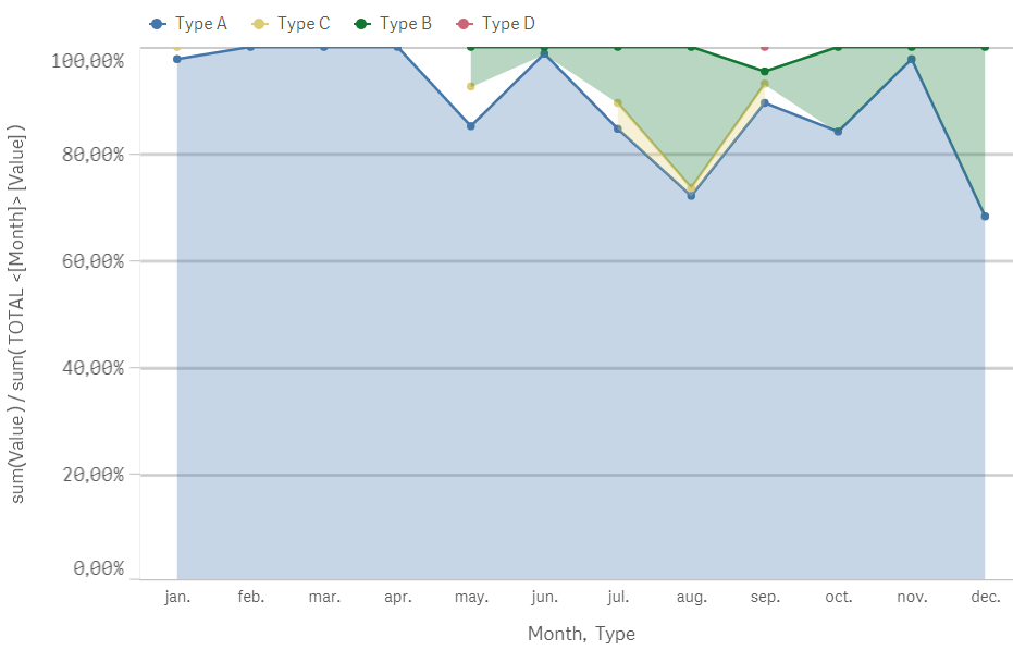
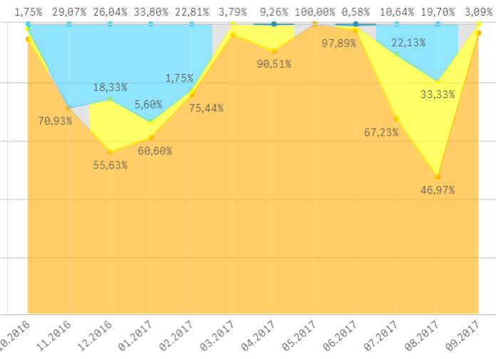
I want to show the percentage of each type for the total values of every month.
With this measure:
sum(Value ) / sum( TOTAL <Month> Value )
This is the output (formatting the measure as %)
In May, I have these values:
Type A: 84.83 (blue)
Type B: 7.58% (green)
Type C: 7.58% (yellow)
Total: 99,99%
Is there any option that there are no blank areas in the second chart?
The same thing happens in September with the Type D and in January, with Type C
Thanks in advance
PS: I'm using Qlik Sense 3.2 SR4
Accepted Solutions
- Mark as New
- Bookmark
- Subscribe
- Mute
- Subscribe to RSS Feed
- Permalink
- Report Inappropriate Content
Finally I was able to solve the problem: it was not for the formula, it was for the granularity of data.
In the script I had several conditions which reduced the volume of data.
[...] WHERE Alt (Value, 0)> 0
Removing those conditions the volume of data increased but thus gained granularity.
Thanks aqu for his help.
- Mark as New
- Bookmark
- Subscribe
- Mute
- Subscribe to RSS Feed
- Permalink
- Report Inappropriate Content
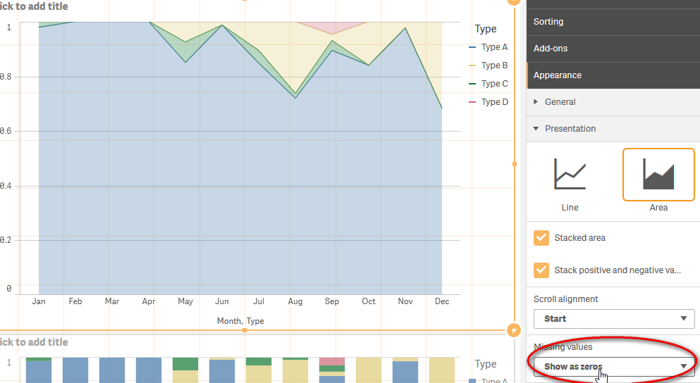
Change Missing values under Appearance/Presentation/Missing Values to "Show as Zeros" and You will get this chart;
- Mark as New
- Bookmark
- Subscribe
- Mute
- Subscribe to RSS Feed
- Permalink
- Report Inappropriate Content
Thanks for the answer, I hadn't seen that option.
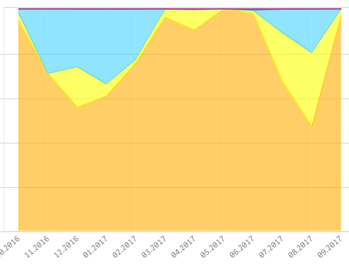
I've selected that option and I get this output with real values:
It looks better but I'd like to fill al the empty spaces.
Thanks again
- Mark as New
- Bookmark
- Subscribe
- Mute
- Subscribe to RSS Feed
- Permalink
- Report Inappropriate Content
Finally I was able to solve the problem: it was not for the formula, it was for the granularity of data.
In the script I had several conditions which reduced the volume of data.
[...] WHERE Alt (Value, 0)> 0
Removing those conditions the volume of data increased but thus gained granularity.
Thanks aqu for his help.
- Mark as New
- Bookmark
- Subscribe
- Mute
- Subscribe to RSS Feed
- Permalink
- Report Inappropriate Content
Hi.
I am new in Qlik Sense "World" and would you like to understand how to do this type of stacked area chart? See the attached image with the final goal (made in excel - sorry).
Thanks for all.
