Unlock a world of possibilities! Login now and discover the exclusive benefits awaiting you.
- Qlik Community
- :
- Forums
- :
- Analytics
- :
- App Development
- :
- Line chart with last 52 weeks, Compare with last y...
- Subscribe to RSS Feed
- Mark Topic as New
- Mark Topic as Read
- Float this Topic for Current User
- Bookmark
- Subscribe
- Mute
- Printer Friendly Page
- Mark as New
- Bookmark
- Subscribe
- Mute
- Subscribe to RSS Feed
- Permalink
- Report Inappropriate Content
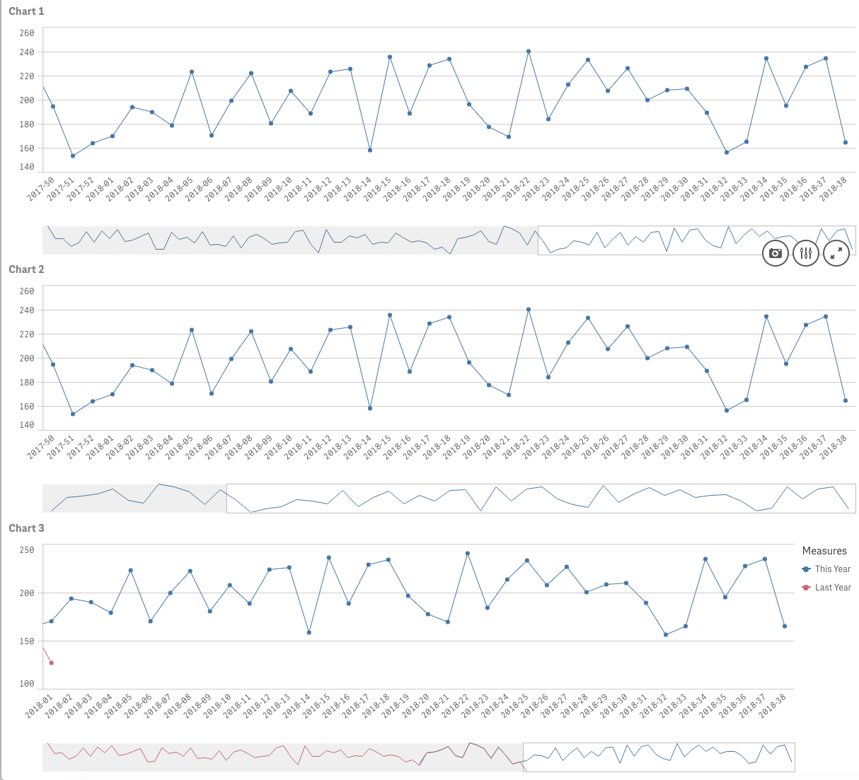
Line chart with last 52 weeks, Compare with last year
Hi guys,
I have attached a test app, which shows volume distribution for the last two years (Chart 1).
I am attempting in Chart 2 and 3 to show volume distribution for the last 52 weeks with two lines: this year and last year.
This year = last 52 weeks
Last year = The same 52 weeks, the year before.
Measures:
This year
Avg({$<Date={">=$(=Date(Today()-365, 'DD/MM/YYYY'))"}>}Volume)
Last year
???
So, the last data point in the chart is current week vs same week last year, and the entire charts contains a total of 52 data points (one for each week)
How do I do that?
Best Regards,
Rasmus
- Tags:
- year to year
Accepted Solutions
- Mark as New
- Bookmark
- Subscribe
- Mute
- Subscribe to RSS Feed
- Permalink
- Report Inappropriate Content
use week(yourDateField) as Dimension.
otherwise you're showing 2 Measures that will only give results for the correcponding year
- Mark as New
- Bookmark
- Subscribe
- Mute
- Subscribe to RSS Feed
- Permalink
- Report Inappropriate Content
use week(yourDateField) as Dimension.
otherwise you're showing 2 Measures that will only give results for the correcponding year
- Mark as New
- Bookmark
- Subscribe
- Mute
- Subscribe to RSS Feed
- Permalink
- Report Inappropriate Content
Thanks for your help.
I actually already tried this, but wanted the current week to be the last point of the chart. If we only use week(date) then week 52 will always be the last point on the chart.
But I managed to fix it with this addition to my calendar:
Dual(Replace(WeekName($1), '/', '-'), Mod(52-(Week(Today()) - Week($1) + 1), 52)) AS [WeekL52] Tagged ('$axis', '$weekl52')
So, this will shift the weeks, so that current week becomes "week 52" and thereby the last point on the chart.