Unlock a world of possibilities! Login now and discover the exclusive benefits awaiting you.
- Qlik Community
- :
- Forums
- :
- Analytics
- :
- App Development
- :
- Mark Multiple Max values in Bar chart of each mont...
- Subscribe to RSS Feed
- Mark Topic as New
- Mark Topic as Read
- Float this Topic for Current User
- Bookmark
- Subscribe
- Mute
- Printer Friendly Page
- Mark as New
- Bookmark
- Subscribe
- Mute
- Subscribe to RSS Feed
- Permalink
- Report Inappropriate Content
Mark Multiple Max values in Bar chart of each month
Good day
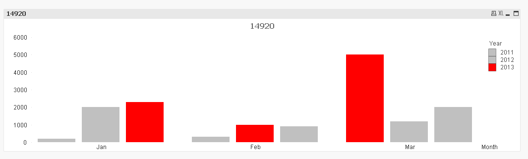
Bar chart
Dimension 1 = Month
Dimension 2 = Year
Expression = Sum( Sales)
There are 3 years , so for Jan there will be 3 groups Jan value 200 , 300 , 500 for 2011 , 2012 , 2014 respectively in a grouped bar chart
For feb , 3 bars of value 2000 , 1000 , 1200 , for 2011 , 2012 , 2013 respectively
I want to change the background color for the maximum value of each month ,
eg Highlight Maximum the bar with maximum value of the various Januarys
Highlight the bar with Maximum value of the 3 bars for the various Febuarys
and so forth for all months
Please assist
Accepted Solutions
- Mark as New
- Bookmark
- Subscribe
- Mute
- Subscribe to RSS Feed
- Permalink
- Report Inappropriate Content
- Mark as New
- Bookmark
- Subscribe
- Mute
- Subscribe to RSS Feed
- Permalink
- Report Inappropriate Content
Like this?
- Mark as New
- Bookmark
- Subscribe
- Mute
- Subscribe to RSS Feed
- Permalink
- Report Inappropriate Content
Perhaps something like this: if(sum(Sales)=max(total <Month> aggr(sum(Sales),Month,Year)),color(1),color(3))
talk is cheap, supply exceeds demand
- Mark as New
- Bookmark
- Subscribe
- Mute
- Subscribe to RSS Feed
- Permalink
- Report Inappropriate Content
Thanks it works
Th part i was missing was month tag after the total TOTAL <Month> , silly me