Unlock a world of possibilities! Login now and discover the exclusive benefits awaiting you.
- Qlik Community
- :
- Forums
- :
- Analytics
- :
- App Development
- :
- Numbers Not Adding Up on Bar Graph
- Subscribe to RSS Feed
- Mark Topic as New
- Mark Topic as Read
- Float this Topic for Current User
- Bookmark
- Subscribe
- Mute
- Printer Friendly Page
- Mark as New
- Bookmark
- Subscribe
- Mute
- Subscribe to RSS Feed
- Permalink
- Report Inappropriate Content
Numbers Not Adding Up on Bar Graph
Hello All,
Yet again, I have run into a situation that simply does not make sense to me. Let's see if I can make this easy to understand...
I want to measure volume for specific periods of time. I have a bar chart set up with [Date.autoCalendar.Date] as the dimension and Count(If([Date] > 0, [Key])) as the measure. Here's an example of what happens:
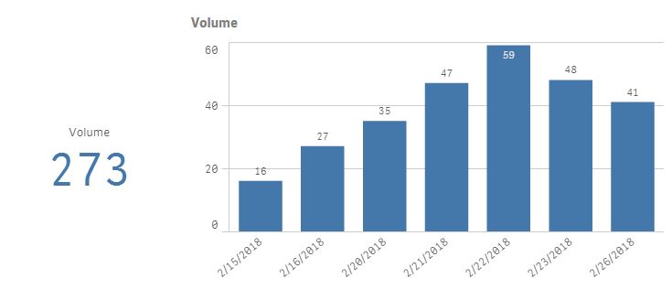
The Volume KPI has the correct number for volume, and has the same formula as the measure in the graph: Count(If([Date]>0, [Key])). The volume during this 7-day period is 273, but the graph shows 184, nearly 100 less than what it should be.
The issue is further complicated when I want to see volume by employee. I added [Employee] as a second dimension in the graph above and got this:
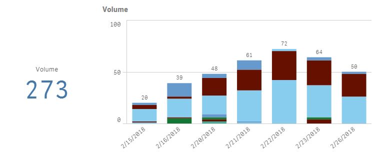
The volume as shown by the graph now adds up to 354.
So now I'm lost.
My only thought is that is must have to do with the way my data is set up. I started with one table and created 3 cross tables from it so that different fields could be bound together with a key. Still, I've used similar set-ups with other apps and never run into this problem.
All ideas are welcome. Thanks ahead of time.
-Aaron
- « Previous Replies
-
- 1
- 2
- Next Replies »
- Mark as New
- Bookmark
- Subscribe
- Mute
- Subscribe to RSS Feed
- Permalink
- Report Inappropriate Content
That was my bad, forgot ending bracket.
But it confirms that there is nothing wrong with the chart. The KPI consider the whole data set but chart aggregates based on what dimensions we provide. When we provided same dimensions to KPI it resulted in same value.
I think you got duplicate 'key' field values per employee so that could be the reason your numbers increased but I need to see the qvf yet to verify.
- Mark as New
- Bookmark
- Subscribe
- Mute
- Subscribe to RSS Feed
- Permalink
- Report Inappropriate Content
Now I understand what you are saying, see the attached qvf, I created straight table at the bottom, since you understand you data, you may find some clue by seeing that table for single day.
I am still trying to understand that in straight table when I keep the default 'Auto' total mode in measure, it matches with your KPI but when I change it to 'Sum', it totals the individual values. So the Bar graph total is doing the similar kind of sum what straight table 'Sum' mode is doing. So if we can understand what is difference between Auto and Sum options of total mode, I think we will get our answer. Give me some time to figure this out
or may be some other expert can jump in to help.
- Mark as New
- Bookmark
- Subscribe
- Mute
- Subscribe to RSS Feed
- Permalink
- Report Inappropriate Content
I looked at the straight table totals and saw what you were talking about. Because of that difference, I wanted to go back to the data to see which was correct. The "Auto" total is the correct one.
That also means that the graph is wrong. For example, looking at 2/21, 2/22, and 2/23 for Category: BAN, the graph shows a total of 29, where the correct total is 27. Looking at the data, Employee: Nan should only be associated with one date, not three.
Again, I'm not sure, but I wonder if the data is being distorted because of the 3 cross tables. Did you take a look at the script load editor?
- Mark as New
- Bookmark
- Subscribe
- Mute
- Subscribe to RSS Feed
- Permalink
- Report Inappropriate Content
I figured it out. Not all combinations of [Event]&[ID-Code] were unique, so there was some overlap that caused the totals to be messed up. To fix this, I threw in a [Row] field with just the row number in it, then made this part of the key: [Event]&[ID-Code]&[Row] AS [Key].
Everything else fell into place.
Thanks a ton for the help!
- « Previous Replies
-
- 1
- 2
- Next Replies »