Unlock a world of possibilities! Login now and discover the exclusive benefits awaiting you.
- Qlik Community
- :
- Forums
- :
- Analytics
- :
- App Development
- :
- Plot A Graph
- Subscribe to RSS Feed
- Mark Topic as New
- Mark Topic as Read
- Float this Topic for Current User
- Bookmark
- Subscribe
- Mute
- Printer Friendly Page
- Mark as New
- Bookmark
- Subscribe
- Mute
- Subscribe to RSS Feed
- Permalink
- Report Inappropriate Content
Plot A Graph
Hi Team ,
Below is my requirement:
I have a field called "Parameter" and each parameter has a numeric value associated with it which is coming from another column "Performance".
I want user should be to select 2 parameter : Say we have 2 filter - 1. Select Parameter A 2. Select Parameter B
Once the Parameter is Selected, i want a graph to be plotted as below:
Parameter A on x - Axis
Parameter B on y- Axis
and the intersecting Performance Value of "Parameter A" and "Parameter B" should be plotted.
Please find attached example.
Help me with anyithing possible on this
Thanks,
Monu
- Mark as New
- Bookmark
- Subscribe
- Mute
- Subscribe to RSS Feed
- Permalink
- Report Inappropriate Content
You may do something like this -
1. Create island table 1 having just parameter field, rename it to ParameterA.
2. Create island table 2 having just parameter field, rename it to ParameterB.
Use filters in UI for these fields to select the Parameter A and Parameter B, use scatter plot to plot the values.
3. In scatter plot choose any associated dimension with the fact table parameter values as a chart dimension.
4. Measure1 - Sum({<Parameterfieldoffacttable={$(=chr(39)&ParameterA & chr(39))}PerformanceField)
5.Measure2- Sum({<Parameterfieldoffacttable={$(=chr(39)&ParameterB & chr(39))}PerformanceField)
Thanks,
- Mark as New
- Bookmark
- Subscribe
- Mute
- Subscribe to RSS Feed
- Permalink
- Report Inappropriate Content
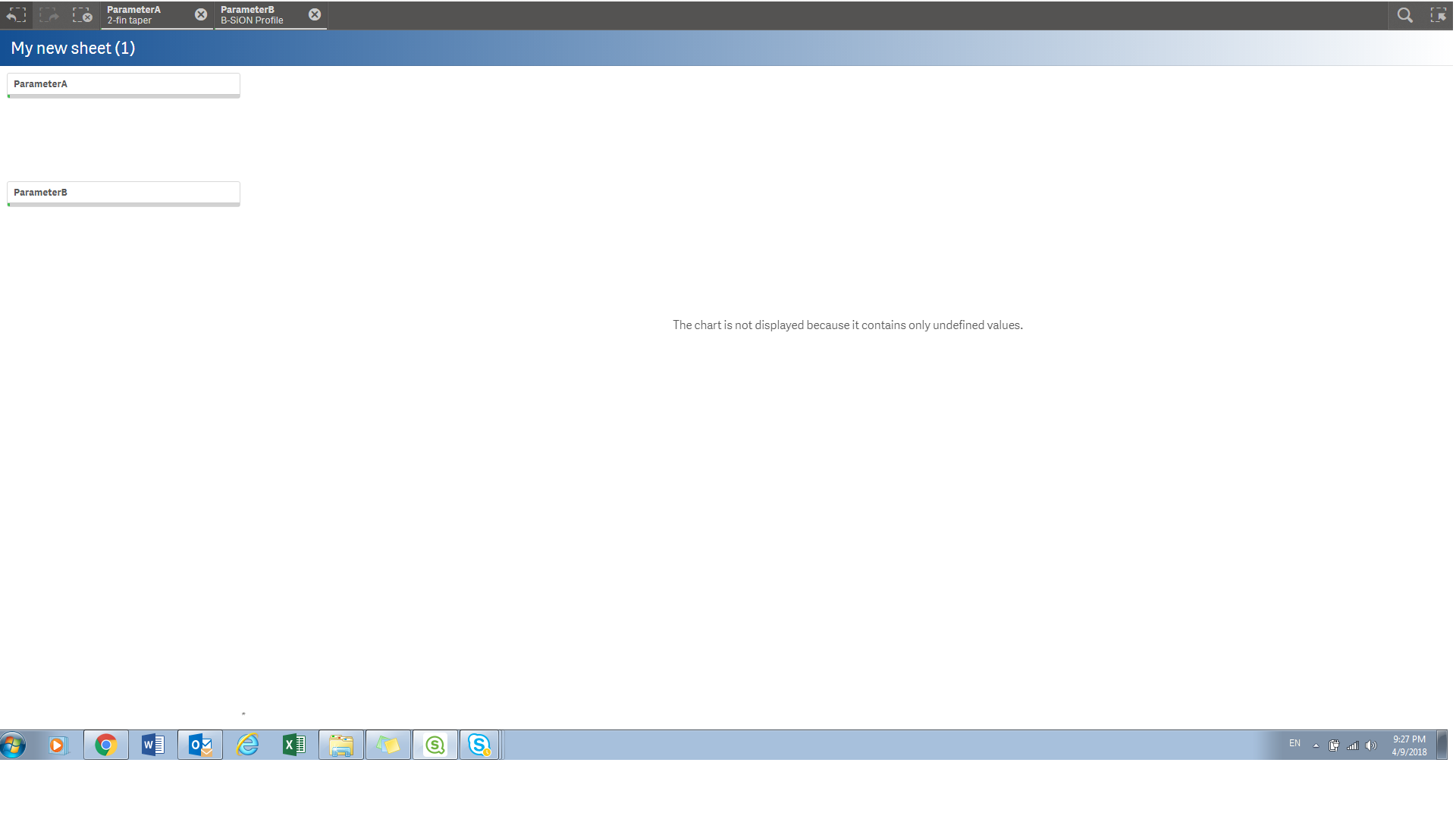
Hi Digvijay,
I tried the above solution you gave. I am not really sure what should i be using for dimension in Scatter Plot.
I am currently using "Parmeter" field from the fact table.
It says: "The chart is not displayed because it contains only unidentified values".
Please find the screen shot attched.
Thanks,
Monu
- Mark as New
- Bookmark
- Subscribe
- Mute
- Subscribe to RSS Feed
- Permalink
- Report Inappropriate Content
You can use any dimension linked to your fact table, pl share the actual measures you have used in the chart.
- Mark as New
- Bookmark
- Subscribe
- Mute
- Subscribe to RSS Feed
- Permalink
- Report Inappropriate Content
Thanks you Digvijay!!
The above Solution works.