Unlock a world of possibilities! Login now and discover the exclusive benefits awaiting you.
- Qlik Community
- :
- Forums
- :
- Analytics
- :
- App Development
- :
- Qlik Sense - Bar Chart X-axis range - white space
- Subscribe to RSS Feed
- Mark Topic as New
- Mark Topic as Read
- Float this Topic for Current User
- Bookmark
- Subscribe
- Mute
- Printer Friendly Page
- Mark as New
- Bookmark
- Subscribe
- Mute
- Subscribe to RSS Feed
- Permalink
- Report Inappropriate Content
Qlik Sense - Bar Chart X-axis range - white space
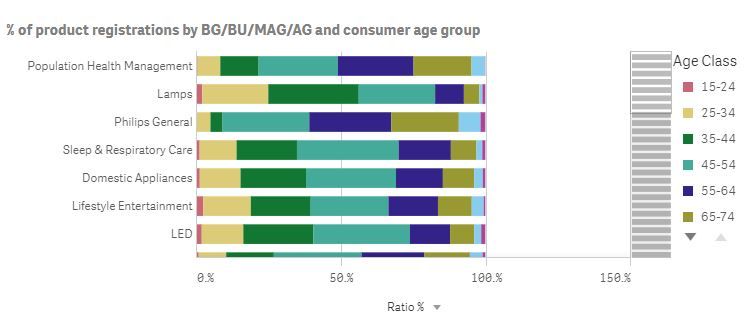
I totally not understand why Sense sometimes, not always, shows white space in a bar chart when there is no data for it.
It looks quite user unfriendly, what is the reason behind it and how can it be solved?
In the below bar chart the maximum value for each bar is 100%, still Sense shows a range till 150%.
I know i can solve this with setting a maximum range, however, that conflicts when you want to toggle between various measures.
How to deal with this?
- Mark as New
- Bookmark
- Subscribe
- Mute
- Subscribe to RSS Feed
- Permalink
- Report Inappropriate Content
The values add up to 100%. To make sure this can be displayed properly the axis is expanded to 1 unit of scale beyond that maximum unless you manually specify another maximum. That's why the axis ends at 150%.
Perhaps you can change the scale setting from Medium (or Wide) to Narrow.
You can use an expression for the maximum setting of the scale. If you change from alternative measures to an inline table with measure names from which the user selects the measure then you could use the expression for the maximum setting to calculate a maximum value based on the measure the user selected.
talk is cheap, supply exceeds demand
