Unlock a world of possibilities! Login now and discover the exclusive benefits awaiting you.
- Qlik Community
- :
- Forums
- :
- Analytics
- :
- App Development
- :
- Qlik Sense Distribution Plot - question about colo...
- Subscribe to RSS Feed
- Mark Topic as New
- Mark Topic as Read
- Float this Topic for Current User
- Bookmark
- Subscribe
- Mute
- Printer Friendly Page
- Mark as New
- Bookmark
- Subscribe
- Mute
- Subscribe to RSS Feed
- Permalink
- Report Inappropriate Content
Qlik Sense Distribution Plot - question about colours
Hi All,
I really want to use a distribution plot to show a timeline view of some actions, many of which occur on the same date.
I'm using a drill down dimension (3 tiers) so that I can get a high level view of targets in that section, and then drill down to the actual action detail.
Against each item I have a RAG identifier (not complex ... literally Red, Amber, Green, Blue - for complete).
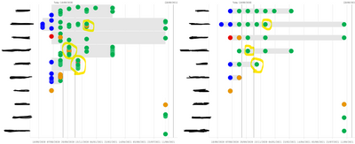
One the LHS I've switched on jitter points and here you can see where we have multiple actions occuring on the same date. On the RHS in this image is the chart without jitter points tuned on (I really don't like how jitter points looks for this use case, so really really don't want to use it). Now, my issue is that in the RHS example, I want to be able to see the highest risk point colour, so if anything in that mini stack is red, I want to see that, then amber etc. But I cannot figure out how to make that happen. At the moment I use a colour field associated with the RAG value, so my expression is simply =RAG_Colour. I've tried MinString(RAG_Colour) and MaxString(RAG_Colour), I've also tried using a match statement (If(WildMatch(ConCat(RAG,';'),'*Red*'),Red())) but nothing seems to work. I've even tried with some sort order changes, but nothing seems to work.
Can anyone suggest a way to make this work? At the moment is it misleading, so I'm going to have to remove all colour, which in my view makes it a less informative visual.
