Unlock a world of possibilities! Login now and discover the exclusive benefits awaiting you.
- Qlik Community
- :
- Forums
- :
- Analytics
- :
- App Development
- :
- Re: Responsive QlikSense Bar Chart
- Subscribe to RSS Feed
- Mark Topic as New
- Mark Topic as Read
- Float this Topic for Current User
- Bookmark
- Subscribe
- Mute
- Printer Friendly Page
- Mark as New
- Bookmark
- Subscribe
- Mute
- Subscribe to RSS Feed
- Permalink
- Report Inappropriate Content
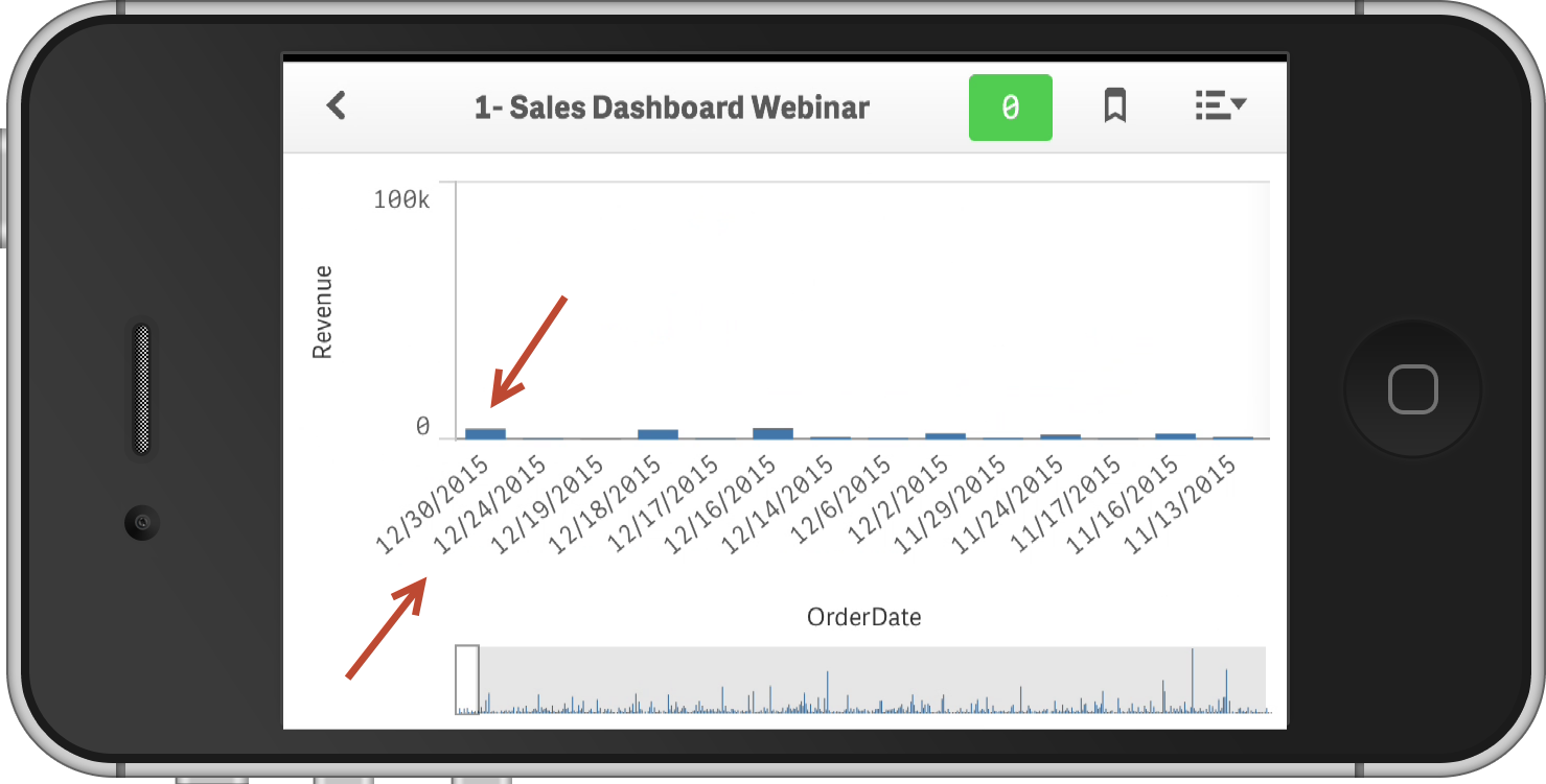
Responsive QlikSense Bar Chart
I have QlikSense Bar Chart that shows a measure bar for each of last 15 days.
When the display shrunk down to iPhone size, it responsively rejigs itself and only shows some of the bars with a slider underneath to scroll left and right across he bars.
This all fine, but is it possible for the default of the bars to be shown to be the right hand bars and not the left hand bars, as it would be more sensible for the default to always how the most recent days ?
- Mark as New
- Bookmark
- Subscribe
- Mute
- Subscribe to RSS Feed
- Permalink
- Report Inappropriate Content
Hi Bill,
Sorting comes to mind here. Can you sort by date - change to descending?
Like this:

Please mark the appropriate replies as CORRECT / HELPFUL so our team and other members know that your question(s) has been answered to your satisfaction.
Regards,
Mike Tarallo
Qlik
Mike Tarallo
Qlik
- Mark as New
- Bookmark
- Subscribe
- Mute
- Subscribe to RSS Feed
- Permalink
- Report Inappropriate Content
I have tried sorting the dates descending, but that just does not seem natural as dates are elsewhere invariably displayed starting on the left and going to the right.
Also every other graph we have against dates goes left to right and I doubt the uses will ever accept it.
What I have done is reduce the number of date bars to 7 so it all fits neatly on an iPhone without the slider bar being needed. This works fine for the iPhone but somewhat negates the multi device responsive design ethos.
- Mark as New
- Bookmark
- Subscribe
- Mute
- Subscribe to RSS Feed
- Permalink
- Report Inappropriate Content
Could you use the footnote or subtitle of the chart to provide the users some additional context as to how to use the chart to negate this issue?
e.g. Sorted by most recent orders first.
- Mark as New
- Bookmark
- Subscribe
- Mute
- Subscribe to RSS Feed
- Permalink
- Report Inappropriate Content
Could have an explanatory footnote, but I doubt the users will ever accept it
- Mark as New
- Bookmark
- Subscribe
- Mute
- Subscribe to RSS Feed
- Permalink
- Report Inappropriate Content
When responsive frameworks like bootstrap first came out I always thought there was a gap in functionality in regards the data itself.
Just because you can alter the control to fit better on the screen does not mean you will have a useable report or chart as the data itself becomes unreadable/unusable.
Perhaps a way to break out the charts dimensions, measures, presentation made visible on a users view port might be an interesting feature to investigate.
E.g. design a mobile version data set, tablet version dataset and a PC version data set. Or have the complete set with option to hide on certain viewports.