Unlock a world of possibilities! Login now and discover the exclusive benefits awaiting you.
- Qlik Community
- :
- Forums
- :
- Analytics
- :
- App Development
- :
- Stacked Bar Chart - Segment Colors
- Subscribe to RSS Feed
- Mark Topic as New
- Mark Topic as Read
- Float this Topic for Current User
- Bookmark
- Subscribe
- Mute
- Printer Friendly Page
- Mark as New
- Bookmark
- Subscribe
- Mute
- Subscribe to RSS Feed
- Permalink
- Report Inappropriate Content
Stacked Bar Chart - Segment Colors
In QlikView, when using a stacked bar chart and using multiple expressions for each segment/stack you could control the individual color of the segment/stack.
It looks like you might be able to do the same in QlikSense but it would have to be done via one formula for all charts. What is the proper formula we should be using in this one formula field to control the colors for each individual segment/stack that would be the most efficient with large data sets?
- Mark as New
- Bookmark
- Subscribe
- Mute
- Subscribe to RSS Feed
- Permalink
- Report Inappropriate Content
Additionally, when selecting the color by expression option the show legend option disables.
How would I make a stacked bar chart with 3 expressions (1) Good, (2) Marginal, (3) Bad for example so that Good would be in Green, Marginal in Yellow and Bad in Red and have a legend indicating that.
Please note the expressions and colors indicate are purely for discussion and problem clarification. We do understand colors and color blindness impact.
- Mark as New
- Bookmark
- Subscribe
- Mute
- Subscribe to RSS Feed
- Permalink
- Report Inappropriate Content
Is the only way to achieve this by adding an extension? Could this be added as a feature request?
- Mark as New
- Bookmark
- Subscribe
- Mute
- Subscribe to RSS Feed
- Permalink
- Report Inappropriate Content
Have you tried to add a Gauge and go to Appearance, then Presentation and check the Use Segments?
Here you can select the segments and the color associated to it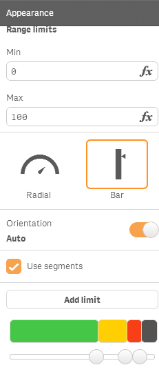
- Mark as New
- Bookmark
- Subscribe
- Mute
- Subscribe to RSS Feed
- Permalink
- Report Inappropriate Content
I don't believe a Gauge will work. As I mentioned we need a bar chart. We have to be able to display dimension(s) with several thousand values.
Does anyone know how to obtain the native javascript utilized for the bar chart and for the guage, so we could have someone look at creating an extension with the functionality? Or are we able to inherit the existing bar chart and extend its paint functionality to incorporate the necessary color control?
- Mark as New
- Bookmark
- Subscribe
- Mute
- Subscribe to RSS Feed
- Permalink
- Report Inappropriate Content
- Mark as New
- Bookmark
- Subscribe
- Mute
- Subscribe to RSS Feed
- Permalink
- Report Inappropriate Content
Hi Brain,
You can colour a stacked bar chart in the following way. Take this as an Example.
Use these expressions:
Dimension 1: year-month
Dimension 2: valuelist( 'achieved', 'justmissed' and 'missed')
Measure : if(valuelist( 'achieved', 'justmissed' and 'missed') = 'achived',<expression1>,
if(valuelist( 'achieved', 'justmissed' and 'missed') = 'justmissed',<expression2>,
if(valuelist( 'achieved', 'justmissed' and 'missed') = 'missed',<expression3> )))
Colour Expression:
if(valuelist( 'achieved', 'justmissed' and 'missed') = 'achived',lightgreen(),
if(valuelist( 'achieved', 'justmissed' and 'missed') = 'justmissed',yellow(),
if(valuelist( 'achieved', 'justmissed' and 'missed') = 'missed',lightred() )))
Check this for a QVF sample.