Unlock a world of possibilities! Login now and discover the exclusive benefits awaiting you.
- Qlik Community
- :
- Forums
- :
- Analytics
- :
- App Development
- :
- Re: 'Table' design - visualization advice needed
- Subscribe to RSS Feed
- Mark Topic as New
- Mark Topic as Read
- Float this Topic for Current User
- Bookmark
- Subscribe
- Mute
- Printer Friendly Page
- Mark as New
- Bookmark
- Subscribe
- Mute
- Subscribe to RSS Feed
- Permalink
- Report Inappropriate Content
'Table' design - visualization advice needed
Currently i'm migrating a Tableau dashboard to Sense and sometimes I find it hard to come up with ideas to design functionalities in a similar way as was done in Tableau.
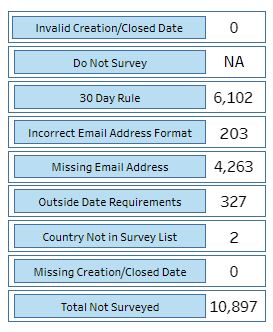
Below is an example, Left is an expression, right is the value. I can put them in a Pivot Table, but then the design will never be as good as it was in Tableau. E.g. a header is not needed and I don't think i can color the Label.
Any design suggestions? 
- Mark as New
- Bookmark
- Subscribe
- Mute
- Subscribe to RSS Feed
- Permalink
- Report Inappropriate Content
Hi
To get similar design you can use extension available in qlik branch site named KPI object
type in the search area KPI to get all the extension
For example
- Mark as New
- Bookmark
- Subscribe
- Mute
- Subscribe to RSS Feed
- Permalink
- Report Inappropriate Content
Thanks, i checked them, however, those extensions don't provide an option to position the label before the expression.
- Mark as New
- Bookmark
- Subscribe
- Mute
- Subscribe to RSS Feed
- Permalink
- Report Inappropriate Content
Hi
What about the native Text Object in qlik Sense ?
- Mark as New
- Bookmark
- Subscribe
- Mute
- Subscribe to RSS Feed
- Permalink
- Report Inappropriate Content
I tried, I doesn't outline all the values under each other.