Unlock a world of possibilities! Login now and discover the exclusive benefits awaiting you.
- Qlik Community
- :
- Forums
- :
- Analytics
- :
- App Development
- :
- Time series chart for monthly time line comparison
- Subscribe to RSS Feed
- Mark Topic as New
- Mark Topic as Read
- Float this Topic for Current User
- Bookmark
- Subscribe
- Mute
- Printer Friendly Page
- Mark as New
- Bookmark
- Subscribe
- Mute
- Subscribe to RSS Feed
- Permalink
- Report Inappropriate Content
Time series chart for monthly time line comparison
I need to plot number of project started and, project completed comparison in a line chart for every month [And may be if possible number of open project for that month].
Below is the sample data.
| Project Id | Project Name | Start date | End date |
| 1 | Project 1 | 3/5/2017 | 4/5/2017 |
| 2 | Project 2 | 4/2/2017 | 4/25/2017 |
| 3 | Project 3 | 4/22/2017 | 5/15/2017 |
| 4 | Project 4 | 5/2/2017 | 5/21/2017 |
| 5 | Project 5 | 5/20/2017 | 5/30/2017 |
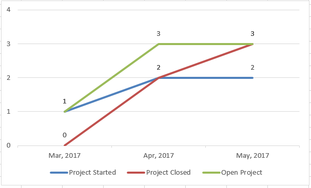
So number of project started in month of march were 1 and in month of April were 2 and month of May were 2.
Similarly number of project completed in month of march were 0 and in month of April were 2 and month of May were 3.
And optionally, if it can be plot in same graph, the number of open projects for that month in the above example in month of march there was 1 open project (1), in month of Apr there were 3 open project (1,2,3) and in month of may 3 open projects (3,4,5)
Expected graph.
- Mark as New
- Bookmark
- Subscribe
- Mute
- Subscribe to RSS Feed
- Permalink
- Report Inappropriate Content
you should ideally go for Gantt Chart refer Henric link
Vikas
If the issue is solved please mark the answer with Accept as Solution & like it.
If you want to go quickly, go alone. If you want to go far, go together.
- Mark as New
- Bookmark
- Subscribe
- Mute
- Subscribe to RSS Feed
- Permalink
- Report Inappropriate Content
Hi Vikas thanks for the suggestion but here i want to display the stats and not the project hierarchy or timeline.
- Mark as New
- Bookmark
- Subscribe
- Mute
- Subscribe to RSS Feed
- Permalink
- Report Inappropriate Content
you can show chart as well and fast change will show stats for the same.
Vikas
If the issue is solved please mark the answer with Accept as Solution & like it.
If you want to go quickly, go alone. If you want to go far, go together.