Unlock a world of possibilities! Login now and discover the exclusive benefits awaiting you.
- Qlik Community
- :
- Forums
- :
- Analytics
- :
- App Development
- :
- Re: Values on every measure in stacked bar chart (...
- Subscribe to RSS Feed
- Mark Topic as New
- Mark Topic as Read
- Float this Topic for Current User
- Bookmark
- Subscribe
- Mute
- Printer Friendly Page
- Mark as New
- Bookmark
- Subscribe
- Mute
- Subscribe to RSS Feed
- Permalink
- Report Inappropriate Content
Values on every measure in stacked bar chart (Qlik Sense)
Hello
I have this stacked bar chart:
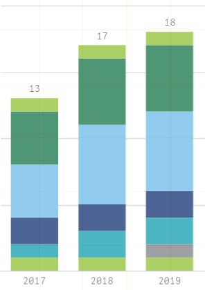
I manage to get only total values shown on the chart. Does anybody know how it would be possible to show values for each measure?
I have the same issue in both cases:
- 2 dimensions, 1 measure
- 1 dimension, 6 measures
Please let me know if you found a workaround.
I attach the app that was used in another discussion for people who would like to try out.
- Mark as New
- Bookmark
- Subscribe
- Mute
- Subscribe to RSS Feed
- Permalink
- Report Inappropriate Content
Hello Patrik,
when would this be available??
Im using September2017,
- Mark as New
- Bookmark
- Subscribe
- Mute
- Subscribe to RSS Feed
- Permalink
- Report Inappropriate Content
Hi Patrik,
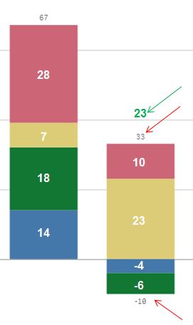
I am also having an issue related to the labeling of stapled bar charts.
Not only that I would wish to see the labels inside the bar (hope this feature will be available soon).
But also that the Totals are shown in another way in case negative figures occur.
As you can see the chart below shows a total for the negative as well as a total for the positive dimensions.
Instead I would prefer to see only one total (shown in green color).
Please let me know if this is possible?
Regards,
Gabriele
- Mark as New
- Bookmark
- Subscribe
- Mute
- Subscribe to RSS Feed
- Permalink
- Report Inappropriate Content
Hello Patrik,
Any updates on this?
Best,
Ben
- Mark as New
- Bookmark
- Subscribe
- Mute
- Subscribe to RSS Feed
- Permalink
- Report Inappropriate Content
^ adding the tag ^
- Mark as New
- Bookmark
- Subscribe
- Mute
- Subscribe to RSS Feed
- Permalink
- Report Inappropriate Content
Hey Omar,
Can you please share the extension name and URL for the "Multi-Expression stacked bar chart" ?
- Mark as New
- Bookmark
- Subscribe
- Mute
- Subscribe to RSS Feed
- Permalink
- Report Inappropriate Content
Hi,
I think the only way to change the colour that you want to show is to deal with extensions files i.e. JS/CSS/HTML.
Thanks
Tushar
- Mark as New
- Bookmark
- Subscribe
- Mute
- Subscribe to RSS Feed
- Permalink
- Report Inappropriate Content
Hello,
I am also interested in this.
Thank You,
Michael
- Mark as New
- Bookmark
- Subscribe
- Mute
- Subscribe to RSS Feed
- Permalink
- Report Inappropriate Content
Qlik Team, can you please provide an update on this subject. (Values on every measure in stacked bar chart)
Is this in development?
Thanks
- Mark as New
- Bookmark
- Subscribe
- Mute
- Subscribe to RSS Feed
- Permalink
- Report Inappropriate Content
We also very interested in that.
I noticed that from April release this is possible with a new bundle extension called "bar & area chart". However, there is a limitation in which colors you can use in the bars (multi colors are only available with two set of colors), and that's also very dissatisfied for us since our clients need both: values in the chart and customized colors (by expression). I hope they improve this chart soon.
- Mark as New
- Bookmark
- Subscribe
- Mute
- Subscribe to RSS Feed
- Permalink
- Report Inappropriate Content
Hi All,
is this resolved without any extension in the latest release?