Unlock a world of possibilities! Login now and discover the exclusive benefits awaiting you.
- Qlik Community
- :
- All Forums
- :
- Connectivity & Data Prep
- :
- alternative states in a line chart
- Subscribe to RSS Feed
- Mark Topic as New
- Mark Topic as Read
- Float this Topic for Current User
- Bookmark
- Subscribe
- Mute
- Printer Friendly Page
- Mark as New
- Bookmark
- Subscribe
- Mute
- Subscribe to RSS Feed
- Permalink
- Report Inappropriate Content
alternative states in a line chart
Hey,
I'm looking for a solution for my problem.
I have this table:
Company name | Employes average wage | Companies economic sector | YearMonth
A 500$ Education 2017-June
B 12000$ Finance 2018-july
C 3654$ Education 2017-january
D 300$ Education 2017-june
A 500$ Education 2017-january
...
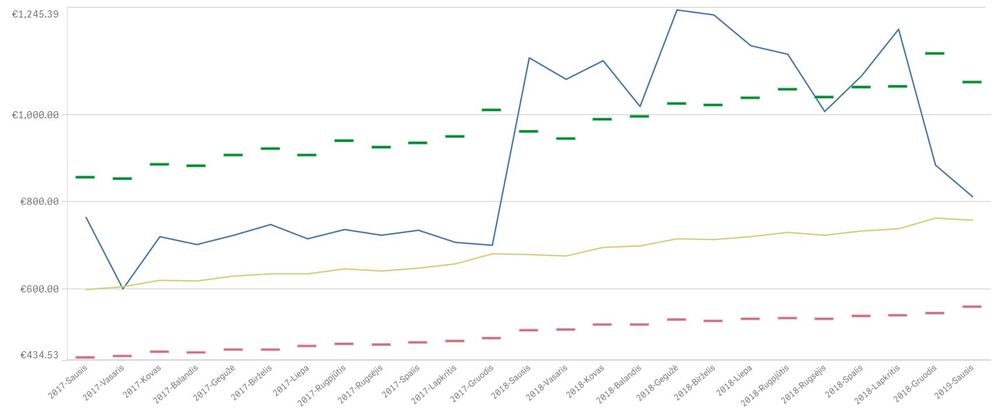
What I would like to do is to make a line chart where a company can see how she looks with a economic sector over time.
This is how it should look:
Green line is 75% quartile from the sectors wage,
Red line is 25% quartile from the sectors wage,
Blue is a companies wage median,
Yellow is sectors average wage
My problem is that when I choose a company sectors wage does not change as well as all quartiles. PLEASE HELP ME.
I wrote as so:
Green - Fractile({<[Companies economic sector]=B::[Companies economic sector]>}[Employes average wage],.75)
Red - Fractile({<[Companies economic sector]=B::[Companies economic sector]>}[Employes average wage],.25)
Yellow- Median({<[Companies economic sector]=B::[Companies economic sector]>}[Employes average wage])
Blue- if(Count (Distinct {B}[Company name])=1, AVG({B}[Employes average wage]))
