Unlock a world of possibilities! Login now and discover the exclusive benefits awaiting you.
- Qlik Community
- :
- All Forums
- :
- Connectivity & Data Prep
- :
- scatter plot
- Subscribe to RSS Feed
- Mark Topic as New
- Mark Topic as Read
- Float this Topic for Current User
- Bookmark
- Subscribe
- Mute
- Printer Friendly Page
- Mark as New
- Bookmark
- Subscribe
- Mute
- Subscribe to RSS Feed
- Permalink
- Report Inappropriate Content
scatter plot
hello Can you please guide me in creating an scatter plot graph.
I have two columns
1) Gross Margin - numbers
2) Customer names
I want to see in where is the most concentration according to gross margin
And also if i click on each circle it must show the customer name and their gross margin.
For example if we have 10 customers (A,B,C,D.....) & their Gross margin is (A=11, B=12, C=5, D=6,.....)
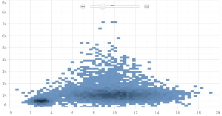
It would be great if you explain in detail as i am new to Qlik sense.
Thank you in advance,
Sachin
- Mark as New
- Bookmark
- Subscribe
- Mute
- Subscribe to RSS Feed
- Permalink
- Report Inappropriate Content
Hi Sachin,
You can refer 2 links below:
- Scatter Plot : Scatter plot ‒ Qlik Sense
- Type of visualization : When to use what type of visualization ‒ Qlik Sense
If you'd like to see in where is the most concentration according to gross margin I think you should used Bar char (Dimension : Customer Name, Measure : Gross Margin) and sort by Measure
Hope this helps.
Justin.
- Mark as New
- Bookmark
- Subscribe
- Mute
- Subscribe to RSS Feed
- Permalink
- Report Inappropriate Content
Hello Justin,
Thank you for the information.
Box plot in this sense is not a solution as the data customers is huge (1 million)
Regards,
Sachin
- Mark as New
- Bookmark
- Subscribe
- Mute
- Subscribe to RSS Feed
- Permalink
- Report Inappropriate Content
Hi Sachin,
You could used the Group Customer or Region or Customer Type, Category or something like this .... and Drill down Customer Name instead of Customer Name (it's so many for visualization). I think the data will be reduced and convenient for your analytic.
Hope this helps.
Justin.