Unlock a world of possibilities! Login now and discover the exclusive benefits awaiting you.
- Qlik Community
- :
- All Forums
- :
- Deployment & Management
- :
- Re: Android tablet rendered as phone
- Subscribe to RSS Feed
- Mark Topic as New
- Mark Topic as Read
- Float this Topic for Current User
- Bookmark
- Subscribe
- Mute
- Printer Friendly Page
- Mark as New
- Bookmark
- Subscribe
- Mute
- Subscribe to RSS Feed
- Permalink
- Report Inappropriate Content
Android tablet rendered as phone
I am using my new Android tablet (8" full HD) on Qlik Sense 1.1 and it automatically gets the phone small screen interfac.
There is no button to switch to full browser mode. How do I make Qlik Sense not detect the tablet as a big phone but use the regular tablet interface?
The tablet works on all other regular web pages I have tested and is not usually treated as a phone.
- « Previous Replies
-
- 1
- 2
- Next Replies »
Accepted Solutions
- Mark as New
- Bookmark
- Subscribe
- Mute
- Subscribe to RSS Feed
- Permalink
- Report Inappropriate Content
I have investigated further and found the following:
the Useragentstring sent by the browser doesn't change anything. I played around in a different browser that could send custom strings and Sense didn't react to different strings.
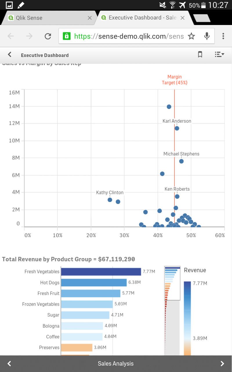
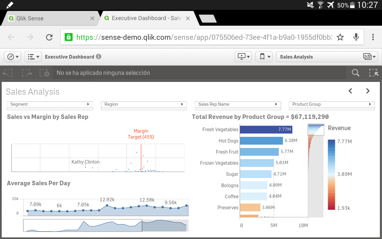
The reason is not in the string of parameters send by the tablet, but the screen size and format and how Sense behaves in the Chrome browser on the Android tablet. Normally when browsing, the top address bar and page tabs usually auto-hides when browsing, making the screen go into full-screen. This normally works, however with Sense, this top bar does NOT auto-hide away, but stays on. As you can see in Borja's screenshot his top bar is still present, BUT because his screen is not a 16:9 (og 16:10) screen, but probably a "higher" widescreen (like the iPad that doesn't run wide-screen but runs 4:3). So in Borja's case there is still room for the regular view, but with my wide-screen tablet (that runs 16:10, 1920x1200) the large menu bar on top makes the browsing window so narrow Sense automatically switches to single-object mode (that actually scrolls side-ways).
I tried another browser (Lightning browser in Android store) where I could force the top menu to hide away. When the menu bar is visible, Sense switches into single-object mode, but when the menu hides away, Sense will go to normal "full" mode with all capabilities available. Now I just need to be careful not to invoke the top bar appearing because that will send Sense into a spin of changing from full mode to single-object mode. 🙂
I still can't make Chrome browser auto-hide the menu bar when using Sense. As Sense has already gone into single-object mode, Chrome does not see the need to hide.
EDIT: Firefox actually freezes the scrolling. I can only see the top 3 sheets in the app overview and then go into single-object mode. It also doesn't hide the top address bar to provide full screen.
I hope the above can help others with similar devises until the sensitivity of Sense is changed to work on widescreen tablets.
- Mark as New
- Bookmark
- Subscribe
- Mute
- Subscribe to RSS Feed
- Permalink
- Report Inappropriate Content
Does this happen when the tablet is in Portrait orientation?
I am using a Note 8 (HD resolution) and I can see the "full" version when in Landscape, but the "mobile" version when in Portrait.
 Vinay_Kapoor
- Mark as New
- Bookmark
- Subscribe
- Mute
- Subscribe to RSS Feed
- Permalink
- Report Inappropriate Content
Hi,
Thank you for the feedback.
Your tablet is being identified as a mobile device due to the browser on this specific tablet reporting certain parameters to the client that the client then uses to decide the amount of information density you as a user should see.
We are making improvements to Qlik Sense responsive design implementation that will take more parameters (e.g. resolution or pixel density) into consideration and would make the experience on small high res tablets more tuned to the needs of the user on those devices.
Regards,
Vinay
- Mark as New
- Bookmark
- Subscribe
- Mute
- Subscribe to RSS Feed
- Permalink
- Report Inappropriate Content
The browser is the standard Chrome browser on Android devices, and there is a setting that reads "request desktop version" but that doesn't change anything on the Sense server.
The screen is around the same size as the iPad mini, so a normal tablet screen size.
Other web sites (like news sites etc) that does have a phone and a tablet version are by default using the tablet version, so for those sites the client parameters are understood.
If we could have a button on Sense where the user can change "mode" could help in these situations where Sense's auto-detection goes wrong. That would also help in cases of hybrid machines that have both touch screen and mouse+kb where the user could switch between touch capabilities and pointer capabilities himself and override Sense's auto-detection.
Vinay_Kapoor
- Mark as New
- Bookmark
- Subscribe
- Mute
- Subscribe to RSS Feed
- Permalink
- Report Inappropriate Content
Hi Theis,
We agree. Such a button would be useful and will most likely make an appearance in a future version.
Regards,
Vinay
- Mark as New
- Bookmark
- Subscribe
- Mute
- Subscribe to RSS Feed
- Permalink
- Report Inappropriate Content
Thank you for the feedback. Hoping for a future fix 🙂
- Mark as New
- Bookmark
- Subscribe
- Mute
- Subscribe to RSS Feed
- Permalink
- Report Inappropriate Content
No here it is phone version regardless of orientation. It is Experia Z3 tablet with 8" HD resolution.
EDIT:
Actually I can see that your tablet has "hard" android navigation buttons, that in landscape mode will be on the side (outside the screen). On my tablet the navigation buttons are "soft" inside the screen area, which takes up more pixels at the button so the space between the top bar (address and tabs) and bottom, makes Sense pop into single-object mode.
Can you make your top navigation bar auto-hide? Or does it stay on, taking up an incredible large amount of space on the screen? 🙂
- Mark as New
- Bookmark
- Subscribe
- Mute
- Subscribe to RSS Feed
- Permalink
- Report Inappropriate Content
I have investigated further and found the following:
the Useragentstring sent by the browser doesn't change anything. I played around in a different browser that could send custom strings and Sense didn't react to different strings.
The reason is not in the string of parameters send by the tablet, but the screen size and format and how Sense behaves in the Chrome browser on the Android tablet. Normally when browsing, the top address bar and page tabs usually auto-hides when browsing, making the screen go into full-screen. This normally works, however with Sense, this top bar does NOT auto-hide away, but stays on. As you can see in Borja's screenshot his top bar is still present, BUT because his screen is not a 16:9 (og 16:10) screen, but probably a "higher" widescreen (like the iPad that doesn't run wide-screen but runs 4:3). So in Borja's case there is still room for the regular view, but with my wide-screen tablet (that runs 16:10, 1920x1200) the large menu bar on top makes the browsing window so narrow Sense automatically switches to single-object mode (that actually scrolls side-ways).
I tried another browser (Lightning browser in Android store) where I could force the top menu to hide away. When the menu bar is visible, Sense switches into single-object mode, but when the menu hides away, Sense will go to normal "full" mode with all capabilities available. Now I just need to be careful not to invoke the top bar appearing because that will send Sense into a spin of changing from full mode to single-object mode. 🙂
I still can't make Chrome browser auto-hide the menu bar when using Sense. As Sense has already gone into single-object mode, Chrome does not see the need to hide.
EDIT: Firefox actually freezes the scrolling. I can only see the top 3 sheets in the app overview and then go into single-object mode. It also doesn't hide the top address bar to provide full screen.
I hope the above can help others with similar devises until the sensitivity of Sense is changed to work on widescreen tablets.
Vinay_Kapoor
- Mark as New
- Bookmark
- Subscribe
- Mute
- Subscribe to RSS Feed
- Permalink
- Report Inappropriate Content
Hi,
Thanks for the detailed analysis.
The client disregards useragentstring as these are of very little use in responsive design and are often unreliable. Coding web apps with useragent often leads to complex code that is specific to the devices considered and leads to a less than optimal implementation in most devices outside of the list considered by the developers.
We rely on devicewidth and the idea is to move to a combination of devicewidth, deviceheight and pixel density in order to render the right UI.
Regards,
Vinay
- Mark as New
- Bookmark
- Subscribe
- Mute
- Subscribe to RSS Feed
- Permalink
- Report Inappropriate Content
One last comment is the size of objects and text in Sense could easily be a lot smaller to make room for more details. There is a lot of space and eg. size of bars in a bar chart could easily be a lot smaller. I don't know where it picks up the optimal size to show, but for the tablet it can easily be smaller, making room for more details and making it less "responsive" in switching between full mode or single-object mode.
Thank you for the attention Vinay. 🙂
- « Previous Replies
-
- 1
- 2
- Next Replies »