Unlock a world of possibilities! Login now and discover the exclusive benefits awaiting you.
- Qlik Community
- :
- Forums
- :
- Forums by Product
- :
- Products (A-Z)
- :
- Qlik Sense
- :
- Documents
- :
- Creating Mini Chart in Qlik Sense tables
- Move Document
- Delete Document
- Subscribe to RSS Feed
- Mark as New
- Mark as Read
- Bookmark
- Subscribe
- Printer Friendly Page
- Report Inappropriate Content
Creating Mini Chart in Qlik Sense tables
- Move Document
- Delete Document and Replies
- Mark as New
- Bookmark
- Subscribe
- Mute
- Subscribe to RSS Feed
- Permalink
- Report Inappropriate Content
Creating Mini Chart in Qlik Sense tables
Hi all,
Mini Charts have always been a good feature in QlikView and It's really 'frustrating' that this has not been added (yet) in Qlik Sense.
With hopes that the Qlik Team will think about such improvements for the next releases, let's discuss here how to create our own mini chart in a Qlik Sense Table.
The following expressions might seem 'complicated' at first sight, but remember that It will be generic.
You'll only have to change your : Dimension(s) and Measure to adapt to your need.
Thus, their use will be very easy.
Let's begin :
Suppose we have:
As a dimension: OICA Region
As measures:
Sum(Sales)
Sum("Commercial Vehicle Sales")
Sum(Sales) / (Sum(Sales)+Sum("Commercial Vehicle Sales"))
Here is our current table:
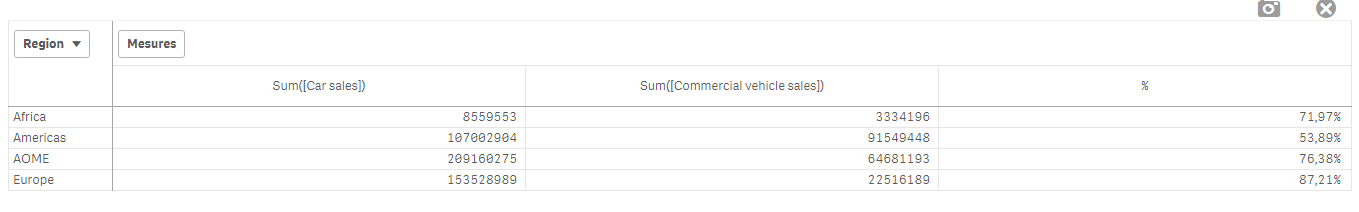
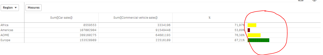
Now, we want to add, a mini 'bar' to represent the %:
How to do so:
As an expression:
=repeat('█',
rangemax(rangemin( ceil(((column(1)/column(2))-1)*2.5),10),0)
)
With that, we repeat the square sign and precise the limits.
And as a text Color expression:
if( (sum([Car sales])/(sum([Car sales])+sum([Commercial vehicle sales])))>=0.8,Green(),
if((sum([Car sales])/(sum([Car sales])+sum([Commercial vehicle sales])))>=0.7,Yellow(),
Red()))
Result:
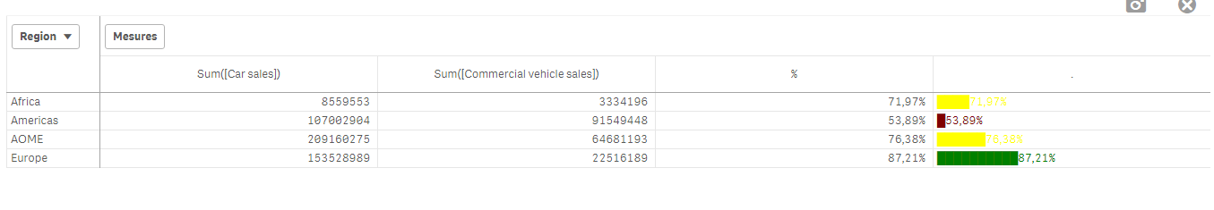
We can also Add the % in front of the bar by adding it in the expression:
From :
=repeat('█',
rangemax(rangemin( ceil(((column(1)/column(2))-1)*2.5),10),0)
)
To:
=repeat('█',
rangemax(rangemin( ceil(((column(1)/column(2))-1)*2.5),10),0)
) & num((sum([Car sales])/(sum([Car sales])+sum([Commercial vehicle sales]))),'# ##0,00%')
Result:
You can even alter it as follow:
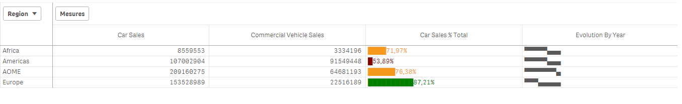
repeat(chr(09608),round( sum([Car sales])/(sum([Car sales])+sum([Commercial vehicle sales])) * 10))
&repeat(chr(09617),10-round( sum([Car sales])/(sum([Car sales])+sum([Commercial vehicle sales])) *10))
&num((sum([Car sales])/(sum([Car sales])+sum([Commercial vehicle sales]))),'# ##0,00%')
&if(sum([Car sales])/(sum([Car sales])+sum([Commercial vehicle sales]))>0.7,'▲','▼')
result:
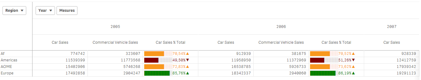
Now, let's suppose we want to add another mini chart, a trend one, to see the % expression by Year:
If it has increased or decreased from a year to the next one.
How to do so?
Expression:
=concat(
aggr(
if((sum([Car sales])/(sum([Car sales])+sum([Commercial vehicle sales]))) > above((sum([Car sales])/(sum([Car sales])+sum([Commercial vehicle sales])))),
'▀',if((sum([Car sales])/(sum([Car sales])+sum([Commercial vehicle sales]))) < above((sum([Car sales])/(sum([Car sales])+sum([Commercial vehicle sales])))),'▄',' ')
)
,[OICA region], (Year,(NUMERIC, ASCENDING))
)
,'',[OICA region])
Wirh:
Red: Our Dimension
Green: The trending dimension
Blue: our expression compared to the previous one (by year, the trending expression)
If expression by Year > expression Previous Year then , Square Up
If expression by Year < expression Previous Year then , Square down
Result:
Special thanks to blog Von Heldendaten in which I found this:
QlikView + Qlik Sense Blog von Heldendaten: Qlik Sense Calendar Measures & "Minicharts" in Tabellen.
Hope you like it !
Omar,
- Move Comment
- Delete Comment
- Mark as Read
- Mark as New
- Bookmark
- Permalink
- Report Inappropriate Content
Hi Omar
Thanks à lot for this very interesting post
- Move Comment
- Delete Comment
- Mark as Read
- Mark as New
- Bookmark
- Permalink
- Report Inappropriate Content
Cunning yet simple. I like it.
- Move Comment
- Delete Comment
- Mark as Read
- Mark as New
- Bookmark
- Permalink
- Report Inappropriate Content
Simple and very effective - thanks for sharing this Omar.
- Move Comment
- Delete Comment
- Mark as Read
- Mark as New
- Bookmark
- Permalink
- Report Inappropriate Content
Hi Omar,
Thanks for the very useful information.
- Move Comment
- Delete Comment
- Mark as Read
- Mark as New
- Bookmark
- Permalink
- Report Inappropriate Content
Just copy and paste them: ▁▂▃▄▅▆▇█
{"▁▂▃▄▅▆▇█▇▆▅▄▃▂▁","▂▁▄▃▆▅█▇","█▇▆▅▄▃▂▁▂▃▄▅▆▇█","▁▅█▆▅▃▂▇▄▅"}
Use ORD('▇') to get CHR code.
Cool post. Thanks for idea.
- Move Comment
- Delete Comment
- Mark as Read
- Mark as New
- Bookmark
- Permalink
- Report Inappropriate Content
Thank you so much.... It was very helpful...
- Move Comment
- Delete Comment
- Mark as Read
- Mark as New
- Bookmark
- Permalink
- Report Inappropriate Content
Nice to have, can i expect any thing related same in Trend like Line chart ?
- Move Comment
- Delete Comment
- Mark as Read
- Mark as New
- Bookmark
- Permalink
- Report Inappropriate Content
Great idea! Thank a lot 
- Move Comment
- Delete Comment
- Mark as Read
- Mark as New
- Bookmark
- Permalink
- Report Inappropriate Content
I got it, By help of extension Qlik Branch
- Move Comment
- Delete Comment
- Mark as Read
- Mark as New
- Bookmark
- Permalink
- Report Inappropriate Content
Hi,
Can someone give me a simple example of using mini chart in qlik sense?
I don't succeed apply the example from this page. My result is the same graphic image on all the column of table.
Thank you,
Magdalena