This example Qlik Sense application shows how to create a bar chart that shows variance to target, both as an absolute value and as a percentage.
The charts in the app look like this:
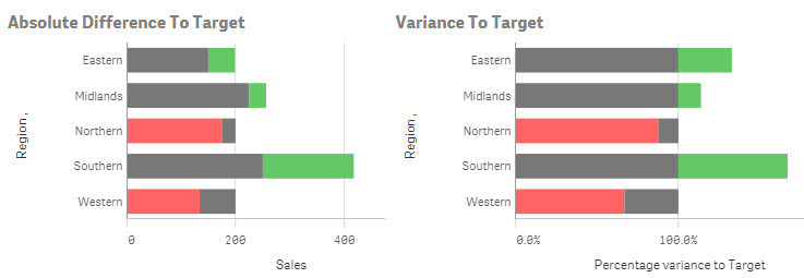
By showing both these charts you can see both how regions are comparing to each other and against the targets that have been set for them.
The example was created to accompany the Quick Intelligence blog post, that can be read here:
https://www.quickintelligence.co.uk/qlik-target-bar-chart/
The example is also available on Qlik Community as a QlikView application.
A list of all our downloadable example files can be found here:
https://www.quickintelligence.co.uk/examples/
Hope you find this application useful.
Regards,
Steve
https://www.quickintelligence.co.uk/