Unlock a world of possibilities! Login now and discover the exclusive benefits awaiting you.
- Qlik Community
- :
- Forums
- :
- Forums by Product
- :
- Products (A-Z)
- :
- Qlik Sense
- :
- Documents
- :
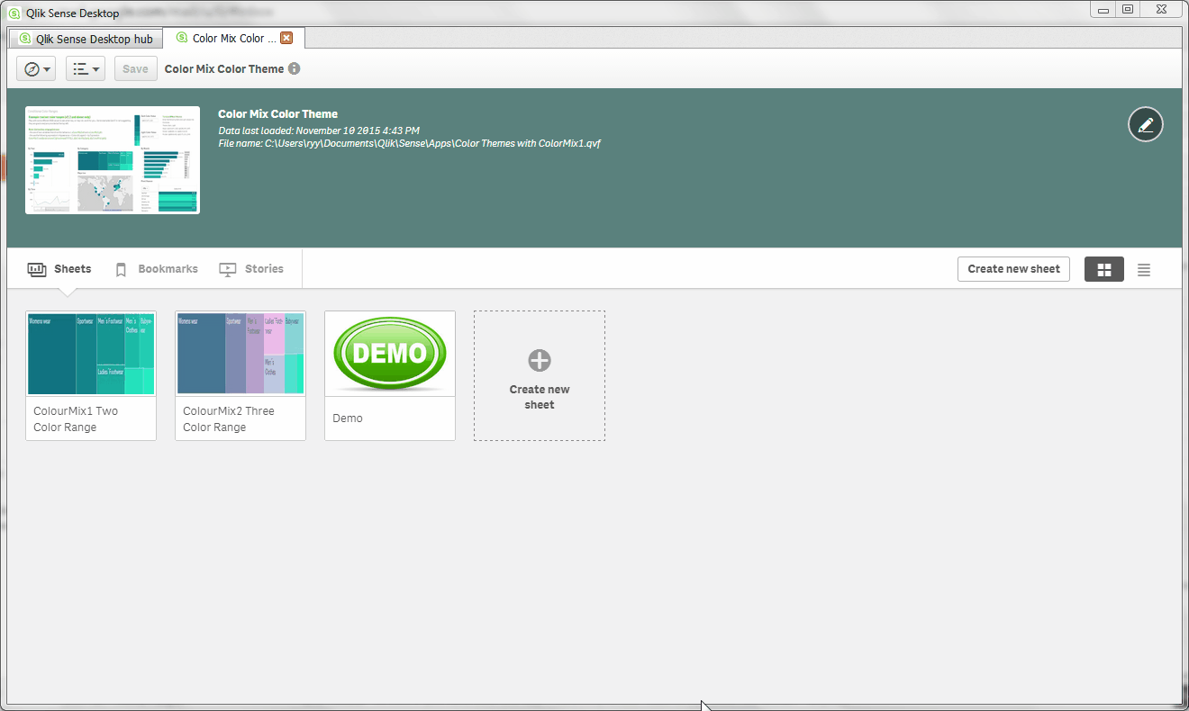
- Qlik Sense Color Range Theme Approach
- Edit Document
- Move Document
- Delete Document
- Subscribe to RSS Feed
- Mark as New
- Mark as Read
- Bookmark
- Subscribe
- Printer Friendly Page
- Report Inappropriate Content
Qlik Sense Color Range Theme Approach
- Move Document
- Delete Document and Replies
- Mark as New
- Bookmark
- Subscribe
- Mute
- Subscribe to RSS Feed
- Permalink
- Report Inappropriate Content
Qlik Sense Color Range Theme Approach
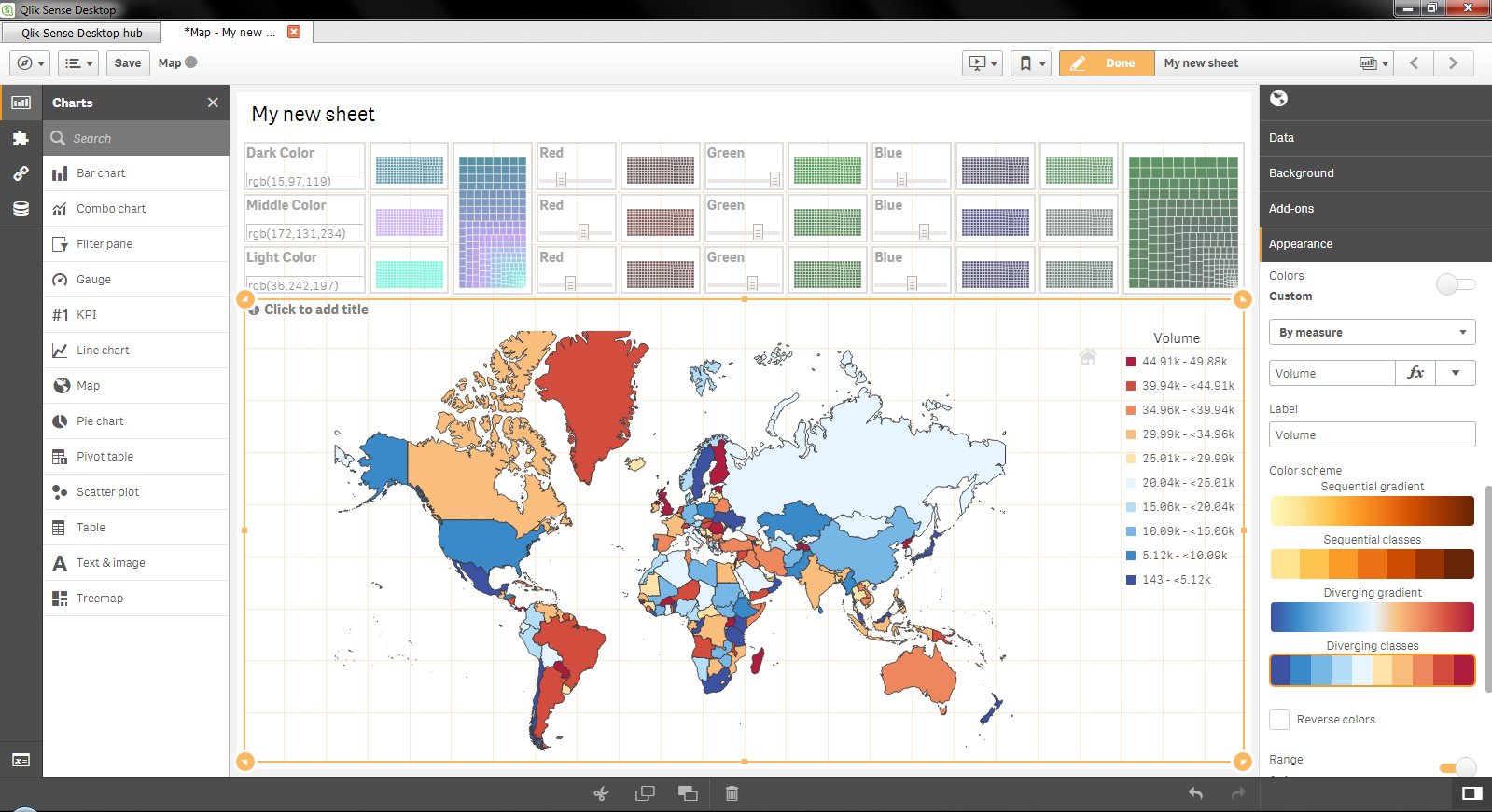
The aim was to theme an application with a variable driven color range that can highlight strong performance and fade off for less performant values. The out of the box palette allows you to do this with the Red to Yellow range but there are often requests for more corporate color sets. I'm sure we'll see this addressed in future versions but for now there is a workaround (in the soon to be release v2,2 at least - read the Note section below for an issue that stops this working in v2.1 and the workaround to address it)
The approach aims to use an expression that doesn't need to be rewritten each time the measure changes and can be copied across different objects without changes. I managed to get something working as you can see below (click on the GIF below if it's not playing for you).
In the end it is quite simple.
Steps to recreate two color range approach
1. setup two variables (vColorMixDark and vColorMixLight) to act as the boundaries for the color range we will use with the ColorMix1() function.
2. If you wish to play with the example application you will need the qVariable extension from Branch (or use the attached). If you want to set these values just once you can do so through the variables window without the extension.
3. Create your charts and use the following formula in the Appearance > Colors & Legend > Color by Expression area
ColorMix1( rank(TOTAL column(1))/NoOfRows(TOTAL) , $(vColorMixDark), $(vColorMixLight))
To explain this formula (just in case):
Assuming that we have one dimension (can be a drill through dimension) and one measure. We use the value of the measure to weight the values to assign a color in the range using the ColorMix1() function. This is completed by ranking the measure results and dividing this by the total number of rows as color mix requires a value between 0 and 1. It is written using column(1) and NoOfRows() so that it doesn't hold the formula itself but references the appropriate field in the objects dataset.
Changes to recreate three color range approach
1. setup an additional (third) variable called vColorMixMiddle, this will set the middle color of the range.
2. use the following expression in place of the one above:
ColorMix2( (rank(total column(1))/(noofrows(TOTAL)/2))-1 ,$(vColorMixDark), $(vColorMixLight),$(vColorMixMiddle))
This formula assigns a value in the range of -1 to +1 as required for the 3 color approach based on your expression identified in column(1) of the dataset. I.e. the second field of your dataset which is typically the first measure after a single dimension field.
NOTE:
- This works on v2.2 (release Feb 2016). In v2.1 there appears to be an issue with sorting when such a color by expression is applied (not all color by expressions). In v2.1 and below you will need to follow the workaround below which is not quite so graceful but gets the same result.
Workaround for v2.1 and below
- The sort order is kind of critical, the only way of making this function in v2.1 was to use the formula itself as rowno(), rank(column(1)) and other options would all deactivate the sort order of descending values which is pretty important in most charts. As such your formula would be as follows:
ColorMix1( rank(total [your measure expression here] ) / NoOfRows(TOTAL) , $(vColorMixDark), $(vColorMixLight))
- Unfortunately this means there is always an admin element whenever you use this, and whenever you change the expression formula. However, a quick upgrade to v2.2. in a months time (as of writing) will have you back to quick and simple.
Taking this idea to the next level with a cool UI through the Color Styler extension
The Color Styler extension is a brilliant tool to make your applications look stunning and fully tailored to the organisation or use case your making it for.. Excellent work by jsn Johannes Sunden.
Any comments are welcome as there's always another way of approaching things and there are things to learn in every approach.
- Move Comment
- Delete Comment
- Mark as Read
- Mark as New
- Bookmark
- Permalink
- Report Inappropriate Content
Thanks for this post.
It has facilitated me a lot of work 
Regards,
Sílvia Ganhão
- Move Comment
- Delete Comment
- Mark as Read
- Mark as New
- Bookmark
- Permalink
- Report Inappropriate Content
This is fantastic. Very helpful.
Thanks!
- Move Comment
- Delete Comment
- Mark as Read
- Mark as New
- Bookmark
- Permalink
- Report Inappropriate Content
Many thanks for the above - all has been extremely useful.
Just one question: How is your map "reading" the colors? I cannot see any expression being used?
I have troubles adding a successful expression to paint a global map with polygons, based on a Volume field. It works using the default pallet but I would like to use custom colors.
Any suggestions?
- Move Comment
- Delete Comment
- Mark as Read
- Mark as New
- Bookmark
- Permalink
- Report Inappropriate Content
Hi Lefteris,
Try something like this where you will need to replace my sum(SalesAmount) with your measure expression.The aggr function looks for the maximum value across the series (so you'll need to also replace the SalesTerritoryCountry with your Country field) and then creates a value between 0 and 1 through a percentage of the maximum.
colormix1(
sum(SalesAmount)
/
max(TOTAL aggr(sum(SalesAmount),SalesTerritoryCountry))
,rgb(15,97,119),rgb(36,242,197))
I have also left the RGB() values in this so replace the dark and light color with the variables as per the example.
Cheers
Richard
- Move Comment
- Delete Comment
- Mark as Read
- Mark as New
- Bookmark
- Permalink
- Report Inappropriate Content
@Richard Byard - You are an absolute star! many thanks!
- Move Comment
- Delete Comment
- Mark as Read
- Mark as New
- Bookmark
- Permalink
- Report Inappropriate Content
Great post! Thanks! 🙂
- Move Comment
- Delete Comment
- Mark as Read
- Mark as New
- Bookmark
- Permalink
- Report Inappropriate Content
Hello,
What if I want to use Combo Chart and set a different color for a primary axis (using ColorMix for bar chart) and a red colour for secondary axis? (line chart)
Bartek
- Move Comment
- Delete Comment
- Mark as Read
- Mark as New
- Bookmark
- Permalink
- Report Inappropriate Content
Hi, this is very helpful.
I'm trying to figure out how to change colors based on a custom rank that I would like to set up. If my measure is from 1 to 50, and I'd like to see the rangs 1-10, and then more than 11 for example, can you please advise how can I do that?
- « Previous
-
- 1
- 2
- Next »