Unlock a world of possibilities! Login now and discover the exclusive benefits awaiting you.
- Qlik Community
- :
- All Forums
- :
- QlikView App Dev
- :
- 80/20 Analysis in Bar Chart
- Subscribe to RSS Feed
- Mark Topic as New
- Mark Topic as Read
- Float this Topic for Current User
- Bookmark
- Subscribe
- Mute
- Printer Friendly Page
- Mark as New
- Bookmark
- Subscribe
- Mute
- Subscribe to RSS Feed
- Permalink
- Report Inappropriate Content
80/20 Analysis in Bar Chart
Hi All,
I've to create a bar chart as shown in the image below:
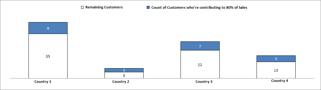
As displayed the bar chart is county wise. In each bar I have two slice of it: one of these slices will show "No. of customers who're contributing to 80% of sales" while other slice will show remaining customers.
Here, I could not find a working expression which can fulfill my requirement. I tried to search on community but unable to find any working solution.
Edit: I've attached the sample data application.
Any suggestions will be really helpful for me
Regards,
Dinesh
Message was edited by: Dinesh Singh
- « Previous Replies
-
- 1
- 2
- Next Replies »
- Mark as New
- Bookmark
- Subscribe
- Mute
- Subscribe to RSS Feed
- Permalink
- Report Inappropriate Content
Hi Digvijay, thanks for mentioning my blog.
I'm not too sure if my method can be used here. It depends on the nature of the question. Since the required chart is plotted by Country, two possible questions can be asked here:
1. In each country, how many customers make up 80% of total Sales in the same country?
or
2. How many customers in each country belong to the global group of customers that make up 80% of my total sales globally.
Using the method that I described in my blog, we can answer the second question, but we can't answer the first question. At the moment, I can't think of a solution that would work well for the first question.
cheers,
Oleg Troyansky
QlikView Your Business: An expert guide to Business Discovery with QlikView and Qlik Sense
- Mark as New
- Bookmark
- Subscribe
- Mute
- Subscribe to RSS Feed
- Permalink
- Report Inappropriate Content
Thanks troyansky for clarifying on this, I guess first question is asked here.
dineshsingh Please confirm.
- « Previous Replies
-
- 1
- 2
- Next Replies »