Unlock a world of possibilities! Login now and discover the exclusive benefits awaiting you.
- Qlik Community
- :
- All Forums
- :
- QlikView App Dev
- :
- Re: Accum. of created records
- Subscribe to RSS Feed
- Mark Topic as New
- Mark Topic as Read
- Float this Topic for Current User
- Bookmark
- Subscribe
- Mute
- Printer Friendly Page
- Mark as New
- Bookmark
- Subscribe
- Mute
- Subscribe to RSS Feed
- Permalink
- Report Inappropriate Content
Accum. of created records
All,
I have a CRM system from which every month the contacts are loaded in Qlik.
What I need is a graph over time which displays the growth in contacts. I use the Created date of the record to plot the contacts on a date and thought if I use a full accumulation of the records count the development would show.
But this is not the case, I see deviations which I don't understand (large gaps between months). And also the current month doesn't match with the total I have when I look in our CRM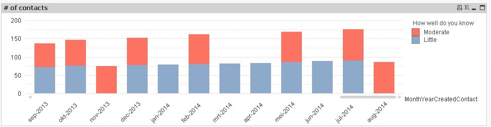
How can I create a graph which accumulate all the created contacts and the current month should then always be the same as the CRM source?
Thanks for the help!
Kind regards,
Paul
- « Previous Replies
-
- 1
- 2
- Next Replies »
- Mark as New
- Bookmark
- Subscribe
- Mute
- Subscribe to RSS Feed
- Permalink
- Report Inappropriate Content
Have you tried to check "Full Accumulation" under Expressions tab in chart properties?
- Mark as New
- Bookmark
- Subscribe
- Mute
- Subscribe to RSS Feed
- Permalink
- Report Inappropriate Content
Yes the graph you see is with the full accumulation on, but this is not working as I expect it to work. Looks like something is not accumulating well because of the stacked bars
- Mark as New
- Bookmark
- Subscribe
- Mute
- Subscribe to RSS Feed
- Permalink
- Report Inappropriate Content
I have tried this on stacked bar chart and it works, the problem may be due to no new contact created at that month
- Mark as New
- Bookmark
- Subscribe
- Mute
- Subscribe to RSS Feed
- Permalink
- Report Inappropriate Content
Hi Paul,
could you provide us with a qvw describing the issue ?
Full accumulation should indeed solve the problem, so there must be something else.
thanks
Loic
- Mark as New
- Bookmark
- Subscribe
- Mute
- Subscribe to RSS Feed
- Permalink
- Report Inappropriate Content
Paul, Can you share the sample data or the QVW.
-Ram
- Mark as New
- Bookmark
- Subscribe
- Mute
- Subscribe to RSS Feed
- Permalink
- Report Inappropriate Content
Please find attached.
As you can see, as soon as I make selection the full accumulation doesn't seem to work.
Even when no contacts are added I should expect the same stacked bar as the month before.
- Mark as New
- Bookmark
- Subscribe
- Mute
- Subscribe to RSS Feed
- Permalink
- Report Inappropriate Content
Paul,
it looks like accumulation is working but somehow does not display the red/blue bar when the link between your two dimensions (MonthYearCreatedContact & new_contact_ratingname) does not exist for that specific month.
I would suggest to :
- open a ticket on our support to check if this is WAD or not
- if so, you could create fake missing links in the data model
- if you don't like this solution you could replace accumulation by an asof calendar table : Calculating rolling n-period totals, averages or other aggregations
Loic
- Mark as New
- Bookmark
- Subscribe
- Mute
- Subscribe to RSS Feed
- Permalink
- Report Inappropriate Content
Loic,
Thanks for your help.
Strange thing is that there should be a link, it comes from the same source and is stored in the same table. The problem only occurs when you select multiple values from the different dimensions.
Regards,
Paul
- Mark as New
- Bookmark
- Subscribe
- Mute
- Subscribe to RSS Feed
- Permalink
- Report Inappropriate Content
Paul,
Sorry, when I said link I meant record. When you perform selections it lowers the chances that a record between month and ratingname exists.
In your example, by performing selections you exclude such records for some months. For these months the chart does not display the previously accumulated value resulting in the red/blue rectangle to disapear.
The accumulated value is still there though because it displays properly on the next month having this kind of record.
For instance, with the provided selections, just clic on nov-2013. You'll see that the "Little" ratingname is greyed in the top left listbox. The record creating the link between those two values does not exist. The blue box is not displayed. On the contrary if you clic on dec-2013, none of the two values is greyed out. The two boxes are displayed.
Loic
- « Previous Replies
-
- 1
- 2
- Next Replies »