Unlock a world of possibilities! Login now and discover the exclusive benefits awaiting you.
- Qlik Community
- :
- All Forums
- :
- QlikView
- :
- Actual vs Projected Hours Visualization
- Subscribe to RSS Feed
- Mark Topic as New
- Mark Topic as Read
- Float this Topic for Current User
- Bookmark
- Subscribe
- Mute
- Printer Friendly Page
- Mark as New
- Bookmark
- Subscribe
- Mute
- Subscribe to RSS Feed
- Permalink
- Report Inappropriate Content
Actual vs Projected Hours Visualization
Hi,
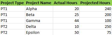
I have the following columns in my data model:
The client wants these to be represented in this way:
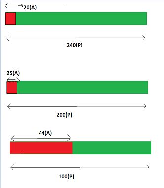
The ProjectedHours is the base (green) and the ActualHour is in red. The visualization has to be in such a way that it represents that out of 240 projected hours, resource has charged 20 hours. Out of 200 projected hours, resource has charged 25 hours
I'm not able to get the baseline.It will be different for each project so putting it in the same chart is where I'm facing issue.
Any help would be appreciated.
Thanks,
YASH
- Mark as New
- Bookmark
- Subscribe
- Mute
- Subscribe to RSS Feed
- Permalink
- Report Inappropriate Content
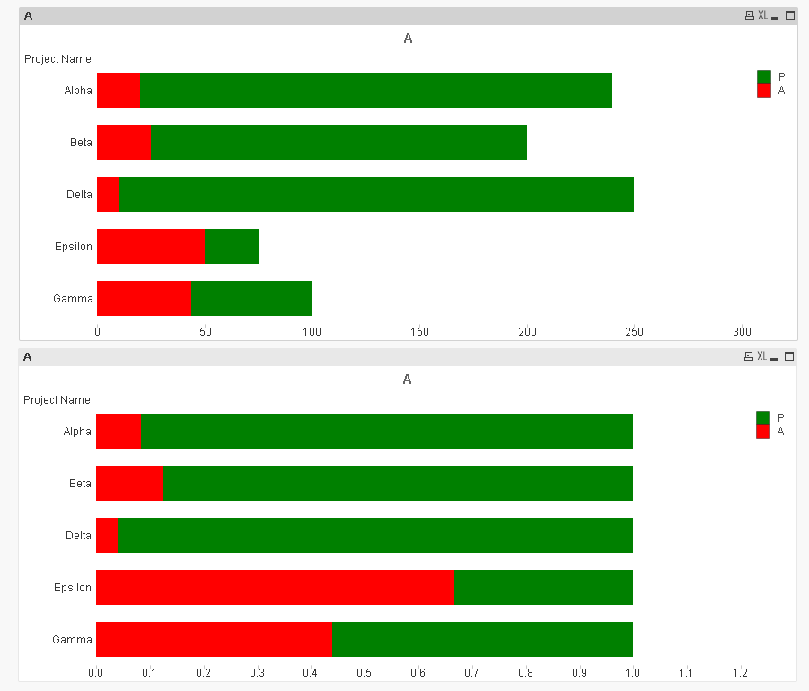
One of these charts? First chart is using the absolute values, whereas the second one is adding up to 100%
- Mark as New
- Bookmark
- Subscribe
- Mute
- Subscribe to RSS Feed
- Permalink
- Report Inappropriate Content
Chart Type: Bar
Dimension - [Project Name]
Expressions:
Expr 1 - Sum([Actual Hours])
Click on  - Background Color - Red().
Expr2 - Sum([Projected Hours])
Click on + - Background color - Green().
Style tab - Orientation - 2nd one, Subtype - Stacked.
Presentation tab - Show legend.
add other options, now check the created Stacked bar chart.
- Mark as New
- Bookmark
- Subscribe
- Mute
- Subscribe to RSS Feed
- Permalink
- Report Inappropriate Content
I believe that will stack Actual over Projected causing the total stacking to cross above 240 for Alpha... the second expression should be [Projected Hours] - [Actual Hours].
- Mark as New
- Bookmark
- Subscribe
- Mute
- Subscribe to RSS Feed
- Permalink
- Report Inappropriate Content
Yes.