Unlock a world of possibilities! Login now and discover the exclusive benefits awaiting you.
- Qlik Community
- :
- All Forums
- :
- QlikView App Dev
- :
- Re: Re: Any alternatives for empty expression in a...
- Subscribe to RSS Feed
- Mark Topic as New
- Mark Topic as Read
- Float this Topic for Current User
- Bookmark
- Subscribe
- Mute
- Printer Friendly Page
- Mark as New
- Bookmark
- Subscribe
- Mute
- Subscribe to RSS Feed
- Permalink
- Report Inappropriate Content
Any alternatives for empty expression in a Pivot table ?
Hi All,
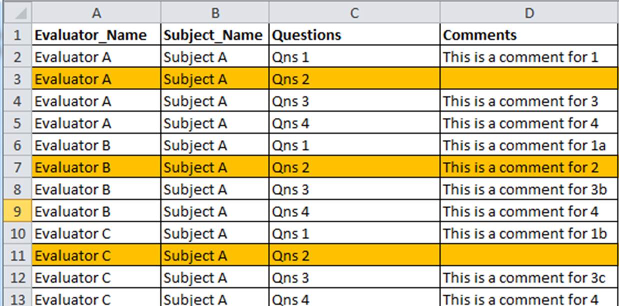
I have created a Pivot Table with 3 dimensions. However, Pivot table requires an expression which I have created an empty one in order to show the data(in text form).
The result is what I wanted with one minor issue. There is a empty row at the end of each row for each group. Below illustrate an example with highlighted rows:
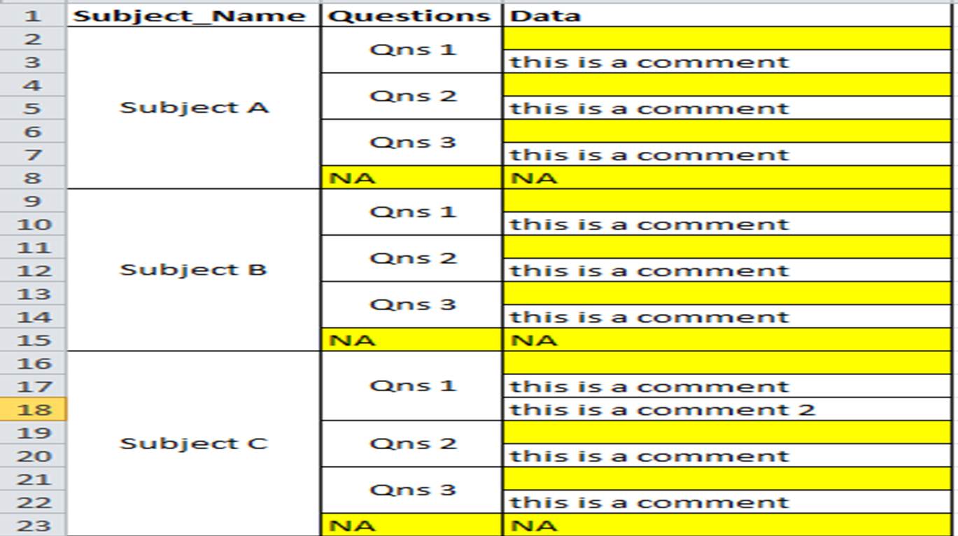
You may ask why I don want to create an expression. This is because I have tried to create one but the data displayed is not what I want. Eg. If I create an expression, the "this is a comment 2" will not be shown. They will show only one comment per qns instead which to me is loss of data displayed.
Any one has encounter similar problem before that can help on this ?
Would appreciate some help here.
thanks!
- Mark as New
- Bookmark
- Subscribe
- Mute
- Subscribe to RSS Feed
- Permalink
- Report Inappropriate Content
Try this:
- Marcus
- Mark as New
- Bookmark
- Subscribe
- Mute
- Subscribe to RSS Feed
- Permalink
- Report Inappropriate Content
Hi Marcus,
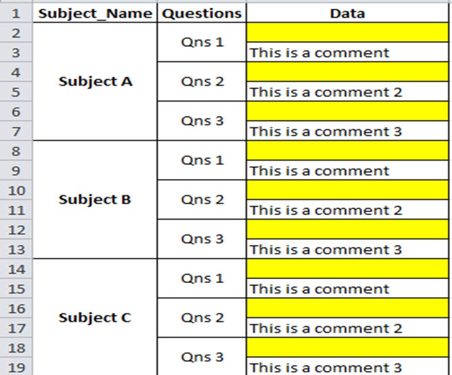
Your above solution did indeed solve part of my problem. I checked the check box for all 3 dimensions. It eliminates the 'NA' under Questions column.
Screenshot below to illustrate the example:
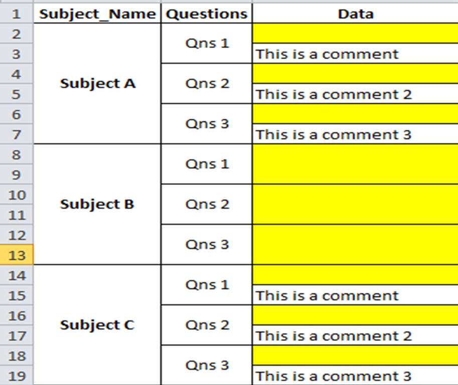
Now left the empty rows under the data column. I also discover that one of the subjects that has no data still been displayed out. Screenshot as per below.
It is due to calculated dimension that I have that resulted in this behavior ?
Thanks in advance!
- Mark as New
- Bookmark
- Subscribe
- Mute
- Subscribe to RSS Feed
- Permalink
- Report Inappropriate Content
Hi
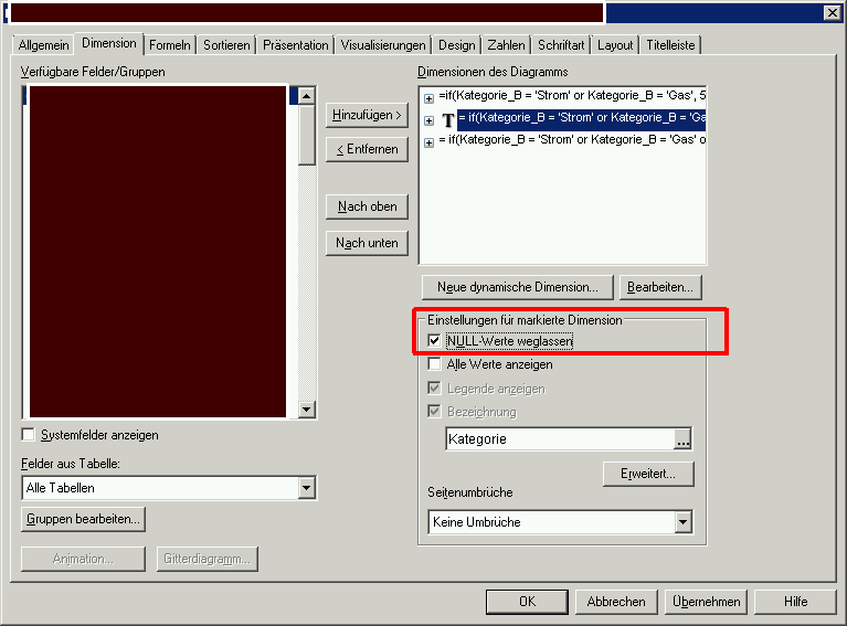
I think your problem is that you are using indent mode for your pivot, and have partial sums enabled. Go to the chart properties | Style tab and clear the check box next to indent mode. Then go to Presentations, and turn off the partial sums on both dimensions. Then, if you prefer, you can check the indent mode option again. That should remove the yellow lines.
Hope that helps
Jonathan
- Mark as New
- Bookmark
- Subscribe
- Mute
- Subscribe to RSS Feed
- Permalink
- Report Inappropriate Content
Hi Jonathan,
Indent is off by default. I have also turned off the partial sums but to no valid.
This is why I am thinking if my dimension is written correctly.
Thanks!
- Mark as New
- Bookmark
- Subscribe
- Mute
- Subscribe to RSS Feed
- Permalink
- Report Inappropriate Content
Hi All,
Think this is the root cause. The Qlikview combine all the blank data into one row. Below is example to illustrate the example.
Screenshot of raw data:
Screenshot of chart table:
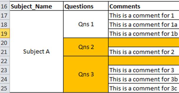
If you compare the data for questions 2 in raw data and chart table, the Qlikview combine my 2 rows of blank data together. This give the illusion of blank value. The question to this will change to: How to make the blank raw data into unique.
Chart table Qns 2 should have 3 rows instead of the current 2 rows.
- Mark as New
- Bookmark
- Subscribe
- Mute
- Subscribe to RSS Feed
- Permalink
- Report Inappropriate Content
Hi,
Any one can help on this ?
Thanks.
- Mark as New
- Bookmark
- Subscribe
- Mute
- Subscribe to RSS Feed
- Permalink
- Report Inappropriate Content
Can you please upload the above displayed Excel file?
- Mark as New
- Bookmark
- Subscribe
- Mute
- Subscribe to RSS Feed
- Permalink
- Report Inappropriate Content
Hi Martin,
As requested.
Thanks!
- Mark as New
- Bookmark
- Subscribe
- Mute
- Subscribe to RSS Feed
- Permalink
- Report Inappropriate Content
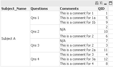
Your issue is because of the nature of how you display your data and I can understand this can be tricky. QlikView combines all cells that are the same in a Pivot-Table.
An idea to create a work around is the following: Create an additional dimension called Question ID (QID). It will carry the numbers 1,2,3.. etc. After loading them into your QV application, pick QID as your dimension AFTER comments. This way it will become clear that your "empty" field exist twice.
What do you think?
- Mark as New
- Bookmark
- Subscribe
- Mute
- Subscribe to RSS Feed
- Permalink
- Report Inappropriate Content
May be this will help you
create a Extra Column as Row
LOAD Subject_Name,
RowNo() as row,
Questions,
Comments
FROM table
Change Background Color to chart Background same for Expression.
Find the attachment