Unlock a world of possibilities! Login now and discover the exclusive benefits awaiting you.
- Qlik Community
- :
- All Forums
- :
- QlikView App Dev
- :
- Budget Vs Actuals Graph
- Subscribe to RSS Feed
- Mark Topic as New
- Mark Topic as Read
- Float this Topic for Current User
- Bookmark
- Subscribe
- Mute
- Printer Friendly Page
- Mark as New
- Bookmark
- Subscribe
- Mute
- Subscribe to RSS Feed
- Permalink
- Report Inappropriate Content
Budget Vs Actuals Graph
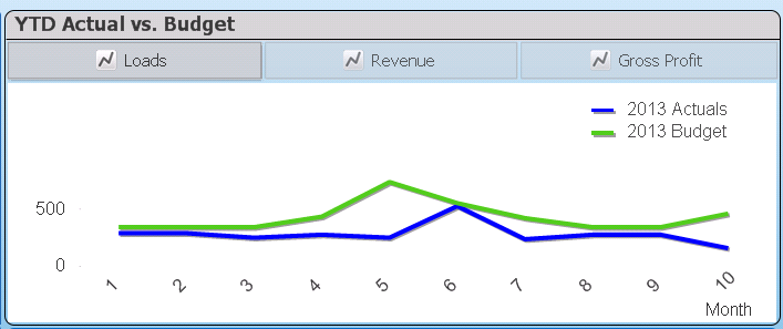
I am trying to graph my actual sales vs budgeted sales.
I have a table with the budget per customer per month.
I also have a table with my actual sales data with a date from which I created additional columns in that table including month.
I would like to show the YTD budget as a linear graph along with the actuals as line (or bars) in the same chart.
I am able to do this by two charts with one transparent above the other, but was wondering if there was a way to do it in one chart.
The problem is that I have no links between the expressions required in one graph to the other, so I can't use one dimension that covers both, at least not as my data model stands.
Any ideas?
- « Previous Replies
-
- 1
- 2
- Next Replies »
- Mark as New
- Bookmark
- Subscribe
- Mute
- Subscribe to RSS Feed
- Permalink
- Report Inappropriate Content
Thanks, that worked. Now I just need to replace my numbers with a month abbreviation in the axis. I have that in a Month field with 1=Apr, etc, should I just add Month to my budget Table and use it as a dimension rather than Period?
- Mark as New
- Bookmark
- Subscribe
- Mute
- Subscribe to RSS Feed
- Permalink
- Report Inappropriate Content
Yup, that should work since the tables are linked properly now.
- Mark as New
- Bookmark
- Subscribe
- Mute
- Subscribe to RSS Feed
- Permalink
- Report Inappropriate Content
Thanks for your help I really appreciate it! 
- Mark as New
- Bookmark
- Subscribe
- Mute
- Subscribe to RSS Feed
- Permalink
- Report Inappropriate Content
Hello everyone,
I like to analyse the Target and Current Revenue.Below is the scenario,
Current Revenue per month- 80,000
My target -1,00,000
Travelling Expenses-10,000
Electricity Charges -3000
Other Expenses -1000.
My Questions is that:
I have a Gauge Chart where One end will display the Current Revenue and opposite will display the Target which I want to achieve.i have three slider control in which Travelling expenses amount,Electricity charges amount and Other Expenses amount are assigned.
If i decreases the Expenses in slider, then automatically my Current Revenue have to increases and
should moves to the target.How can i do this.Please give me the code to do it.Please help me.
- « Previous Replies
-
- 1
- 2
- Next Replies »