Unlock a world of possibilities! Login now and discover the exclusive benefits awaiting you.
- Qlik Community
- :
- All Forums
- :
- QlikView App Dev
- :
- Re: Can this "smartiebox" graph be done in QV?
- Subscribe to RSS Feed
- Mark Topic as New
- Mark Topic as Read
- Float this Topic for Current User
- Bookmark
- Subscribe
- Mute
- Printer Friendly Page
- Mark as New
- Bookmark
- Subscribe
- Mute
- Subscribe to RSS Feed
- Permalink
- Report Inappropriate Content
Can this "smartiebox" graph be done in QV?
Hi Everyone 
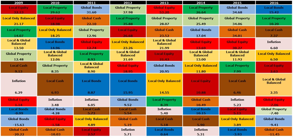
I'd like to know if a graph like this is possible in QV? I have tried to replicate it and just can't seem to get it right. I started by using a straight table with Year and Asset class as dimensions. As an expression, I ranked the asset classes based on their yearly return. The closest I got to replicating the graph was selecting "horizontal" for the Year dimension under the presentation tab - however, this then makes everything horizontal and there ends up being multiple columns for the same year for each asset class. Please could someone let me know if they have any other ideas to do this? Any guidance would be much appreciated - thanks!
Accepted Solutions
- Mark as New
- Bookmark
- Subscribe
- Mute
- Subscribe to RSS Feed
- Permalink
- Report Inappropriate Content
yes... but is a very common solution in QlikView, and works fine
- Mark as New
- Bookmark
- Subscribe
- Mute
- Subscribe to RSS Feed
- Permalink
- Report Inappropriate Content
You can try block chart.
- Mark as New
- Bookmark
- Subscribe
- Mute
- Subscribe to RSS Feed
- Permalink
- Report Inappropriate Content
I've tried that - does not give me what I'm looking for
- Mark as New
- Bookmark
- Subscribe
- Mute
- Subscribe to RSS Feed
- Permalink
- Report Inappropriate Content
Try with a pivot table, one dimension as a row, one year dimension located as a expresion, all expanded, expresion with CRLF and colours in the background... I think it is possible!
- Mark as New
- Bookmark
- Subscribe
- Mute
- Subscribe to RSS Feed
- Permalink
- Report Inappropriate Content
I think it is possible with only one year dimension as columns... Even row dimension could be avoided....
- Mark as New
- Bookmark
- Subscribe
- Mute
- Subscribe to RSS Feed
- Permalink
- Report Inappropriate Content
Yeah I think I might have to strip the year dimension into columns. Was hoping to avoid this
- Mark as New
- Bookmark
- Subscribe
- Mute
- Subscribe to RSS Feed
- Permalink
- Report Inappropriate Content
yes... but is a very common solution in QlikView, and works fine