Unlock a world of possibilities! Login now and discover the exclusive benefits awaiting you.
- Qlik Community
- :
- All Forums
- :
- QlikView App Dev
- :
- Change color on line char when max value is reache...
- Subscribe to RSS Feed
- Mark Topic as New
- Mark Topic as Read
- Float this Topic for Current User
- Bookmark
- Subscribe
- Mute
- Printer Friendly Page
- Mark as New
- Bookmark
- Subscribe
- Mute
- Subscribe to RSS Feed
- Permalink
- Report Inappropriate Content
Change color on line char when max value is reached
Hello,
I have a line chart, with full accumulation expresion.
The "x" Axis is dinamyc, when is 1 or 2 months selected show the days. When is geater than 2 and less than 11 show weeks, when is the complete year show months and year.
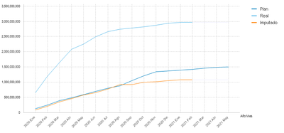
I would like to change the color to transparent when the full accumulation is equal to max value as shown below:
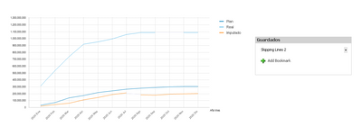
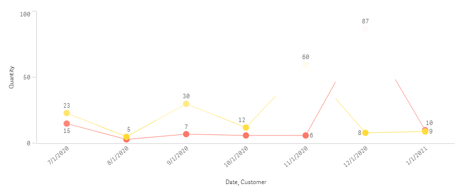
For some reason when I make some specific selections (souch as bookmars "Skipping Lines 1" and "Skipping Lines 2" into the attached file) the chart behavior shows as the image below:
How could I manage when the max value is reached change the line color to transparent in this case? Any adivce?
Please help
Thank you
- Mark as New
- Bookmark
- Subscribe
- Mute
- Subscribe to RSS Feed
- Permalink
- Report Inappropriate Content
ColorMix1(
	(sum(quantity) - Min(Total<customer> quantity))
    / Max(Total<customer> quantity)
    ,color(FieldIndex('customer',customer)), white()
)
Try mixing max color with background color.


