Unlock a world of possibilities! Login now and discover the exclusive benefits awaiting you.
- Qlik Community
- :
- All Forums
- :
- QlikView App Dev
- :
- Chart Data Issue,
- Subscribe to RSS Feed
- Mark Topic as New
- Mark Topic as Read
- Float this Topic for Current User
- Bookmark
- Subscribe
- Mute
- Printer Friendly Page
- Mark as New
- Bookmark
- Subscribe
- Mute
- Subscribe to RSS Feed
- Permalink
- Report Inappropriate Content
Chart Data Issue,
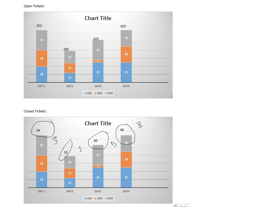
I have a data for 30 days, two charts one below the other, first chart for all cumulative open tickets and next chart below that is for closed tickets. logic is it should be the same all the time, fileds, representation, and also the filters. but the problem is need to show only cosed for that particular day instead of cumulative (unlike open cases). Please help me!!
Please help me.
Thanks.
Kanth
- Mark as New
- Bookmark
- Subscribe
- Mute
- Subscribe to RSS Feed
- Permalink
- Report Inappropriate Content
You might benefit from creating flag in the script on when a certain thing got closed and then use those flag to create the below chart.
- Mark as New
- Bookmark
- Subscribe
- Mute
- Subscribe to RSS Feed
- Permalink
- Report Inappropriate Content
Hi Sunny,
this is only an example, we have altogether 10 charts using the same logic, so wanted to apply for all the closed tickets on a different line of business. Can you help me with any other solution than the flags please .
Regards,
kanth
- Mark as New
- Bookmark
- Subscribe
- Mute
- Subscribe to RSS Feed
- Permalink
- Report Inappropriate Content
I would use an count and an IF formula for example for chart2:
count(if(ticket='Closed', ticket,null()))
Regards Paolo
- Mark as New
- Bookmark
- Subscribe
- Mute
- Subscribe to RSS Feed
- Permalink
- Report Inappropriate Content
HI Kanth,
Does your data have the date the ticket was closed ?
If so, couldn't you use the closed date as a dimension.
Mark
- Mark as New
- Bookmark
- Subscribe
- Mute
- Subscribe to RSS Feed
- Permalink
- Report Inappropriate Content
Hi All,
thanks for the reply, if I use the closed date field istead of the cumulative field it spoils chart functionality from the above and below, they are all inter related, so i cant use the date field alone for closed.
what i am thinking is can we subtract the field value and represent the same. can any one help on the same please.\
Thanks