Unlock a world of possibilities! Login now and discover the exclusive benefits awaiting you.
- Qlik Community
- :
- All Forums
- :
- QlikView App Dev
- :
- Chart that show 0-100% in x-axes
- Subscribe to RSS Feed
- Mark Topic as New
- Mark Topic as Read
- Float this Topic for Current User
- Bookmark
- Subscribe
- Mute
- Printer Friendly Page
- Mark as New
- Bookmark
- Subscribe
- Mute
- Subscribe to RSS Feed
- Permalink
- Report Inappropriate Content
Chart that show 0-100% in x-axes
Hi, we've got answers on some questions in range between 0-10. I want to represent them like this in QV:

So I can see the difference between 2 weeks or months. And see how many percent each grade has. In example above 2015-Sep got 6% 0 grade and 35% has 10 grade.
Anyone know if thats possible in QV ?
- Mark as New
- Bookmark
- Subscribe
- Mute
- Subscribe to RSS Feed
- Permalink
- Report Inappropriate Content
I think you just need to use an expression like
=Num( Count(Grade) / Count(TOTAL<YearMonth> Grade) , '#.00%','.',',')
in a bar chart with dimensions YearMonth and Grade.
- Mark as New
- Bookmark
- Subscribe
- Mute
- Subscribe to RSS Feed
- Permalink
- Report Inappropriate Content
I will try that, but the date (month/week) is dynamic and selected using a calendar. And month/week is switched by a cycling group.
- Mark as New
- Bookmark
- Subscribe
- Mute
- Subscribe to RSS Feed
- Permalink
- Report Inappropriate Content
Just add all fields of that cycle group to the TOTAL qualifier field list:
=Num( Count(Grade) / Count(TOTAL<YearMonth, Month, Week> Grade) , '#.00%','.',',')
- Mark as New
- Bookmark
- Subscribe
- Mute
- Subscribe to RSS Feed
- Permalink
- Report Inappropriate Content
Thanks, got it to work, kinda. Here is the output ("Betyg" is grade),

I want the procent of each grade to be printed inside the block, like:
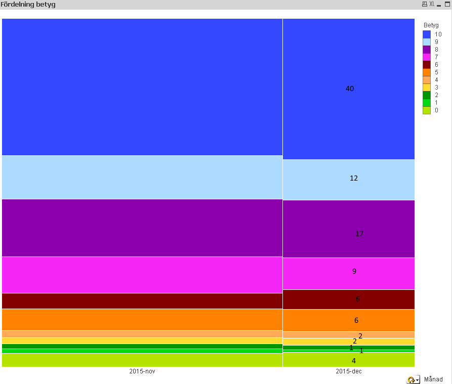
Is that possible? And also, if its possible, I want the diagram horisontal instead of vertical.
I use Mekko-chart.
- Mark as New
- Bookmark
- Subscribe
- Mute
- Subscribe to RSS Feed
- Permalink
- Report Inappropriate Content
You can set the 'Orientation' to horizontal in 'style' tab of chart properties.
For the values inside segments, enable 'values on data points' in expression tab and 'plot values inside segments' on presentation tab. For small segments, QV will print no number.
You can change the number formatting in the expression like
=Num( Count(Grade) / Count(TOTAL<YearMonth, Month, Week> Grade) , '0%')