Unlock a world of possibilities! Login now and discover the exclusive benefits awaiting you.
- Qlik Community
- :
- All Forums
- :
- QlikView App Dev
- :
- Re: Compare Sales Differences between 2 dynamicall...
- Subscribe to RSS Feed
- Mark Topic as New
- Mark Topic as Read
- Float this Topic for Current User
- Bookmark
- Subscribe
- Mute
- Printer Friendly Page
- Mark as New
- Bookmark
- Subscribe
- Mute
- Subscribe to RSS Feed
- Permalink
- Report Inappropriate Content
Compare Sales Differences between 2 dynamically selected sets
I have a simple table:
| ABF | YYYY | MM | CustCode | ItemCode | Sales | PM |
| Actual | 2012 | 4 | C01 | X01 | 100 | 20 |
| Actual | 2012 | 5 | C01 | X01 | 100 | 20 |
| Actual | 2012 | 6 | C01 | X01 | 100 | 20 |
| Actual | 2012 | 6 | C02 | X01 | 200 | 45 |
| Actual | 2012 | 6 | C02 | X02 | 300 | 100 |
| Budget | 2012 | 4 | C01 | X01 | 100 | 20 |
| Budget | 2012 | 5 | C01 | X01 | 90 | 18 |
| Budget | 2012 | 6 | C01 | X01 | 80 | 16 |
| Budget | 2012 | 6 | C02 | X01 | 100 | 20 |
| Budget | 2012 | 6 | C02 | X02 | 500 | 200 |
I want to compare two columns dynamically, e.g. Actual vs Budget for 2012, Actual Apr vs Actual May, etc
I have tried hard coding the expressions:
- Sum({$<ABF={'Actual'}>} Sales)
- Sum({$<ABF={'Budget'}>} Sales)
- Sum({$<ABF={'Actual'}>} Sales) - Sum({$<ABF={'Budget'}>} Sales)
They worked fine to show me the difference between Actual and Budget, and I know same will apply for Year and Month.
What I want now is to extend this so that I can have 2 list boxes of ABF, and and pick the 1st one as left hand side, the 2nd one as right hand side, and the pivot chart can display the 3 columns accordingly. I need some enlightenment as it just sounds like an easy piece of homework on set analysis. Any help would be appreciated.
Regards,
Alfred
Accepted Solutions
- Mark as New
- Bookmark
- Subscribe
- Mute
- Subscribe to RSS Feed
- Permalink
- Report Inappropriate Content
This should be an easy exercise if you are using QlikView 11. The new feature "alternate states" will allow you to set up comparitive data sets that will allow you to do side by side comparisons.
- Mark as New
- Bookmark
- Subscribe
- Mute
- Subscribe to RSS Feed
- Permalink
- Report Inappropriate Content
Cool, it works fine! Thanks! Seems I am just lucky to have v11 with me.
Only some minor issue, there is a red syntax warning below the last closing curly. The pivot chart is working fine though, just this red mark I am puzzled.
- Mark as New
- Bookmark
- Subscribe
- Mute
- Subscribe to RSS Feed
- Permalink
- Report Inappropriate Content
One more thing, the Show Partial Sum is not following the other filters...
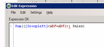
This is the actual expression:
Sum({[GroupLeft] <ABF=GroupABFLeft, YYYY=GroupYYYYLeft, MM=GroupMMLeft>} Sales * ExRate) / SymbolValue
Thanks!