Unlock a world of possibilities! Login now and discover the exclusive benefits awaiting you.
- Qlik Community
- :
- All Forums
- :
- QlikView App Dev
- :
- Re: Connect two graphs (make them look like one)
- Subscribe to RSS Feed
- Mark Topic as New
- Mark Topic as Read
- Float this Topic for Current User
- Bookmark
- Subscribe
- Mute
- Printer Friendly Page
- Mark as New
- Bookmark
- Subscribe
- Mute
- Subscribe to RSS Feed
- Permalink
- Report Inappropriate Content
Connect two graphs (make them look like one)
Hi everybody,
I have the following problem:
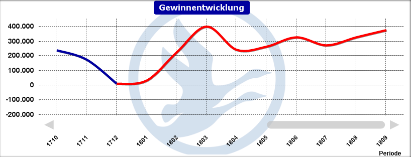
I would like to create a graph showing my actual numbers and forecast numbers together in one chart.
So until October, my actual numbers would be in there and then forecast numbers. However, the graph should, as soon as it contains only forecast numbers change its color, so that it is recognizable that you look at the forecast there.
So I just went ahead and created 2 graphs (2 seperate formulars) in the same chart. One contains only actual numbers and the other one shows forecast numbers if there are no actual numbers for this month yet (e.g. Nov-Dec).
So far so good ... But now I have a nasty gap between the graphs ... Does anyone see a solution to 'connect' the red graph with the green one?
PS: I have only been working with QV for a few weeks 
Thank you in advance!
Jan
- Mark as New
- Bookmark
- Subscribe
- Mute
- Subscribe to RSS Feed
- Permalink
- Report Inappropriate Content
I believe, We can merge. Can you share sample to work around
- Mark as New
- Bookmark
- Subscribe
- Mute
- Subscribe to RSS Feed
- Permalink
- Report Inappropriate Content
Have a look at merging the two expressions into one, like:
=RangeSum(<"actual" expression>, <"forecast" expression>)
Then use a conditional expression for the foreground colour (click the + next to the expression in the Properties | Expressions tab). Something to determine of the x-axis date is later than the last "actuals" date
=If([DateField] > Max({<Sales = {">0"}>} DateField), Red(), Green())
Adjust to your specific requirements.
- Mark as New
- Bookmark
- Subscribe
- Mute
- Subscribe to RSS Feed
- Permalink
- Report Inappropriate Content
Hi everybody,
Sorry for my late reply...
I managed to merge them visually. I have two functions now: 1. actual Profit/Loss until max(month_closed)
2. Forecast starting in max(month_closed)... They now look like one graph which switches its coulor when turning into forecast.
I guess that's not best practice but I'm fine with that as long as the result is working.
Cheers
Jan