Unlock a world of possibilities! Login now and discover the exclusive benefits awaiting you.
- Qlik Community
- :
- All Forums
- :
- QlikView App Dev
- :
- Different colors on data points of bar
- Subscribe to RSS Feed
- Mark Topic as New
- Mark Topic as Read
- Float this Topic for Current User
- Bookmark
- Subscribe
- Mute
- Printer Friendly Page
- Mark as New
- Bookmark
- Subscribe
- Mute
- Subscribe to RSS Feed
- Permalink
- Report Inappropriate Content
Different colors on data points of bar
Hi everyone ,
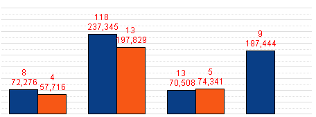
I have following chart in which value on top shows " No of records " i.e. "8" and second value shows expression value i.e. ""72,276. What I want is to show first value in red color and second value in black color , currently I have given red color in Text color attribute of expression.
Any help is highly appreciated.
Regards:
Mubbasher Khaliq
- Mark as New
- Bookmark
- Subscribe
- Mute
- Subscribe to RSS Feed
- Permalink
- Report Inappropriate Content
Hii
Select -> Background Colour of first expr -> type =RGB(224,80,41) and =RGB(0,3,3) in another expression background.
Hope this helps you.
Vikas
If the issue is solved please mark the answer with Accept as Solution & like it.
If you want to go quickly, go alone. If you want to go far, go together.
- Mark as New
- Bookmark
- Subscribe
- Mute
- Subscribe to RSS Feed
- Permalink
- Report Inappropriate Content
Hi
That's correct, and then for the second column add black() as the text colour in the expressions. It is the background colour of the expression that you need to change the colour of the bar itself. Is this not what you want?
Or do you want the 72,276 and 57,716 in red and then the second two columns (237,345 and 197,829) in black?
Steve
- Mark as New
- Bookmark
- Subscribe
- Mute
- Subscribe to RSS Feed
- Permalink
- Report Inappropriate Content
Sorry my mistake , for example lets take first blue bar there are two values shown at top of this bar '8' and '72,276' , What I want is to show 8 in red font color and 72,276 in black font color , I have attached the document please have a look.
- Mark as New
- Bookmark
- Subscribe
- Mute
- Subscribe to RSS Feed
- Permalink
- Report Inappropriate Content
Hi Mubbasher,
that is quite amazing. Being able to display two different figures on top of a column would help me in some diagrams, too.
Would you mind explaining how you did that?
That would possibly lead to a solution to your current problem, too - believe it or not, describing a problem precisely often does lead to the conclusion...
Thanks a lot!
Best regards,
DataNibbler
- Mark as New
- Bookmark
- Subscribe
- Mute
- Subscribe to RSS Feed
- Permalink
- Report Inappropriate Content
Hi Friedrich ,
Please get attachment.
- Mark as New
- Bookmark
- Subscribe
- Mute
- Subscribe to RSS Feed
- Permalink
- Report Inappropriate Content
Hi
A tricky one. The only solution I came up with was to separate the two text items out between a Data Point on the bar and a PopUp, which physically separates them. I don't know if that's acceptable. This allows you to assign different formatting to both text items.
That said, it still does not work for some reason, which looks like a bug with the system. I'm currently using v10 as we're due to upgrade soon. Maybe it's a v10 issue - I've attached the amended file for you to have a look at, but this may affect v11 also.
Steve
- Mark as New
- Bookmark
- Subscribe
- Mute
- Subscribe to RSS Feed
- Permalink
- Report Inappropriate Content
You can check it from background color option of Expression or Color tab in properties.
- Mark as New
- Bookmark
- Subscribe
- Mute
- Subscribe to RSS Feed
- Permalink
- Report Inappropriate Content
Hi Mubbasher,
it is a separate formula without any graphical representation. Interesting.
Thanks a lot!
Unfortunately, I cannot come up with a solution to this just now - at least not the way you did it.
Creating a clone of that formula and hiding it might be a step towards a solution - but it seems that in that case the figures are also hidden...
I have had the same challenge - representing several values for one column/ displaying more values
than the axes would allow - and I solved it using free_text_boxes in the diagram.
However, that works only when you have a fixed number of dimension_points (e.g. months) and it is a bit fickle to position those boxes.
Best regards,
DataNibbler
- Mark as New
- Bookmark
- Subscribe
- Mute
- Subscribe to RSS Feed
- Permalink
- Report Inappropriate Content
Hi
The free text box is an option, but you are really reliant on the data set not changing and this would require that the table is non-interactable. i.e. any selections made did not apply to the chart, otherwise your careful formatting goes to pot. Although this functionality should be possible when you split the fields up, it looks like a bug, and it may be best to question the customers need for this requirement with this information in mind- it's all a question of cost benefit.
Sorry I've not come up with a working solution. I hope my ion put has at least been useful.
Have a good weekend
Steve