Unlock a world of possibilities! Login now and discover the exclusive benefits awaiting you.
- Qlik Community
- :
- All Forums
- :
- QlikView App Dev
- :
- Re: Grouped Bar chart Month by Month
- Subscribe to RSS Feed
- Mark Topic as New
- Mark Topic as Read
- Float this Topic for Current User
- Bookmark
- Subscribe
- Mute
- Printer Friendly Page
- Mark as New
- Bookmark
- Subscribe
- Mute
- Subscribe to RSS Feed
- Permalink
- Report Inappropriate Content
Grouped Bar chart Month by Month
hi All (newbie here),
I am trying to show a grouped bar chart comparing ticket numbers monthly for the pats 3 years (2018, 19 and 20).
So Far, I have only managed to show all the months but Year after year - Meaning:
Jan... Dec 2018, Jan...Dec 2019, Jan... June 2020
My dimension is: date(Monthname([CAT.Created]),'MMM')
My Expression is: Count({1<CAT_Ticket_ID>}CAT_Ticket_ID) - cannot be impacted by other user's selections
Dimension sort added is: num(month(CAT.Created)) + year(CAT.Created)/100000
I am getting the following bar chart.
- Jan, Feb, Mar (2018) || Jan, Feb, Mar, ... (2019) || Jan, Feb, Mar.... (2020)
What i would like seeing is:
- Jan '18, Jan '19, Jan'20 || Feb'18, Feb'19, Feb '20... and so on
any help highly appreciated...
Accepted Solutions
- Mark as New
- Bookmark
- Subscribe
- Mute
- Subscribe to RSS Feed
- Permalink
- Report Inappropriate Content
Hi @Anonymous , I wasn't sure what you meant by adding 1 dimension as a group and 1 as a bar.
However, this is what I did and it works now.
I changed my two dimensions for month and Year FROM:
=date(monthname([cat.created]))
=date(yearname([cat.created])
TO:
CreatedYear
CreatedMonth
(in the data load script I added: Month ([cat.created]) AS CreatedMonth, Year ([cat.created]) AS CreatedYear
And the expression didn't change: [Cat.Tickets]
The graph works now 😉
- Mark as New
- Bookmark
- Subscribe
- Mute
- Subscribe to RSS Feed
- Permalink
- Report Inappropriate Content
Hi,
Have you tested =date([CAT.Created],'MMMYY') in stead of date(Monthname([CAT.Created]),'MMM') ?
Taoufiq ZARRA
"Please LIKE posts and "Accept as Solution" if the provided solution is helpful "
(you can mark up to 3 "solutions") 😉
- Mark as New
- Bookmark
- Subscribe
- Mute
- Subscribe to RSS Feed
- Permalink
- Report Inappropriate Content
Its depend on how you wanna display data, if you go with granular level Drill down chart, if you wanna display for all months for each year need to create clear dimension values like Jan-18,Jan-19,Jan-20.
If you would like to show overall month dimension then they can have Year filter on it, So try to understand the difference and tool limitation over it.
- Mark as New
- Bookmark
- Subscribe
- Mute
- Subscribe to RSS Feed
- Permalink
- Report Inappropriate Content
Hi @Taoufiq_Zarra, I havent tested that combination, I will try and let you know. Thanks
- Mark as New
- Bookmark
- Subscribe
- Mute
- Subscribe to RSS Feed
- Permalink
- Report Inappropriate Content
Hi @Anonymous , Thanks for your reply. To clarify I would like to display the data for all months for each year.
Does that mean I need to create dimension values like Jan-18,Jan-19,Jan-20?
I saw another post (for Qlik Sense) where this coding was not necessary and they were simply sorting the dimension. Please see this link for reference: https://community.qlik.com/t5/New-to-Qlik-Sense/Group-Bar-Chart-Month-wise/td-p/1575698
- Mark as New
- Bookmark
- Subscribe
- Mute
- Subscribe to RSS Feed
- Permalink
- Report Inappropriate Content
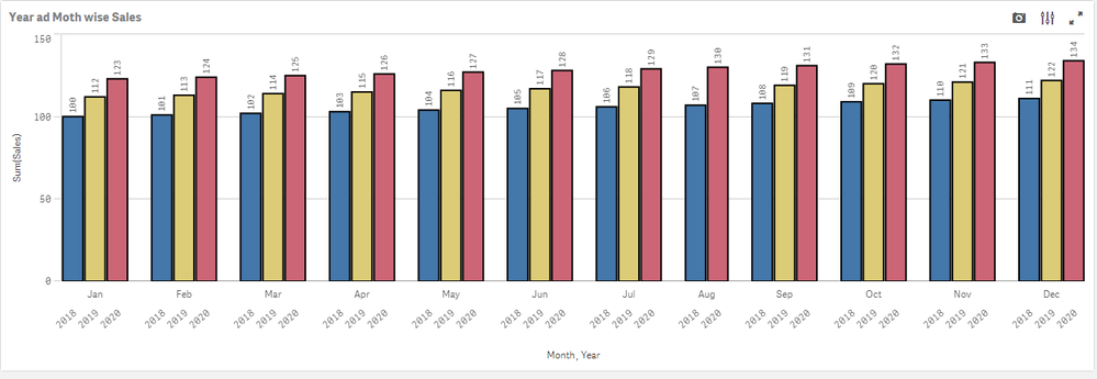
Hi if you looking for below chart then follow below steps.
Step 1: Add two dimensions year and month in the dimensions. Month in group and Year as Bar
Step 2: Add your Expressions.
Step 3: Goto Apperance --> Colors and legend --> show legend OFF
Step 4: Done
Thanks
Pavan Nallani 🙂
- Mark as New
- Bookmark
- Subscribe
- Mute
- Subscribe to RSS Feed
- Permalink
- Report Inappropriate Content
Hi @Anonymous , I wasn't sure what you meant by adding 1 dimension as a group and 1 as a bar.
However, this is what I did and it works now.
I changed my two dimensions for month and Year FROM:
=date(monthname([cat.created]))
=date(yearname([cat.created])
TO:
CreatedYear
CreatedMonth
(in the data load script I added: Month ([cat.created]) AS CreatedMonth, Year ([cat.created]) AS CreatedYear
And the expression didn't change: [Cat.Tickets]
The graph works now 😉
