Unlock a world of possibilities! Login now and discover the exclusive benefits awaiting you.
- Qlik Community
- :
- All Forums
- :
- QlikView App Dev
- :
- Re: Hide some legends in Bar Chart based on set an...
- Subscribe to RSS Feed
- Mark Topic as New
- Mark Topic as Read
- Float this Topic for Current User
- Bookmark
- Subscribe
- Mute
- Printer Friendly Page
- Mark as New
- Bookmark
- Subscribe
- Mute
- Subscribe to RSS Feed
- Permalink
- Report Inappropriate Content
Hide some legends in Bar Chart based on set analysis
I’m trying to get a bar chart legend to only show the legend if there is a valid entry for that month.
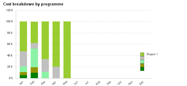
There are five expressions like this: =Sum({<Month>}CostsP5)/Sum({<Month>}Costs)
And the Label for each is like:
=NameP5
I’ve tried changing the label to: =If(Len(NameP5)>0,NameP5,'')
Any ideas?
- Mark as New
- Bookmark
- Subscribe
- Mute
- Subscribe to RSS Feed
- Permalink
- Report Inappropriate Content
But we do see Grey and other colors in the chart, shouldn't the legend show this info? May be try this
=Only({<Month>} NameP5)
- Mark as New
- Bookmark
- Subscribe
- Mute
- Subscribe to RSS Feed
- Permalink
- Report Inappropriate Content
They are, but the projects can change over the year so that Project 2 in February will be different from Project 2 in November. I only want to show the legend for projects running in the current month, but leave the chart showing all projects.
- Mark as New
- Bookmark
- Subscribe
- Mute
- Subscribe to RSS Feed
- Permalink
- Report Inappropriate Content
I think this might be challenging to do it this way... can you may be do this with 2 dimensions and 1 expression, instead of 1 dimension and 5 expressions?
- Mark as New
- Bookmark
- Subscribe
- Mute
- Subscribe to RSS Feed
- Permalink
- Report Inappropriate Content
The data looks something like this:
| MonthYear | Programme 1 | Programme 2 | Programme 3 | Programme 4 | Programme 5 | Costs Programme 1 | Costs Programme 2 | Costs Programme 3 | Costs Programme 4 | Costs Programme 5 |
| Jan-18 | AJH | SR | NCP | RPN | Oct | 100 | 50 | 20 | 10 | 10 |
| Feb-18 | AJH | SR | NCP | RPN | Oct | 80 | 20 | 70 | 20 | 20 |
| Mar-18 | Project 1 | AJH | BBJ | 60 | 20 | 10 | ||||
| Apr-18 | Project 1 | AJH | 120 | 30 | ||||||
| May-18 | Project 1 | 150 | ||||||||
| Jun-18 | ||||||||||
| Jul-18 |
- Mark as New
- Bookmark
- Subscribe
- Mute
- Subscribe to RSS Feed
- Permalink
- Report Inappropriate Content
And do you use CrossTable load to transform your data?
- Mark as New
- Bookmark
- Subscribe
- Mute
- Subscribe to RSS Feed
- Permalink
- Report Inappropriate Content
We don't. There's a lot more on each line, although a lot of them are also broken down by Programme.