Unlock a world of possibilities! Login now and discover the exclusive benefits awaiting you.
- Qlik Community
- :
- All Forums
- :
- QlikView App Dev
- :
- Re: How can I show Actual vs Forecast in a single ...
- Subscribe to RSS Feed
- Mark Topic as New
- Mark Topic as Read
- Float this Topic for Current User
- Bookmark
- Subscribe
- Mute
- Printer Friendly Page
- Mark as New
- Bookmark
- Subscribe
- Mute
- Subscribe to RSS Feed
- Permalink
- Report Inappropriate Content
How can I show Actual vs Forecast in a single Line Chart line where if there YTD Flag is not 1, use forecast values instead for the line?
Hi all,
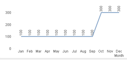
I have a table that looks like this:
| Month | YTD Flag | Actual | Forecast |
|---|---|---|---|
| Jan | 1 | 100 | 200 |
| Feb | 1 | 100 | 200 |
| Mar | 1 | 100 | 200 |
| Apr | 1 | 100 | 200 |
| May | 1 | 100 | 200 |
| Jun | 1 | 100 | 200 |
| Jul | 1 | 100 | 200 |
| Aug | 1 | 100 | 200 |
| Sep | 1 | 100 | 200 |
| Oct | - | 100 | 300 |
| Nov | - | 100 | 300 |
| Dec | - | 100 | 300 |
What I would like to do is create a Line Chart where it shows using one line what the actual spend is and when there is no YTD flag, use Forecast value instead for the remaining months.
So in the aboe, up to Sep it would a line consisting of values up to 100, and then the line rises to 300 for Oct, Nov, and Dec because YTD flag has nothing.
Does anyone know how to do this please? Example of an expression? 
- Mark as New
- Bookmark
- Subscribe
- Mute
- Subscribe to RSS Feed
- Permalink
- Report Inappropriate Content
You can create line chart and then use full accumulation croon expression tab
Then don't suppress the null values. You might achieve
- Mark as New
- Bookmark
- Subscribe
- Mute
- Subscribe to RSS Feed
- Permalink
- Report Inappropriate Content
Hi Anil,
I cannot use this. I am looking to do it the expression way.
- Mark as New
- Bookmark
- Subscribe
- Mute
- Subscribe to RSS Feed
- Permalink
- Report Inappropriate Content
Ok, Like this
Dim is Month
Expression is If([YTD Flag] = 1, Sum(Actual), If([YTD Flag] = Null(), Sum(Forecast),Sum(Forecast)))
PFA